

In today’s fast-paced project environments, understanding team performance isn’t just a ‘nice-to-have’—it’s the bedrock of continuous improvement and predictable delivery. For teams using Jira Cloud, visibility into workflows, capacity, and potential bottlenecks is critical. But how do you transform raw Jira data into actionable intelligence? The answer lies in well-crafted performance dashboards.
A great dashboard does more than just display metrics; it tells a story, highlighting successes, flagging risks, and guiding strategic decisions. This article moves beyond generic charts to provide a deep analysis of seven distinct performance dashboard examples. We will break down what makes each one effective, showcasing different layouts and key performance indicators (KPIs) tailored for specific business needs, from high-level executive overviews to granular, team-specific insights.
We’ll specifically explore how tools like the Out of Office Assistant for Jira Cloud can enhance these dashboards by providing crucial data on team availability, ensuring your performance metrics reflect the full picture. Beyond simply tracking internal performance, dashboards can also be leveraged to provide transparent reporting to external stakeholders, as seen with powerful SEO client dashboards.
Each example in our list includes screenshots, strategic analysis, and actionable takeaways you can apply immediately. You will learn how platforms like Tableau, Microsoft Power BI, and Geckoboard can be configured to solve specific problems, helping you build a dashboard that truly drives your team’s success. Let’s dive in.
1. The Absence Impact Dashboard: Visualizing Team Availability & Risk
Our featured choice for performance dashboard examples is the Absence Impact Dashboard, a powerful and specialized view built using gadgets from the Out of Office Assistant for Jira Cloud. This dashboard moves beyond traditional metrics like cycle time or ticket closure rates. Instead, it provides a strategic, real-time visualization of how team availability directly impacts project health and capacity.
This dashboard is an exemplary model for proactive risk management. It transforms the often-siloed data of employee leave into an actionable intelligence layer within your Jira environment. For project managers, Scrum Masters, and team leads, it answers critical questions that are typically difficult to quantify, such as “Which sprints are most vulnerable to upcoming team absences?” or “How much of our planned sprint capacity is affected by leave?”
Deep Dive Analysis: Why It’s a Standout Example
The true power of this performance dashboard lies in its ability to connect human resources data (absences) with project management data (story points, tasks, deadlines). This integration provides a holistic view that is often missing from standard performance reporting.
Key Strengths & Strategic Advantages:
- Proactive Risk Mitigation: Instead of reacting to resource shortages, managers can see upcoming availability gaps weeks or months in advance. This allows for smarter sprint planning, workload redistribution, and more realistic deadline setting.
- Data-Driven Capacity Planning: The dashboard replaces guesswork with hard data. By visualizing the story points or hours associated with absent team members, you gain an accurate picture of your true operational capacity for any given period.
- Enhanced Stakeholder Communication: When project delays are unavoidable due to team leave, this dashboard provides clear, visual evidence. It facilitates transparent conversations with stakeholders about adjusting timelines or scope based on proven resource constraints.
- Direct Jira Integration: Its components are native Jira gadgets. This means there is no need to switch between different applications or manually export data. The insights are delivered directly within the project management workspace where decisions are made.
Strategic Insight: The most effective performance dashboards don’t just report on past events; they provide forward-looking intelligence. The Absence Impact Dashboard excels here by turning leave schedules into a predictive tool for project risk and resource planning.
Core Components & Use Cases
This dashboard is constructed using several key gadgets from the Out of Office Assistant for Jira, each serving a distinct purpose.
| Gadget Component | Primary Function & Use Case |
|---|---|
| Capacity Report Gadget | Function: Displays total available work capacity (in hours or story points) for a specific team or project, factoring in all scheduled absences. Use Case: A Scrum Master uses this to set realistic sprint goals, ensuring the committed story points align with the team’s actual availability. |
| Who is Away Gadget | Function: Provides a simple, real-time list or calendar view of which team members are currently out of the office and when they will return. Use Case: A support team lead quickly checks this gadget to see which agents are available to handle an urgent incoming ticket. |
| Absence Timeline Gadget | Function: Visualizes all planned absences across a project or team on a Gantt-style chart. Use Case: A project manager reviews the timeline for the next quarter to identify potential resource bottlenecks, especially where multiple key developers have overlapping vacations. |
Practical Takeaways & Implementation
- Start with Key Projects: When first implementing this dashboard, focus on your most critical or high-velocity projects. Use the insights to fine-tune resource allocation where it matters most.
- Combine with Velocity Charts: Place the Capacity Report gadget next to your team’s standard Velocity Chart. This creates a powerful comparison, helping you correlate dips in velocity with periods of high team absence.
- Customize for Different Audiences: Create multiple versions of this dashboard. A team-level version can focus on daily availability, while a management-level dashboard can show a quarterly overview of capacity risks across multiple projects.
This dashboard is a premier example of how to leverage specialized data for a massive competitive advantage. It elevates performance monitoring from a passive, historical review to an active, predictive strategy.
Access Details:
- Tool Required: Out of Office Assistant for Jira Cloud
- Availability: Accessible via the Atlassian Marketplace for all Jira Cloud instances.
- Setup: The gadgets are added to any standard Jira dashboard after the app is installed, requiring no complex configuration.
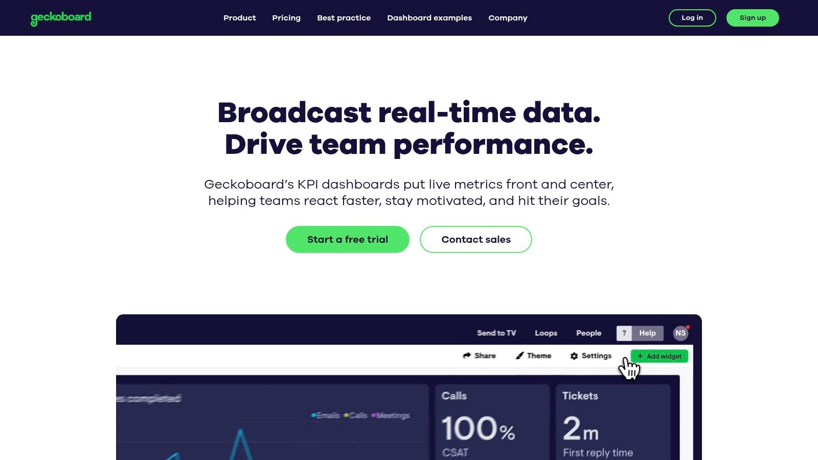
2. Geckoboard
Geckoboard stands out in the crowded market of dashboarding tools with its laser focus on simplicity and team motivation. It’s designed for businesses that need to get key performance indicators (KPIs) in front of their teams quickly and effectively, without a steep learning curve or the need for a dedicated data analyst. This makes it an excellent choice for agile software teams, sales departments, and support centers that thrive on real-time visibility.
Its core philosophy revolves around making data accessible and understandable to everyone, not just managers. Geckoboard excels at transforming complex datasets from various sources into clean, visually engaging dashboards that can be displayed on office TVs, shared via links, or sent as automated Slack updates. This approach positions it as a powerful communication tool, turning metrics into a shared team objective.
Strategic Analysis: The Power of Simplicity and Visibility
Geckoboard’s primary strength is its intuitive, non-technical user experience. The drag-and-drop builder allows project managers and team leads to create and launch a professional performance dashboard in minutes, not hours. This ease of use democratizes data, empowering teams to build and own their own dashboards.
Key Takeaway: By removing technical barriers, Geckoboard encourages team-led data monitoring. When teams build their own dashboards, they gain a deeper sense of ownership and understanding of the metrics that matter most to their daily work, directly impacting performance.
The platform is optimized for high-visibility displays like large-screen TVs. This isn’t just a feature; it’s a strategic choice designed to foster a data-driven culture. When KPIs are constantly visible in a shared space, they become part of the team’s ambient awareness, promoting proactive problem-solving and celebrating wins collectively.
Unique Features and Actionable Insights
Geckoboard’s value is enhanced by its practical features designed for immediate team impact.
- Over 90 Pre-built Integrations: Connect seamlessly with tools like Jira, Salesforce, Google Analytics, and Zendesk. This wide range of integrations means you can pull data from virtually any part of your business into one unified view.
- Real-Time Data: Dashboards update automatically, ensuring the team is always looking at the most current information. This is critical for fast-paced environments like support desks or development sprints.
- Sharing and Reporting: Use “Sharing Links” to give stakeholders read-only access, or schedule automated “Snapshots” to be sent to Slack channels or email inboxes for regular updates.
Practical Tip: For a Jira team, use the Geckoboard integration to create a “Sprint Health” dashboard. Combine widgets for Bugs Raised vs. Resolved, Cycle Time, and Story Points Completed. Display this on a TV in the team area to keep the sprint goals top of mind for everyone.
Pricing and Access
Geckoboard offers several pricing tiers based on the number of users and dashboards.
- Free: A limited-feature plan for a single user and one dashboard, built from spreadsheet data only.
- Team: Starting at $159/month (billed annually), this plan includes unlimited dashboards, TV display optimization, and standard integrations.
- Company: Starting at $479/month (billed annually), it adds premium integrations, custom branding, and advanced user management features.
While the cost can be a consideration, especially for smaller teams, the value lies in its rapid deployment and motivational impact. For teams looking for one of the most straightforward and visually compelling performance dashboard examples that requires minimal technical overhead, Geckoboard is a top-tier choice.
Website: https://www.geckoboard.com/
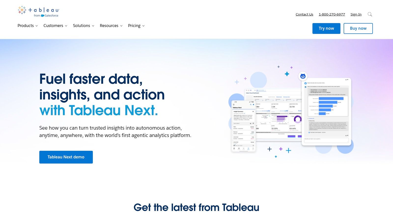
3. Tableau
Tableau is a powerhouse in the business intelligence and data analytics space, renowned for its advanced visualization capabilities and deep analytical depth. It’s designed for organizations that need to go beyond surface-level metrics, enabling users to explore, understand, and present complex data from disparate sources. This makes it a go-to solution for data scientists, business analysts, and enterprises that require granular, interactive, and highly customized dashboards.
The platform’s philosophy is rooted in empowering users to “see and understand data.” Tableau excels at transforming massive, raw datasets into beautiful, interactive visualizations that invite exploration. Unlike simpler tools focused on high-level KPI tracking, Tableau provides a canvas for sophisticated data storytelling, making it an indispensable tool for uncovering hidden trends, correlations, and business-critical insights.
Strategic Analysis: The Power of Deep Data Exploration
Tableau’s core strength lies in its unmatched flexibility and analytical power. While it has a steeper learning curve than some competitors, this investment unlocks the ability to perform complex calculations, blend diverse data sources, and build multi-layered dashboards that answer nuanced business questions. Its drag-and-drop interface is powerful, allowing for the creation of intricate charts and graphs that can be filtered and drilled down into in real time.
Key Takeaway: Tableau moves beyond simple metric display to enable genuine data discovery. By empowering teams to ask and answer their own complex questions, it fosters a culture of deep analytical inquiry, turning data from a reporting tool into a strategic asset for decision-making.
This platform is not just about showing what happened; it’s about understanding why it happened. Features like predictive analytics and AI-powered insights (Ask Data, Explain Data) help users identify drivers behind their metrics without needing a degree in statistics, making advanced analysis more accessible.
Unique Features and Actionable Insights
Tableau’s enterprise-grade features are designed for comprehensive data analysis and visualization.
- Extensive Data Integrations: Connect to hundreds of data sources, from on-premise SQL databases and cloud warehouses to spreadsheets and web data connectors like the one for Jira. This versatility ensures all relevant business data can be unified.
- Interactive Visualizations: Build dashboards where every element is clickable, filterable, and interconnected. Users can explore data from multiple angles, slicing and dicing it on the fly to uncover insights.
- Predictive Analytics and AI: Use built-in modeling functions like forecasting and clustering to predict future outcomes. Tableau’s AI can automatically explain the drivers behind a specific data point.
- Mobile-Friendly Dashboards: Design once and view anywhere. Dashboards are automatically optimized for viewing on tablets and smartphones, ensuring stakeholders have access to data on the go. You can find more information about how Tableau fits into the ecosystem of reporting automation tools on resolution.de.
Practical Tip: For a Jira project manager, use Tableau to blend Jira data with financial data from an ERP system. Create a performance dashboard example showing Cost per Story Point or ROI per Epic. Use interactive filters to allow stakeholders to drill down by team, quarter, or project type, providing a powerful view of development efficiency and business value.
Pricing and Access
Tableau’s pricing is role-based, reflecting its enterprise focus.
- Tableau Creator: Starting at $75/user/month (billed annually), this license is for users who design and build dashboards. It includes Tableau Desktop, Tableau Prep Builder, and one Creator license for Tableau Server/Cloud.
- Tableau Explorer: Starting at $42/user/month (billed annually), for users who need to explore and analyze data within existing dashboards.
- Tableau Viewer: Starting at $15/user/month (billed annually), for users who only need to view and interact with published dashboards.
While the cost is higher and may be prohibitive for small teams, its deep analytical capabilities provide immense value for data-driven organizations. For teams needing one of the most powerful and customizable performance dashboard examples available, Tableau is the industry standard.
Website: https://www.tableau.com/
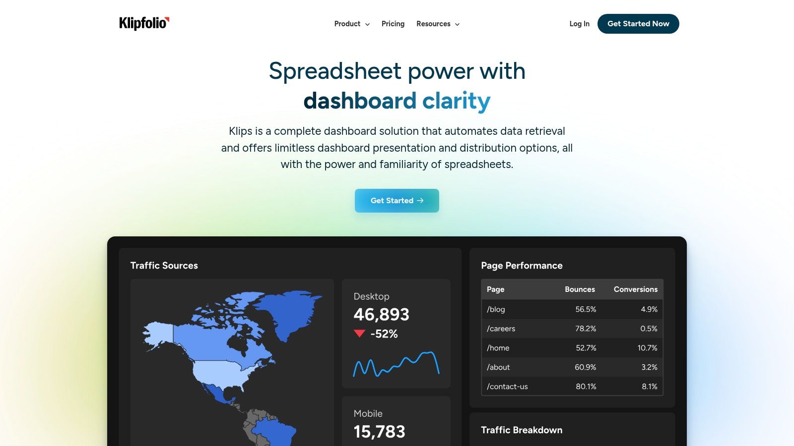
4. Klipfolio
Klipfolio positions itself as a powerful, highly customizable business intelligence platform designed for data-savvy teams that need to go beyond basic KPIs. It enables businesses to build and share real-time dashboards by integrating a vast array of data sources, from cloud services and SQL databases to simple spreadsheets. Its strength lies in its flexibility and depth, allowing users to not just visualize data, but also to model, manipulate, and explore it.
This platform is ideal for organizations that need to blend data from multiple departments, such as marketing, sales, finance, and operations, into a single cohesive view. Klipfolio’s core component, PowerMetrics, allows for the creation of complex, calculated metrics that can be reused across different dashboards, providing a consistent and reliable single source of truth for performance tracking.
Strategic Analysis: The Power of Customization and Metric Modeling
Klipfolio’s main competitive advantage is its robust customization engine. While other tools focus on simplicity, Klipfolio provides a more granular level of control, allowing users to write custom formulas, join different data sources, and define intricate data models. This makes it an exceptional tool for analysts and teams who need to answer complex business questions that pre-built widgets cannot address.
Key Takeaway: Klipfolio empowers teams to build a centralized metric layer for the entire business. By defining and managing key metrics in one place (PowerMetrics), organizations can ensure consistency and trust in their data, which is fundamental for creating reliable performance dashboard examples that drive strategic decisions.
The platform’s architecture supports real-time data integration, which is critical for monitoring operational performance. This capability, combined with its customization features, allows teams to create dynamic dashboards that are not just reports of past performance but are active tools for day-to-day management.
Unique Features and Actionable Insights
Klipfolio offers several features that cater to analytically-minded teams, providing deeper insights and control.
- PowerMetrics: A standout feature that lets you create, manage, and explore a catalog of reusable metrics. This helps standardize calculations and definitions across the organization.
- Extensive Data Connectivity: Klipfolio supports hundreds of data sources, including databases, files, and popular cloud applications like Jira, Salesforce, and Google Analytics. Explore some of the best workflow automation solutions to see how such integrations can further enhance your data ecosystem.
- AI-Powered Insights: A newer feature includes an AI-powered chat interface that allows users to ask questions in natural language and receive instant data visualizations, making data exploration more accessible.
- Advanced Customization: Users can get deep into the editor to control every aspect of a visualization’s look and feel, from formulas to formatting.
Practical Tip: For a product team using Jira, leverage Klipfolio’s PowerMetrics to define a custom “Feature Adoption Rate” metric. Combine Jira data (features shipped) with data from a product analytics tool (user engagement). This blended metric provides a far richer insight into the actual impact of development work than just looking at story points completed.
Pricing and Access
Klipfolio’s pricing is structured to cater to different business sizes and needs.
- Free: A plan for individuals and small teams, offering unlimited metrics and dashboards but with limitations on users and data source refresh rates.
- Go: Starting at $125/month, this plan is designed for growing teams and offers more users, data services, and faster data refresh intervals.
- Pro & Ace: Custom-priced enterprise plans that include advanced features like single sign-on (SSO), a dedicated success manager, and premium support.
While some users have noted unexpected price increases, the platform’s power and flexibility offer significant value. For teams that have outgrown simpler tools and need one of the most customizable performance dashboard examples available, Klipfolio is an excellent and scalable choice.
Website: https://www.klipfolio.com/
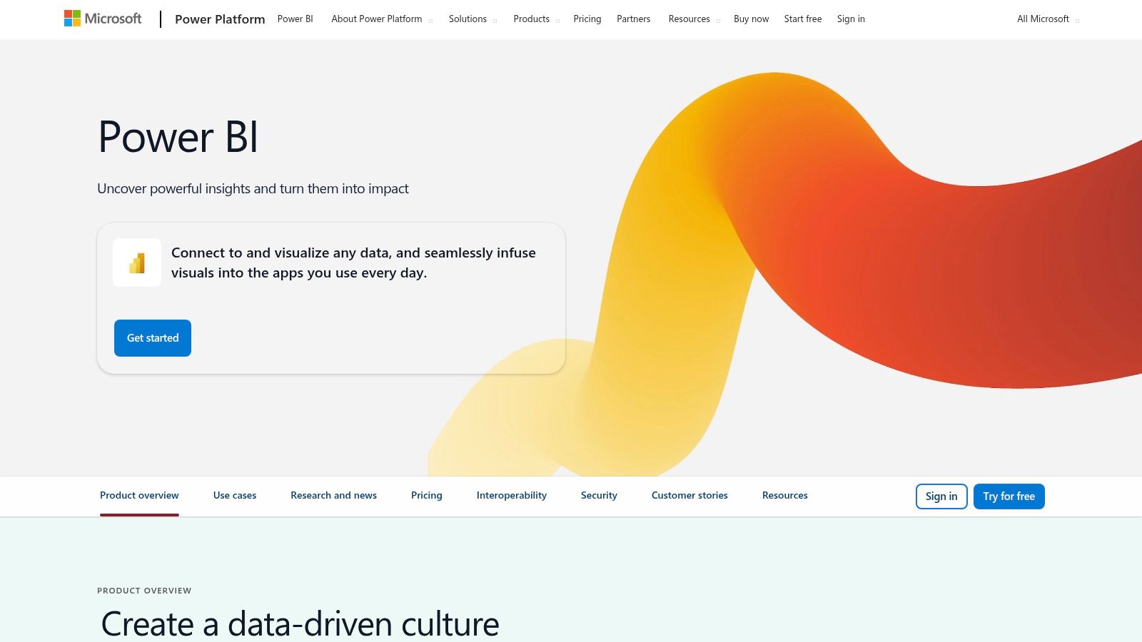
5. Microsoft Power BI
Microsoft Power BI is a dominant force in the business intelligence landscape, offering an enterprise-grade suite of tools for deep data analysis and interactive visualization. It’s designed for organizations that require robust, scalable analytics and is particularly powerful for businesses deeply integrated with the Microsoft ecosystem, such as Azure, SQL Server, and Microsoft 365. This platform goes beyond simple metric display, empowering data analysts and business users to connect to hundreds of data sources, model complex datasets, and uncover granular insights.
Power BI’s core strength lies in its ability to transform raw data into a cohesive, interactive, and strategically rich narrative. It positions itself not just as a dashboarding tool, but as a comprehensive analytics solution that supports everything from self-service BI for individual teams to enterprise-wide reporting. This makes it a go-to choice for data-driven organizations aiming to build a centralized and highly governed data culture.
Strategic Analysis: The Power of Integration and Advanced Analytics
Power BI’s primary advantage is its seamless integration with the broader Microsoft product stack. For companies running on Azure, using SharePoint, or managing data in SQL Server, Power BI offers native connectors that simplify data pipelines and enhance security. This tight coupling creates a unified environment where data can flow from operational systems to analytical dashboards with minimal friction.
Key Takeaway: Power BI’s strength is its dual-capability. It empowers business users with its user-friendly interface for basic reports while providing data scientists with advanced tools like DAX (Data Analysis Expressions) for sophisticated data modeling, creating truly dynamic and insightful performance dashboard examples.
The platform is built to handle complexity. Unlike some simpler tools, Power BI excels at data preparation and modeling through its Power Query feature, allowing users to clean, shape, and combine data from disparate sources before visualization. This robust back-end capability ensures that the insights presented are not just visually appealing but also accurate and reliable. You can find many detailed Jira dashboard examples built with Power BI and other tools on resolution.de.
Unique Features and Actionable Insights
Power BI’s value is amplified by its enterprise-focused features designed for deep analysis and collaboration.
- Interactive and Drill-Down Reports: Create dashboards where users can click on a data point to filter the entire report or drill down into the underlying data for root cause analysis.
- AI-Powered Insights: Leverage built-in AI features like “Quick Insights” to automatically analyze your dataset and surface key trends, correlations, and outliers that you might have missed.
- Power Query Editor: A powerful tool for data transformation (ETL) that allows you to clean, combine, and enrich data from various sources without writing complex code.
- Seamless Collaboration: Share reports and dashboards through the Power BI Service, embed them in SharePoint or Microsoft Teams, and control access with granular permissions.
Practical Tip: Connect Power BI to your Jira and financial software. Create a “Project Profitability” dashboard that combines Jira’s Story Points Completed and Time Spent with financial data on project costs. Use the drill-down feature to let stakeholders click on a specific epic to see its associated costs and development progress in one view.
Pricing and Access
Power BI offers a flexible pricing model that scales from individual users to large enterprises.
- Free: A desktop version (Power BI Desktop) for individual users to create reports and dashboards. Sharing is limited.
- Pro: At $10 per user/month, this plan allows users to publish and share reports, collaborate with others, and consume content in the Power BI service.
- Premium Per User: At $20 per user/month, this includes all Pro features plus access to larger model sizes, paginated reports, and advanced AI capabilities.
- Premium Per Capacity: Starting around $4,995/month, this is for large-scale enterprise deployments, providing dedicated cloud capacity and performance.
While the learning curve can be steeper for beginners compared to more focused tools, its advanced capabilities and strong integration make it an unparalleled choice for organizations committed to the Microsoft ecosystem.
Website: https://powerbi.microsoft.com/
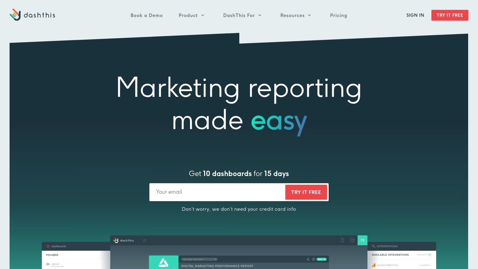
6. DashThis
DashThis carves out a specific niche in the dashboarding world by focusing exclusively on the needs of marketing agencies and professionals. It’s built to streamline the often time-consuming process of client reporting, transforming complex marketing data into clear, concise, and visually appealing dashboards. This makes it an ideal solution for digital marketing teams, SEO specialists, and PPC managers who need to communicate campaign performance effectively without spending hours compiling reports.
The platform’s core strength is its emphasis on automation and simplicity. DashThis is engineered to connect to all major marketing channels, pull in the relevant metrics, and present them in pre-configured, professional-looking reports. This focus on efficiency allows marketers to spend more time on strategy and optimization and less on manual data wrangling, positioning it as a powerful time-saver for performance-driven agencies.
Strategic Analysis: The Power of Automated Marketing Reporting
DashThis’s primary advantage is its deep integration with the marketing ecosystem, combined with a user-friendly, template-driven approach. The platform provides pre-built widgets for common marketing KPIs from sources like Google Analytics, Facebook Ads, and SEMrush, which drastically reduces setup time. This allows even non-technical account managers to create comprehensive performance reports quickly.
Key Takeaway: By automating the data aggregation and reporting process, DashThis shifts the focus from data collection to insight delivery. It standardizes reporting across multiple clients and channels, ensuring consistency and professionalism while freeing up valuable team resources.
The tool’s white-label capabilities are a strategic asset for marketing agencies. The ability to add custom branding and domains to reports reinforces an agency’s brand identity and delivers a seamless client experience. This transforms the dashboard from a simple reporting tool into a professional, branded client communication portal.
Unique Features and Actionable Insights
DashThis packs in features specifically designed to enhance marketing reporting workflows. For a wider array of insights and visualization techniques, explore more marketing dashboard examples.
- Preset Report Templates: Choose from templates for SEO, PPC, social media, and more, or create your own to standardize reporting across your entire client portfolio.
- Automated Email Dispatches: Schedule reports to be sent automatically to clients or stakeholders on a daily, weekly, or monthly basis, ensuring timely updates without any manual intervention.
- All-in-One Marketing Integrations: With over 40 native integrations, you can connect tools like Ahrefs, Mailchimp, Google Search Console, and LinkedIn Ads into a single, unified view of campaign performance. While it excels at marketing, it’s less suited for tracking internal operational data like help desk metrics.
Practical Tip: Create a consolidated “Monthly Performance Review” dashboard for a client. Pull in key metrics like Cost Per Acquisition (CPA) from Google Ads, Click-Through Rate (CTR) from Facebook Ads, and Organic Sessions from Google Analytics. Add a comment widget to each section to provide your own analysis and recommendations, turning the data into an actionable strategic document.
Pricing and Access
DashThis offers plans based on the number of dashboards you need, which is ideal for agencies scaling their client base.
- Individual: Starting at $42/month (billed annually) for 3 dashboards.
- Professional: Starting at $126/month (billed annually) for 10 dashboards, a popular choice for small agencies.
- Business: Starting at $246/month (billed annually) for 25 dashboards, with added white-label features.
- Standard: Starting at $382/month (billed annually) for 50+ dashboards, designed for larger agencies.
For marketing teams seeking one of the most efficient and professional performance dashboard examples tailored for client reporting, DashThis is an exceptional choice that delivers significant time savings and enhances client communication.
Website: https://dashthis.com/
7. Scoro
Scoro positions itself as a comprehensive work management solution, where performance dashboards are not just an add-on but a core, integrated component. It is designed specifically for professional services businesses, agencies, and consultancies that need to connect project management, client work, billing, and team performance in one place. This all-in-one approach provides a holistic view of business health that standalone dashboard tools often struggle to achieve.
Instead of just visualizing data from other tools, Scoro generates much of the data itself through its project management, time tracking, and financial features. This creates a single source of truth, making its dashboards incredibly accurate and context-rich. The platform excels at translating operational activities directly into financial outcomes and performance metrics, offering a complete picture from time logged on a task to its impact on the profit margin.

Strategic Analysis: The Power of an Integrated Ecosystem
Scoro’s key strategic advantage is its unified data model. By housing project plans, timesheets, invoices, and CRM data within a single platform, it eliminates the data silos that plague many organizations. This allows for the creation of deeply insightful performance dashboards that connect effort directly to results without complex integrations.
Key Takeaway: Scoro’s integrated nature means its dashboards are not just for monitoring but for true business management. You can drill down from a high-level KPI like “Project Profitability” directly into the specific tasks, billable hours, and expenses that contributed to it, enabling real-time course correction.
The platform’s highly customizable nature allows businesses to build dashboards that reflect their unique workflows and financial models. While this requires a more considered setup than simpler tools, the payoff is a performance monitoring system that is perfectly tailored to the company’s operational reality.
Unique Features and Actionable Insights
Scoro’s features are built to provide control and clarity for service-based businesses.
- Extensive Report Library: With over 50 pre-built report templates, teams can quickly get started tracking metrics like billable vs. non-billable hours, team utilization, and project budgets.
- Highly Customizable Widgets: Build your dashboard from scratch using a variety of widgets and metrics. You can create different dashboards for different roles, such as a project manager view, a sales view, or an executive overview.
- Automated Reporting: Schedule detailed performance reports to be generated and sent to stakeholders automatically, saving significant administrative time and ensuring consistent communication.
- Integrated Financial Data: Link project performance directly to financial KPIs like revenue, costs, and profit margins, all within the same dashboard.
Practical Tip: For a professional services team, use Scoro to create a “Client Health” dashboard. Combine widgets for Budget vs. Actual Spent, Team Utilization Rate for that client, Upcoming Deadlines, and Uninvoiced Billable Hours. This gives account managers a 360-degree view to manage client relationships proactively.
Pricing and Access
Scoro’s pricing reflects its status as a comprehensive work management platform. It is structured in tiers and requires a minimum of five users.
- Essential: Starting at $26 per user/month, offering basic project, work, and contact management.
- Standard: Starting at $37 per user/month, adding more detailed financial reporting, purchase orders, and templates.
- Pro: Starting at $63 per user/month, which includes the full suite of features like advanced time tracking, billability reporting, and more sophisticated dashboard capabilities.
- Ultimate: Custom pricing for a fully tailored solution.
While the investment is higher than a standalone dashboard tool, Scoro provides one of the most powerful performance dashboard examples for businesses that need to tie daily operations directly to financial outcomes. It’s an ideal choice for organizations looking to replace multiple disparate tools with a single, unified platform.
Website: https://www.scoro.com/
Performance Dashboard Tools Comparison
| Product | Implementation Complexity 🔄 | Resource Requirements ⚡ | Expected Outcomes 📊 | Ideal Use Cases 💡 | Key Advantages ⭐ |
|---|---|---|---|---|---|
| resolution Reichert Network Solutions GmbH Out of Office Assistant | Moderate – requires admin setup for rules and integrations | Medium – Jira admin involvement needed | Streamlined absence management and uninterrupted workflows | Jira Cloud teams, project managers, IT service agents | Automates reassignment, deep tool integration, detailed reporting |
| Geckoboard | Low – quick setup with user-friendly interface | Low – minimal technical skill required | Real-time KPI visualization and team motivation | Teams needing easy, fast KPI dashboards | Intuitive UI, fast deployment, wide integrations |
| Tableau | High – steep learning curve for beginners | High – skilled users needed | Advanced customizable data visualization and analysis | Enterprises requiring complex analytics | Powerful analytics, highly customizable dashboards |
| Klipfolio | Moderate – customization with some limits | Medium – ongoing usage costs | Real-time comprehensive dashboards with complex metrics | Businesses needing diverse data source integration | Wide data support, PowerMetrics for metric management |
| Microsoft Power BI | Moderate to High – technical expertise required | Medium to High – technical support | Advanced interactive dashboards with AI insights | Organizations using Microsoft 365 ecosystem | Strong Microsoft integration, collaboration tools |
| DashThis | Low – easy to start with pre-built templates | Low – marketing-focused resources | Quick setup marketing dashboards with automation | Marketing teams wanting fast reporting | Prebuilt marketing widgets, automated reports |
| Scoro | Moderate – some learning curve | Medium to High – costlier solution | Customizable KPI dashboards and automated reporting | Professional services needing multi-role management | Extensive reports, customizable widgets |
From Data Overload to Actionable Insight: Building Your Perfect Dashboard
We have journeyed through a diverse landscape of powerful performance dashboard examples, from the deep, Jira-native integration of Out of Office Assistant to the broad, enterprise-level analytics of Tableau and Microsoft Power BI. Each example, whether it’s Geckoboard’s real-time visibility or Scoro’s comprehensive work management overview, underscores a fundamental truth: a great dashboard does more than just display data; it tells a story and guides your next move.
The most impactful dashboards are born from strategic intent, not just technical capability. They transform abstract numbers into a clear narrative about your team’s progress, challenges, and opportunities. The goal is to move beyond passive data consumption and create an active, dynamic tool that fuels productive conversations and empowers decisive action.
Synthesizing the Key Takeaways
Reflecting on the examples from Klipfolio, DashThis, and others, several core principles for effective dashboard creation emerge. Adhering to these will ensure your final product is a strategic asset rather than a glorified report that gathers digital dust.
- Purpose Before Pixels: Always start with the “why.” What specific decisions will this dashboard inform? What critical questions must it answer? A dashboard for a development team tracking sprint velocity has a fundamentally different purpose than one for an HR manager monitoring team availability and its impact on project timelines.
- Context is King: Raw metrics are meaningless without context. As seen with the Out of Office Assistant’s impact analysis, knowing who is absent is less important than knowing how their absence affects critical project tasks. Always frame your data with contextual information to provide true insight.
- Integration is Non-Negotiable: Your dashboard should be a seamless part of your workflow. Tools that integrate directly with your central work hub, like Jira Cloud, eliminate manual data entry and ensure the information is always current and relevant. This direct connection makes the data more trustworthy and actionable.
- Simplicity Drives Adoption: The best dashboards prioritize clarity over complexity. Use visual hierarchy, whitespace, and a limited color palette to guide the user’s eye to the most important information. If a user needs a manual to understand your dashboard, you’ve already lost the battle.
Your Actionable Roadmap to a Better Dashboard
Feeling inspired by these performance dashboard examples is the first step; turning that inspiration into reality is the next. Here is a practical roadmap to get you started on building or refining your own performance dashboard.
- Identify Your Single Most Pressing Question: Don’t try to boil the ocean. What is the one area where improved visibility could have the biggest impact right now? Is it project risk due to team absences? Is it marketing campaign ROI? Is it customer support ticket resolution time? Focus your initial efforts there.
- Select Your Core Metrics (Fewer is Better): Choose 3-5 Key Performance Indicators (KPIs) that directly answer your primary question. For each metric, ask yourself, “What action would we take if this number went up or down?” If there’s no clear answer, it’s likely a vanity metric and should be discarded.
- Choose the Right Tool for the Job: Your tool selection should be guided by your specific needs.
- For deep Jira integration and team availability insights: The Out of Office Assistant by resolution Reichert Network Solutions GmbH is purpose-built to provide actionable dashboards right within your Jira environment.
- For broad business intelligence and data sources: Consider platforms like Tableau or Microsoft Power BI.
- For real-time, shareable wallboards: Geckoboard is an excellent choice.
- Iterate and Gather Feedback: Your first dashboard will not be your last. Build a prototype, share it with the intended users, and actively solicit feedback. Is it clear? Is it useful? What’s missing? Use this feedback to continuously refine and improve.
By following this strategic approach, you can create a performance dashboard that serves as a true command center for your team. It will foster a culture of transparency and data-informed decision-making, transforming your team’s relationship with its own performance data from a chore into a powerful competitive advantage.
Ready to turn absence data into a strategic advantage? Many of the most crucial performance dashboard examples for Jira teams focus on mitigating risks from employee leave. The Out of Office Assistant by resolution Reichert Network Solutions GmbH provides the tools to build these dashboards directly in Jira, offering instant clarity on how team availability impacts your projects. Start building more insightful dashboards today.
