

In a world saturated with information, raw data is no longer enough. The ability to transform complex datasets into clear, compelling, and actionable visuals is a critical skill for any professional, from DevOps managers tracking sprints in Jira to marketing teams analyzing campaign performance in HubSpot.
Effective data visualization isn’t just about creating aesthetically pleasing charts; it’s about communicating insights, driving decisions, and telling powerful stories with integrity. However, common pitfalls can easily lead to confusion, misinterpretation, and ultimately, missed opportunities. A poorly designed graph can obscure a critical trend or, even worse, actively mislead an audience.
This guide cuts through the noise. It provides a definitive roundup of data visualization best practices that will elevate your charts from simple graphics to strategic communication tools. We will explore the foundational principles and advanced techniques that separate a forgettable chart from an unforgettable insight. For teams looking to streamline this process, integrating customer data directly into your workflow tools can provide the real-time context needed to visualize user stories and prioritize development effectively.
This article provides actionable steps to ensure your data doesn’t just get seen-it gets understood and acted upon. We will cover everything from selecting the perfect chart type for your dataset to crafting a compelling narrative that resonates with your specific audience. Let’s dive into the practices that will empower you to build visuals that inform, persuade, and inspire action.
1. Know Your Audience and Purpose
Before a single data point is plotted, the most critical step is defining who the visualization is for and what it needs to achieve. This foundational practice of knowing your audience and purpose dictates every subsequent design choice, from the chart type and color palette to the level of detail included. Ignoring this step is like giving a presentation in a language your audience doesn’t understand; the message, no matter how brilliant, will be lost.
Effective data visualization bridges the gap between raw data and human comprehension. To build that bridge, you must first understand the people on the other side. A dashboard for a C-suite executive with five minutes between meetings requires a high-level, scannable summary with clear key performance indicators (KPIs). In contrast, a deep-dive analysis for a team of data scientists can and should include granular detail, complex chart types, and statistical overlays.
Tailoring Your Visualization Strategy
The core of this practice involves creating a clear profile of your end-user. Consider their role, their familiarity with the subject matter, and the context in which they will view the visualization. Is it on a large presentation screen, a printed report, or a mobile device? Answering these questions helps you prioritize information and remove anything that doesn’t directly serve the primary goal.
For example, The New York Times masterfully serves multiple audiences with its layered COVID-19 visualizations. A casual reader can quickly grasp national trends from a simple map, while an epidemiologist can dig into county-level data and logarithmic charts for deeper analysis. Similarly, a sales manager’s Tableau dashboard might show top-line revenue trends, while an analyst’s view of the same data would include pipeline velocity and lead conversion funnels.
“The greatest value of a picture is when it forces us to notice what we never expected to see.” – John Tukey, Mathematician
This approach ensures your visualization isn’t just a chart, but a decision-making tool. By aligning the design with user needs, you transform data from a passive report into an active catalyst for insight and action. This alignment is central to creating a powerful user journey, a key concept in improving the overall customer experience.
A Decision Framework for Audience-Centric Design
To streamline this process, you can use a simple decision tree that maps audience characteristics to appropriate visualization strategies. The following flowchart illustrates how to adjust complexity based on audience expertise and the time they have available.
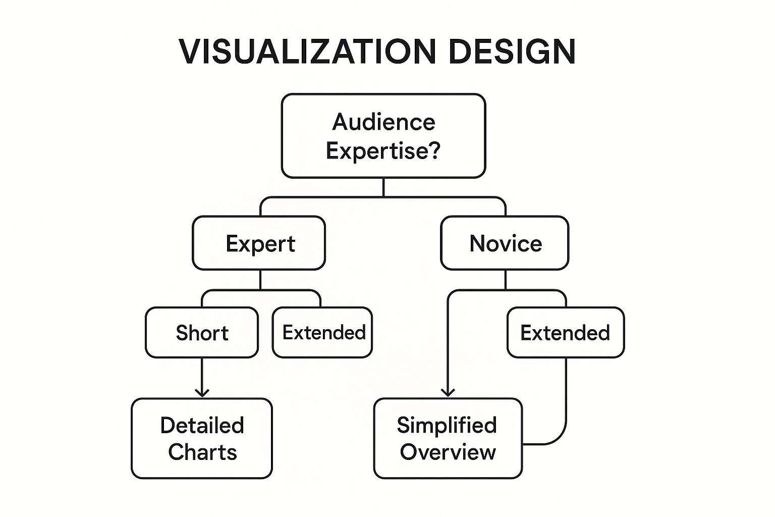
This decision model clarifies that for a novice with limited time, a simplified overview is essential, while an expert with more time can benefit from highly detailed, interactive charts. Following this path is a core tenet of data visualization best practices.
2. Choose the Right Chart Type
Once you understand your audience and purpose, the next critical decision is selecting the right visual format for your data. The chart type you choose is the primary vehicle for your message; an inappropriate choice can obscure insights or, even worse, mislead your audience. Each chart is designed to represent specific data relationships, such as comparisons, compositions, distributions, or trends over time.
Selecting the right chart isn’t about finding the most visually complex option; it’s about clarity and efficiency. The goal is to match the chart’s function to the core question you are trying to answer with your data. This foundational skill, a cornerstone of data visualization best practices, ensures that the story within your data is communicated accurately and intuitively, minimizing the cognitive load on your audience.

Matching Data Relationships to Chart Types
The core of this practice is aligning your data’s structure with a visual encoding that our brains can easily decode. For instance, bar charts excel at comparing distinct categories, while line charts are unparalleled for showing a continuous trend over time. A scatter plot is the go-to for revealing relationships between two numeric variables, and a histogram is ideal for understanding the distribution of a single variable.
Consider how Spotify’s annual “Wrapped” campaign uses a variety of charts to tell a personal story. It might use a bar chart to compare your top genres and a custom radial chart to show your listening habits over the day. Similarly, news organizations like FiveThirtyEight often prefer dot plots over bar charts for election polling comparisons, as they reduce visual clutter and make small differences easier to spot. This deliberate selection enhances the narrative and makes complex data feel personal and accessible.
“The purpose of visualization is insight, not pictures.” – Ben Shneiderman, Computer Scientist
This principle guides you to prioritize function over form. While a donut chart might look more modern than a simple pie chart, both are often poor choices for precise comparisons between more than a few categories. A simple bar chart is almost always clearer. By consciously choosing the simplest, most effective chart, you ensure your message is received without ambiguity.
A Framework for Chart Selection
Pioneers like Jacques Bertin and modern practitioners like Alberto Cairo have developed frameworks to guide these decisions. A simple but effective approach is to first identify the primary relationship you want to highlight in your data.
- Comparison: Use bar, column, or dot plot charts to compare values across categories.
- Trend over Time: Use a line chart or an area chart for continuous data.
- Composition: Use a stacked bar chart or a treemap to show parts of a whole. Use pie charts cautiously and only for a few distinct categories.
- Distribution: Use a histogram, box plot, or density plot to show how data points are spread.
- Relationship: Use a scatter plot or a bubble chart to explore the correlation between two or more variables.
By starting with the story you want to tell, you can quickly narrow down the most suitable chart types, transforming your data from a spreadsheet into a compelling and insightful visual narrative.
3. Maintain Visual Hierarchy and Focus
Once you know your audience and have chosen the right chart, the next step is to guide their eyes. Effective data visualization isn’t a democracy where every element shouts for attention; it’s a carefully orchestrated story. Creating a clear visual hierarchy guides the viewer’s attention to the most important insights first, then to supporting details. This involves the strategic use of size, color, position, and contrast to establish a logical flow that tells your data story in the intended order.
Failing to establish a hierarchy results in a chaotic and confusing visual. The viewer is left unsure where to look first, what is most important, and how the different pieces of information relate to each other. By deliberately designing a path for the eye to follow, you control the narrative and ensure your key message is received loud and clear. This principle transforms a simple chart into a powerful communication tool, a core tenet of effective data visualization best practices.
Directing Attention with Design
At its core, this practice involves making intentional choices about which elements stand out and which recede into the background. Your most critical KPI should be the most visually dominant element on the page. Secondary metrics and contextual information should be less prominent but still easily accessible. This creates a natural order of consumption, preventing cognitive overload and making the information easier to process.
For instance, Google Analytics dashboards masterfully use a card-based layout where the largest, most prominent cards display primary metrics like “Users” and “Sessions.” Supporting charts and tables are smaller and arranged below, allowing a user to grasp the high-level summary instantly before drilling down. Similarly, Airbnb’s host dashboard places earnings and upcoming bookings in the most prominent positions, as these are the most critical pieces of information for the user.
“If everything is important, then nothing is.” – Patrick M. Lencioni, Author
This concept, rooted in Gestalt psychology and popularized by design experts like Nancy Duarte, ensures that your visualization is not just seen but understood. It’s about building a framework that supports the story you want to tell. By strategically using design elements, you make your data’s narrative intuitive, a key element discussed in our guide to dashboard design best practices.
A Framework for Prioritizing Visual Elements
To implement a strong visual hierarchy, you can apply a few simple yet powerful techniques. These methods help create contrast and direct the user’s focus without adding unnecessary clutter.
- The Squint Test: Squint your eyes while looking at your visualization. The most important elements and the overall structure should still be discernible. If everything blurs into a single, uniform block, your hierarchy is too weak.
- Strategic Use of Color: Use a muted or neutral color palette for the majority of your visualization, and reserve a single, vibrant accent color to highlight the most critical data points or callouts.
- Size and Position: Place the most important information in the top-left corner, as this is where Western audiences naturally start reading. Make key numbers or charts larger than supporting elements.
- Leverage White Space: Don’t be afraid of empty space. White space helps to group related items, separate distinct sections, and reduce visual noise, allowing key insights to stand out more effectively.
4. Use Color Strategically and Accessibly
Color is one of the most powerful tools in data visualization, capable of highlighting key insights, showing relationships, and guiding the viewer’s eye. However, when used improperly, it can just as easily mislead, confuse, or exclude. The practice of using color strategically and accessibly means treating it as a functional element, not just a decorative one. This approach ensures that your color choices enhance clarity, accurately represent the data, and are perceivable by the widest possible audience, including those with color vision deficiencies.

Effective color use is about encoding information. A sequential color palette, like the one used on GitHub’s contribution graph, can show magnitude through varying intensity. A diverging palette, often seen on weather maps from platforms like Weather.com, is perfect for showing a range with a clear midpoint, like temperatures above and below a baseline. A qualitative palette is used to distinguish between discrete categories, but using too many colors can create overwhelming visual noise. The goal is to make color choices that are intuitive and serve a clear analytical purpose.
Tailoring Your Color Strategy
The foundation of a strong color strategy is purpose. Is the color meant to distinguish categories, show a numerical progression, or highlight a specific data point? Answering this question prevents arbitrary color application and ensures every hue has a job to do. This is a core principle of data visualization best practices that separates amateur charts from professional, insightful graphics.
For example, Cynthia Brewer’s work on ColorBrewer provides scientifically-backed, pre-built palettes that are optimized for maps and data graphics. These palettes are categorized as sequential, diverging, and qualitative, and they come with settings to ensure they are colorblind-safe and print-friendly. Similarly, Python’s matplotlib library defaults to the Viridis color scale, a perceptually uniform and accessible palette designed to be clear to viewers with common forms of color blindness. These tools make implementing an effective color strategy straightforward.
“The first and most important rule of data visualization is that it should be, above all, clear. Color is a primary means to that end, but it can also be a primary means to its opposite.” – Maureen Stone, Color Theory Expert
This disciplined approach ensures that your visualization communicates effectively without creating unintentional barriers. It also considers cultural contexts; for instance, red may signify loss or danger in Western business contexts but represents luck or celebration in many Eastern cultures. By being intentional, you create visuals that are not only beautiful but also universally understandable and analytically sound.
A Decision Framework for Strategic Color Use
To implement a strategic color palette, start by defining the nature of your data and the message you want to convey. The following guidelines help map data types to appropriate and accessible color schemes, forming a practical checklist for any project.
- For Categorical Data: Use a qualitative palette with a limited number of distinct hues (ideally 5-7). To improve accessibility, pair colors with other visual cues like patterns, icons, or direct labels.
- For Sequential Data: Employ a single-hue progression from light to dark (or vice versa). This intuitively represents low-to-high values, as seen in heatmaps.
- For Diverging Data: Use a palette with two distinct hues that meet at a neutral central color. This is ideal for showing deviations from a baseline, such as profit and loss.
- Always Test for Accessibility: Before finalizing, use online simulators like Coblis to check how your visualization appears to individuals with different types of color blindness. This simple step is crucial for inclusive design.
By following this framework, you ensure that color works in service of your data story, making your insights clearer, more impactful, and accessible to everyone.
5. Minimize Cognitive Load and Chart Junk
A core principle of effective data communication is to ensure that every visual element serves a purpose. This practice, often summarized by Edward Tufte’s concept of maximizing the “data-to-ink ratio,” involves deliberately removing any visual noise, or “chart junk,” that distracts from the data’s message. By simplifying the design, you reduce the cognitive load on your audience, allowing them to process the information faster and more accurately.
The goal is to create a clean, uncluttered visual that directs the viewer’s attention to the data itself, not the container it’s presented in. Every pixel should justify its existence. Heavy gridlines, decorative fonts, unnecessary 3D effects, and redundant labels create mental friction, forcing the brain to work harder to extract the core insights. A streamlined visualization, by contrast, feels intuitive and lets the story in the data shine through.
Streamlining Your Visualization Strategy
This practice requires a minimalist’s eye and a critical approach to every design choice. The central question to ask is: “Does this element help my audience understand the data?” If the answer is no, it should be removed or toned down. The aim is not to make the chart look sparse, but to make every remaining element more powerful and meaningful.
For instance, the clean, signature style of The Economist‘s charts embodies this principle. They use direct labeling instead of separate legends, subtle or absent gridlines, and a limited color palette to focus attention on the data trends. Similarly, FiveThirtyEight is renowned for its minimalist designs that prioritize clarity and readability, making complex data accessible to a broad audience. This approach is a cornerstone of professional data visualization best practices.
“Perfection is achieved, not when there is nothing more to add, but when there is nothing left to take away.” – Antoine de Saint-Exupéry
Adopting this philosophy means treating your visualization like a finely tuned instrument rather than a decorated canvas. By eliminating extraneous details, you enhance the clarity and impact of your message, enabling quicker comprehension and more confident decision-making.
A Framework for Decluttering Visuals
To implement this practice effectively, you can apply a systematic process of subtraction to your designs. Question every element and justify its inclusion based on its contribution to understanding the data.
- Gridlines and Borders: Remove them entirely or lighten their color to a faint gray. Heavy lines can create a “cage” effect that traps the data.
- Legends: When possible, apply labels directly to the data series (e.g., at the end of a line in a line chart) to eliminate the need for a separate legend.
- Backgrounds: Use a simple white or very light neutral background. Avoid gradients, patterns, or images that compete with the data.
- Color: Use color intentionally to highlight key information, not for decoration. A muted palette for base data with a single bright color for emphasis is highly effective.
- Labels and Ticks: Don’t over-label. If an axis shows years, you may not need a tick mark for every single year if the trend is clear.
By following this decluttering framework, you ensure your charts are not just seen but truly understood, transforming them into efficient tools for communication and analysis.
6. Tell a Clear Data Story
Data on its own is just a collection of numbers; it becomes powerful when it communicates a meaningful narrative. Effective data visualization is not about simply plotting points on a graph. It’s about crafting a compelling story that guides the viewer through the insights, establishing a clear beginning, middle, and end. This practice transforms a passive chart into an active, persuasive tool for understanding and action.
Simply presenting a dashboard full of metrics without a guiding narrative is like handing someone a book with chapters in a random order. The reader has the information, but lacks the structure to make sense of it. A data story provides that structure, connecting individual data points into a cohesive whole that supports a central message or conclusion. This is a crucial element of data visualization best practices, as it ensures the audience not only sees the data but understands its significance.
Structuring Your Data Narrative
At its core, this practice involves strategically arranging your visualizations to build a case. You start with the most important insight or question, then use supporting charts and annotations to provide context, explain the “why,” and lead the viewer to a logical conclusion. The goal is to make the journey from data to insight as seamless and intuitive as possible.
Consider Hans Rosling’s famous TED talks, where he used animated bubble charts from Gapminder to tell the story of global development. He didn’t just show the data; he narrated its movement over time, highlighting key events and challenging preconceived notions. Similarly, Spotify’s annual “Wrapped” feature doesn’t just give users a list of their most-played songs. It crafts a personalized story of their year in music, making the data engaging, memorable, and shareable.
“The goal is to provide your audience with the information they need, when they need it, and in a way that makes sense to them.” – Cole Nussbaumer Knaflic, Storytelling with Data
This storytelling approach ensures that the visualization is not just looked at, but understood and remembered. By deliberately constructing a narrative, you control the message and focus the audience’s attention on what truly matters, preventing them from getting lost in the noise or drawing incorrect conclusions.
A Framework for Narrative Visualization
To build a compelling data story, you can follow a simple yet effective narrative arc. This framework helps structure your visualizations to maximize their impact and clarity, guiding your audience from initial curiosity to final action.
- Set the Stage: Begin by establishing context. Present a high-level overview or a key benchmark that answers the question, “What are we looking at?”
- Introduce the Conflict or Insight: Highlight the central finding. This is the “aha!” moment, such as a sudden drop in sales, a surprising customer trend, or an unexpected correlation. Use annotations or visual cues to draw attention to this key point.
- Provide Supporting Evidence: Use additional charts and data to explain the “why” behind the main insight. This could involve drilling down into specific segments, comparing different time periods, or showing related metrics.
- Conclude with a Resolution: End the story with a clear summary, a takeaway message, or a recommended next step. This provides closure and transforms the visualization into an actionable decision-making tool.
7. Ensure Accuracy and Avoid Misleading Representations
The credibility of a data visualization rests entirely on the integrity of the data it presents and the honesty of its design. Ensuring accuracy is a non-negotiable tenet of ethical visualization, requiring a commitment to representing information truthfully without distortion or deception. This practice involves using appropriate scales, providing full context, and being transparent about the data’s origins and limitations, a principle popularized by pioneers like Edward Tufte.
Effective data visualization is fundamentally about telling a true story. Misleading representations, whether intentional or accidental, erode trust and lead to flawed conclusions. Common pitfalls include truncating the Y-axis on bar charts to exaggerate differences, using inconsistent scales to compare related datasets, or cherry-picking data to support a desired narrative. Adhering to standards of graphical integrity ensures that your audience can rely on your visualization as a basis for sound decision-making.
Tailoring Your Visualization Strategy
The core of this practice is maintaining a rigorous commitment to transparency. This means not only plotting the data correctly but also providing the necessary context for interpretation. You must consider the source of the data, how it was collected, and what it doesn’t show. Being upfront about these factors builds credibility and empowers your audience to engage with the information critically.
For instance, news organizations like Reuters Graphics and the Financial Times are masters of this principle. They consistently start bar charts at a zero baseline to provide an accurate sense of proportion and include detailed methodology notes with their visualizations. Similarly, research institutions like Pew Research Center always report their sampling methods and margins of error, giving readers the tools to assess the data’s reliability. This transparency is key to upholding the standards of data visualization best practices.
“Graphical integrity is more than just efficiency; it is a matter of accurate and truthful representation of data, ensuring that the visual story being told is a reflection of the reality it represents.” – Alberto Cairo, Author and Professor
This approach transforms your visualization from a mere illustration into a trustworthy source of information. The foundation of this accuracy starts long before any chart is created; it begins with robust data preparation, a concept explored further in these best practices for data cleaning. By prioritizing accuracy, you ensure your visualizations serve as catalysts for genuine insight rather than sources of misinformation.
8. Optimize for Multiple Devices and Contexts
In today’s multi-device world, data visualizations are no longer confined to a desktop monitor. They are consumed on smartphones during a commute, tablets in a meeting, and large screens in a boardroom. Optimizing for this variety of devices and contexts ensures that your insights are accessible, legible, and impactful, regardless of how they are viewed. This practice, rooted in the principles of responsive design, is crucial for maintaining data integrity and user experience across all platforms.
Effective responsive data visualization is not simply about shrinking a chart to fit a smaller screen; it’s about intelligently adapting the entire experience. This means considering touch interactions on mobile, hover states on desktop, and high-level summaries for smaller displays, while offering deeper detail on larger ones. Ignoring this step can render a brilliant visualization useless if its labels are unreadable or its interactive elements are unusable on a common device like a smartphone.
Tailoring Your Visualization Strategy
The core of this practice is adopting a “mobile-first” mindset. By designing for the most constrained environment first (a small mobile screen), you force yourself to prioritize the most critical information. Once the core message is clear on mobile, you can progressively enhance the visualization for larger screens by adding more detail, secondary data, or advanced interactive features. This approach ensures a solid foundation for all users.
For example, The Guardian’s interactive data stories are masterfully designed to provide a compelling narrative on both mobile and desktop. On a phone, they present a simplified, scrollable story with clear, tappable charts. The desktop version uses the extra space for more complex annotations and side-by-side comparisons. Similarly, Google Analytics provides an adaptive dashboard that reorganizes modules and simplifies charts for mobile access, ensuring key metrics are always at the user’s fingertips.
“Content is like water. You put water into a cup, it becomes the cup. You put water into a bottle, it becomes the bottle. You put it in a teapot, it becomes the teapot.” – Bruce Lee (as adapted for responsive design by Josh Clark)
This philosophy ensures that your visualization is fluid and functional, not fixed and fragile. By planning for different contexts, you guarantee that the user’s experience is seamless and the data’s story is never compromised by the dimensions of a screen. This is a non-negotiable aspect of modern data visualization best practices.
Data Visualization Best Practices Overview
| Item | Implementation Complexity 🔄 | Resource Requirements 🔄 | Expected Outcomes 📊 | Ideal Use Cases 💡 | Key Advantages ⭐ |
|---|---|---|---|---|---|
| Know Your Audience and Purpose | Low – mainly research and analysis 🔄 | Low – time for audience study 🔄 | Higher adoption, better decision-making 📊 | Tailoring visualizations for specific stakeholders 💡 | Improved effectiveness, reduced cognitive load ⭐ |
| Choose the Right Chart Type | Medium – requires chart knowledge 🔄 | Medium – requires skill and tool access | Maximized data comprehension and impact 📊 | Showing various data relationships clearly 💡 | Clear communication, reduces misinterpretation ⭐ |
| Maintain Visual Hierarchy and Focus | Medium – balance and design skill 🔄 | Medium – design iteration and testing | Guided attention, improved retention 📊 | Complex dashboards, multi-metric visualizations 💡 | Engaging, reduces cognitive overload ⭐ |
| Use Color Strategically and Accessibly | Medium – knowledge of color theory 🔄 | Medium – testing and palette selection | Enhanced pattern recognition and accessibility 📊 | Visualizations requiring clarity across audiences 💡 | Accessibility, intuitive interpretation ⭐ |
| Minimize Cognitive Load and Chart Junk | Low to Medium – discipline required 🔄 | Low – focus on simplification | Faster comprehension, less fatigue 📊 | Minimalist, professional presentations 💡 | Clean, credible, efficient insights ⭐ |
| Tell a Clear Data Story | Medium to High – narrative skills 🔄 | Medium – requires storytelling effort | Increased memorability, action-driving 📊 | Presentations, persuasive reports, public communication 💡 | Emotional engagement, clearer meaning ⭐ |
| Ensure Accuracy and Avoid Misleading Representations | Medium – attention to detail 🔄 | Medium – verification and documentation | Builds trust, ethical decision-making 📊 | All professional, journalistic, and ethical reporting 💡 | Credibility, integrity, reduces misinterpretation ⭐ |
| Optimize for Multiple Devices and Contexts | High – responsive design complexity 🔄 | High – development and testing resources | Broader reach, consistent experience 📊 | Multi-device dashboards, public-facing visuals 💡 | Accessibility, engagement, future-proofing ⭐ |
Putting Best Practices into Action
The journey from raw data to actionable insight is paved with deliberate choices. Throughout this guide, we’ve explored eight foundational pillars of effective data communication. From anchoring your design in a deep understanding of your audience and purpose to meticulously selecting the right chart type, each principle serves a critical function. Mastering these techniques is not just about creating aesthetically pleasing graphics; it’s about building a common language for your entire organization.
By establishing a clear visual hierarchy, using color with purpose, and relentlessly eliminating chart junk, you reduce the cognitive load on your audience. This allows them to move from deciphering a chart to understanding its meaning in seconds. For product managers tracking feature adoption, DevOps teams monitoring system uptime, or marketing specialists analyzing campaign performance, this speed to insight is a competitive advantage. The goal is to make the data feel intuitive, immediate, and undeniable.
From Principles to Daily Practice
Adopting these data visualization best practices is an iterative process, not a one-time checklist. The true power emerges when these principles become second nature, embedded in your team’s workflow. Start small. For your next Jira report or HubSpot dashboard, consciously focus on just two of these principles.
- Practice 1: The “Five-Second Test.” Before sharing your visualization, show it to a colleague for just five seconds. Can they identify the main takeaway? If not, your visual hierarchy or focal point needs refinement.
- Practice 2: The “So What?” Drill. For every chart you create, ask yourself, “So what?” What decision does this visualization enable? What action should be taken based on this information? This ensures every element contributes directly to a clear and compelling data story.
- Practice 3: The Accessibility Audit. Use a color blindness simulator and check contrast ratios. This simple step ensures your insights are accessible to everyone, making your data-driven culture more inclusive.
Consistently applying these micro-habits transforms how your team interacts with information. It shifts the focus from merely presenting numbers to communicating meaning and driving strategic alignment. For those working in specialized fields like finance, understanding how to apply these general rules to specific datasets is crucial. For an overview of specific techniques and their applications in a financial context, consider exploring: Top Financial Data Visualization Techniques for 2025.
Unifying Your Data, Unifying Your Story
Ultimately, the most impactful visualizations are built on a foundation of complete, connected data. When your customer support data in Jira is siloed from your sales and marketing activities in HubSpot, you’re only seeing a fraction of the customer journey. You can create a perfect chart, but it will tell an incomplete story.
This is where integrating your core platforms becomes a strategic imperative. By bridging the gap between development, sales, and support, you create a single source of truth. This unified view allows you to visualize the entire customer lifecycle, track support tickets against deal sizes, and prioritize feature development based on real-time customer feedback. When your data is connected, your visualizations become exponentially more powerful, enabling your teams to make truly holistic, data-informed decisions that propel the business forward.
Every chart, dashboard, and report is an opportunity to empower your team, clarify complexity, and inspire confident action. By committing to these data visualization best practices, you are not just improving your charts; you are building a smarter, more agile, and more successful organization.
Ready to unify your data and supercharge your visualizations? Connect your HubSpot and Jira instances with the top-rated integration from resolution Reichert Network Solutions GmbH. By providing a seamless, two-way sync, our app empowers your teams to build comprehensive dashboards that tell the full customer story. See how connected data can transform your insights at resolution Reichert Network Solutions GmbH.
