
In a world saturated with data, the ability to transform raw numbers into actionable intelligence is a superpower. For teams juggling customer interactions in HubSpot and development tasks in Jira, a poorly designed dashboard isn’t just an eyesore; it’s a bottleneck that slows decisions, creates silos, and hides critical insights. The key to unlocking seamless collaboration between your sales, marketing, and development teams lies in effective visualization. Great dashboards don’t just present data, they tell a clear story, much like a well-organized continuous integration dashboard streamlines DevOps by highlighting build statuses and deployment pipelines at a glance.
This guide provides eight essential dashboard design best practices tailored to help you master the resolution Reichert ‘HubSpot for Jira’ integration. By applying these principles, you can build dashboards that provide instant clarity, surface real-time HubSpot data directly within Jira, and empower your teams to make smarter, faster decisions. We will skip the generic advice and dive straight into actionable strategies that turn cluttered data dumps into powerful command centers for your entire organization. Forget the chaos; it’s time to achieve crystal-clear insights and align your teams around a single source of truth.
1. Follow the 3-Second Rule for Data Comprehension
The 3-Second Rule is a fundamental principle in effective dashboard design. It dictates that any user, regardless of their technical expertise, should be able to understand the most critical information presented on the dashboard within three seconds of looking at it. This rule forces you to prioritize ruthlessly, ensuring that the primary purpose of the dashboard is immediately clear and the key performance indicators (KPIs) are instantly recognizable. This is a core tenet of data-informed decision making, as quick comprehension prevents analysis paralysis and empowers users to act swiftly.

Think of the high-level overview dashboards in HubSpot Marketing or Google Analytics. They don’t overwhelm you with every possible metric. Instead, they present the most vital information, like website sessions or new marketing qualified leads (MQLs), in large, clear “cards” at the very top. This immediate clarity is what makes them so powerful and is a key goal when implementing your own dashboard design best practices.
How to Implement the 3-Second Rule
To achieve this level of clarity when building Jira dashboards with HubSpot data, focus on strategic layout and visual hierarchy.
- Place KPIs in the Top-Left Quadrant: Western reading patterns (like the F-pattern) mean users’ eyes naturally start at the top-left of the screen. Position your most crucial metrics here, such as “New HubSpot Deals Created this Week” or “Open High-Priority Support Tickets from HubSpot.”
- Use Visual Cues: Employ color-coding and clear iconography. A red, downward-trending arrow next to a “Customer Satisfaction Score” from HubSpot Service Hub data instantly communicates a problem, requiring no deep reading.
- Leverage Progressive Disclosure: Don’t show everything at once. Present the most important, high-level numbers first. Users can then click on a specific KPI to drill down into a more detailed report or a separate, more granular dashboard. This keeps the main view clean and scannable.
By adhering to this rule, you ensure your dashboard serves its primary purpose: providing quick, actionable insights that drive better business outcomes. Learn more about how this principle supports data-informed decision making on resolution.de.
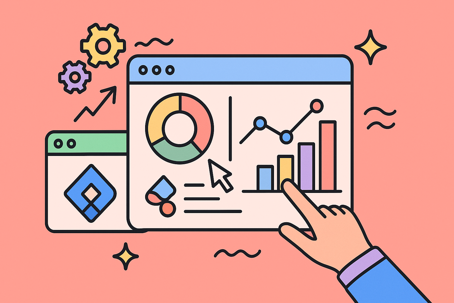
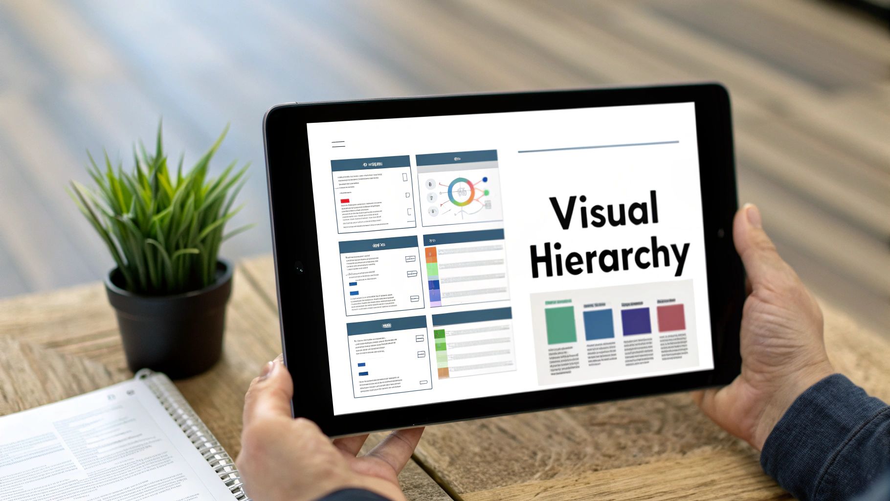
2. Implement a Clear Visual Hierarchy
Visual hierarchy is the principle of arranging elements to show their order of importance. In dashboard design, it’s not just about making things look good; it’s about creating a logical path for the user’s eye to follow. By using cues like size, color, contrast, and strategic placement, you can guide users from the most critical, high-level insights to more detailed, supporting data. This is a cornerstone of effective dashboard design best practices because it reduces cognitive load, allowing users to process information efficiently and intuitively.
Think about the pre-built dashboards in platforms like Tableau or Microsoft Power BI. They don’t just randomly place charts on a canvas. They use larger elements for primary KPIs, create clear divisions between sections, and use color consistently to highlight key trends. This intentional arrangement ensures that the most important information commands the most attention, preventing users from getting lost in a sea of data and helping them focus on what truly matters.
How to Implement a Clear Visual Hierarchy
To apply this principle to your Jira dashboards featuring HubSpot data, you must be deliberate about how you organize your gadgets and reports.
- Establish Importance with Size: Make your most critical metrics physically larger than others. For example, a gadget showing “Total Revenue from New HubSpot Deals Closed” should be significantly larger and more prominent than a gadget listing recent support ticket comments.
- Use White Space Strategically: Don’t cram every inch of the dashboard with data. Use ample white space, or negative space, to group related items and separate distinct sections. This creates a clean, uncluttered layout and helps the brain categorize information. For instance, group all HubSpot sales-related gadgets together with clear spacing around the block.
- Apply the 60-30-10 Color Rule: For a balanced and professional look, use a primary color for 60% of the dashboard (like backgrounds and major elements), a secondary color for 30% (for less critical charts or highlights), and an accent color for 10% (reserved for crucial callouts, like alerts or critical warnings).
A strong visual hierarchy transforms a dashboard from a simple collection of charts into a compelling, easy-to-understand narrative that guides users toward actionable insights.
3. Choose Appropriate Chart Types for Data Stories
Selecting the right visualization is fundamental to telling an accurate and compelling data story. Different chart types are designed to answer specific questions, and a poor choice can obscure insights or, worse, lead to incorrect conclusions. This principle, championed by experts like Cole Nussbaumer Knaflic in “Storytelling with Data,” emphasizes that the visualization must match the data’s purpose to be effective. Misusing charts is a common pitfall that undermines even the most robust data, making this one of the most critical dashboard design best practices to master.
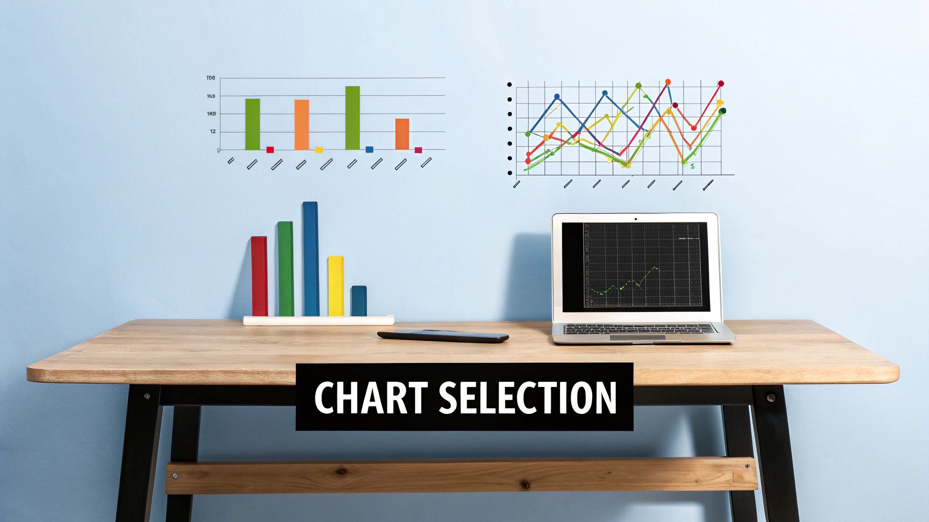
Think of how Netflix uses line charts to illustrate viewership trends over time or how Spotify employs bar charts to compare the popularity of different playlists. Each visual is chosen deliberately to communicate a specific message with maximum clarity. In a business context, this means choosing a chart that directly supports the key question your audience needs answered, preventing confusion and guiding them toward actionable insights.
How to Implement Appropriate Chart Selection
To apply this to your Jira dashboards with HubSpot data, you must first define the question each visualization is meant to answer. Is it a comparison, a trend, a distribution, or a relationship?
- Use Bar Charts for Comparison: To compare the number of Jira issues created from HubSpot tickets across different product lines, a bar chart is ideal. It provides a clear, at-a-glance comparison of distinct categories.
- Use Line Charts for Trends: When tracking “New HubSpot MQLs” or “Resolved Support Tickets” over the last quarter, a line chart is the best choice. It effectively shows the progression and patterns of a metric over a continuous period.
- Avoid Pie Charts for Complex Comparisons: While tempting for showing parts of a whole, pie charts become difficult to read with more than five or six categories. For displaying the “Status of Open Jira Epics,” a horizontal bar chart is often a more precise and readable alternative.
- Consider Scatter Plots for Correlation: To analyze the relationship between “Time Spent on Jira Issues” and the corresponding “HubSpot Deal Size,” a scatter plot can reveal potential correlations that might otherwise be hidden.
By thoughtfully selecting your charts, you transform raw data into a clear narrative. Explore these concepts further with these performance dashboard examples on resolution.de.
4. Design for Mobile-First Responsiveness
In today’s work environment, decisions aren’t confined to a desk. A mobile-first approach is a crucial dashboard design best practice that ensures your data is accessible and actionable for users on the go. This strategy involves designing for the smallest screen first, then progressively enhancing the experience for larger devices. By starting with mobile constraints, you force a focus on what’s truly essential, leading to a cleaner, more intuitive design across all platforms. This ensures your teams can access critical HubSpot data within Jira, whether they are in a meeting, traveling, or working remotely.

Think about the mobile apps for Google Analytics or Mixpanel. They don’t simply shrink the desktop version; they re-imagine the experience. Charts become swipeable, filters are tucked into accessible menus, and the layout stacks vertically for easy scrolling. This is the goal for your Jira dashboards. A sales manager should be able to instantly see “New Deals in Triage” from HubSpot on their phone, and a support lead should be able to check “Open High-Priority Tickets” with a single tap.
How to Implement Mobile-First Responsiveness
Building a responsive dashboard requires thinking about layout and interaction from a different perspective. It prioritizes clarity and usability on smaller, touch-based screens.
- Adopt a Single-Column Layout: Start by organizing your dashboard elements into a single vertical column. This is the most natural way to present information on a mobile device, eliminating the need for horizontal scrolling. Widgets displaying HubSpot contact activity or recent marketing campaign performance will stack cleanly.
- Use Responsive Charting Libraries: Ensure the charts and graphs you embed can adapt to different screen sizes. Many modern libraries automatically resize text, simplify axes, and adjust their layout to remain readable on a phone.
- Implement Touch-Friendly Controls: Replace tiny, hard-to-click buttons with larger tap targets. Utilize common mobile gestures, such as tapping on a KPI card to drill down into a detailed Jira report or swiping through a series of charts showing HubSpot pipeline stages.
- Test on Real Devices: While browser simulators are helpful, nothing beats testing on actual smartphones and tablets. This helps you identify real-world usability issues, like awkward touch interactions or text that is too small to read comfortably.
Prioritizing a mobile-first design ensures your dashboard provides value to every user, no matter how or where they access it.
5. Use Color Strategically and Consistently
Color in dashboard design is far more than an aesthetic choice; it’s a powerful tool for communication. Strategic and consistent color usage helps users categorize data, understand status at a glance, and quickly identify patterns or anomalies. When used correctly, color acts as a silent guide, directing attention and reducing cognitive load. This is a crucial element of dashboard design best practices, as a chaotic or inconsistent color scheme can easily mislead users and undermine the dashboard’s entire purpose.
Think of the status indicators in Datadog or New Relic. A green metric signals health, yellow indicates a warning, and red immediately flags a critical issue. This universal “traffic light” system requires no explanation and allows engineers to assess system health instantly. Similarly, Grafana allows users to assign consistent colors to specific data series across multiple graphs, so “CPU Usage” is always blue, regardless of the chart it appears in. This consistency builds a mental model for the user, making data interpretation faster and more intuitive over time.
How to Implement Strategic Color Usage
To effectively apply this principle to your Jira dashboards with HubSpot data, you need to create a clear and documented color system.
- Establish a Color Dictionary: Before building, define what each color means. For example, assign specific hues to different HubSpot deal stages (e.g., blue for “Appointment Scheduled,” green for “Closed Won”) or support ticket priorities. Document these choices so all dashboard creators in your organization follow the same standard.
- Design for Accessibility: Not everyone perceives color the same way. Use tools like ColorBrewer to select palettes that are distinct for people with color vision deficiencies. Always pair color with another visual cue, like an icon, a label, or a pattern. This practice, known as redundant encoding, ensures your dashboard is universally understandable.
- Align with Brand and Purpose: While function comes first, using your company’s brand colors can create a cohesive experience. However, reserve highly saturated, attention-grabbing colors (like bright red or orange) for alerts and critical information. Use more muted, neutral tones for the background and less critical data points to avoid visual clutter.
By treating color as a functional element, you transform your dashboard from a simple data repository into a highly efficient decision-making tool. This approach ensures your key insights are not just visible, but instantly understood.
6. Provide Context and Comparisons
A number on its own is just a data point; it becomes an insight only when placed in context. An effective dashboard doesn’t just display raw numbers, it tells a story by framing those numbers with relevant comparisons and benchmarks. This practice transforms a static display of metrics into a dynamic tool for analysis, answering the crucial question: “Is this number good or bad?” This is a cornerstone of advanced dashboard design best practices, as context is what separates data reporting from true performance analysis.
Think about how Google Analytics presents session data. It rarely just shows you the total number of visits. Instead, it prominently displays a percentage change, comparing the current period to the previous one. Similarly, sales dashboards in platforms like Salesforce often feature a gauge chart showing “Actual vs. Quota,” immediately clarifying how close a sales representative is to hitting their target. This contextual layer is what gives the data meaning and drives actionable responses.
How to Implement Context and Comparisons
Adding context to your Jira dashboards with HubSpot data helps teams understand performance trends and identify anomalies quickly.
- Include Time-Based Comparisons: Always show how a metric is performing against a previous period. For a HubSpot marketing metric like “New Leads,” display the week-over-week (WoW) or month-over-month (MoM) change. For example, show “New HubSpot Contacts: 150 (+15% vs. Last Week).”
- Use Visual Goal Indicators: Incorporate targets directly into your charts. A bar chart showing “Closed Support Tickets” from HubSpot Service Hub should have a line or shaded area indicating the monthly goal. This instantly visualizes progress and performance against expectations.
- Leverage Sparklines for Trends: To show historical context without cluttering the dashboard, use sparklines. Next to a key metric like “Average Deal Size” from HubSpot Sales Hub, a small, simple line chart can illustrate the trend over the last 90 days, providing instant historical perspective in a compact space.
By providing this crucial context, your dashboard becomes a more powerful and intuitive tool, enabling teams to make faster, more informed decisions. This approach aligns perfectly with creating a truly data-driven culture, a topic further explored in our guide to improving business intelligence with Jira and HubSpot on resolution.de.
7. Optimize Loading Performance and Real-time Updates
A dashboard’s value diminishes rapidly if it’s slow to load or displays outdated information. Optimizing for performance ensures that users can access insights without frustrating delays, making the dashboard a reliable tool for timely decision-making. This practice is crucial because a lagging interface can lead to user abandonment and a lack of trust in the data, defeating the entire purpose of a central reporting hub.
This principle is at the heart of platforms where speed is non-negotiable, like the real-time stock tickers on a Bloomberg Terminal or the live driver-tracking maps used by Uber. These systems are engineered to deliver instantaneous updates because even a few seconds of delay can have significant consequences. Applying this focus on speed to your Jira and HubSpot dashboards ensures they remain practical and effective for daily operations.
How to Optimize Performance and Updates
To build a responsive dashboard that displays current HubSpot data within Jira, focus on efficient data handling and smart loading strategies.
- Implement Smart Refresh Rates: Not all data needs to be updated in real-time. Set a 15-minute refresh interval for HubSpot sales pipeline data but a one-hour refresh for less critical marketing campaign metrics. This balances data freshness with system performance.
- Leverage Caching: Store frequently accessed, less dynamic data (like “Deals Closed Last Quarter”) in a cache. This reduces the number of direct calls to the HubSpot API, dramatically speeding up load times for users who view the dashboard repeatedly.
- Use Loading Indicators: Always provide visual feedback when data is being fetched. Displaying skeleton screens or spinners assures users that the system is working and prevents them from assuming the dashboard is broken. This simple UX element is a key part of effective dashboard design best practices.
- Employ Progressive Loading: Load the most critical, top-level KPIs first. Less vital charts or detailed tables lower on the page can load moments later (lazy loading). This gives users immediate access to essential information while the rest of the dashboard populates in the background.
By prioritizing performance, you create a seamless user experience that encourages adoption and empowers teams to act on the most current information. These techniques are grounded in solid principles that are essential for any successful integration. For a deeper dive into this topic, explore these data integration best practices on resolution.de.
8. Enable Customization and Personalization
Not every user needs to see the same information. A sales leader’s priorities are vastly different from a customer support manager’s, even if both are pulling data from HubSpot. Enabling customization allows users to tailor dashboards to their specific roles, responsibilities, and workflows. This personal touch transforms a static report into a dynamic, indispensable tool, dramatically increasing user engagement and the dashboard’s overall effectiveness. This is a crucial element of modern dashboard design best practices, as it empowers individuals to focus on the metrics that matter most to them.
Think about the highly customizable nature of platforms like Tableau or Microsoft Power BI. They allow users to drag and drop widgets, resize charts, and bookmark specific views. This level of control ensures the dashboard serves the individual user’s immediate needs. For a team using Jira and HubSpot, this could mean a project manager filters a dashboard to show only tickets related to their projects, while a support agent focuses on tickets originating from high-value HubSpot contacts.
How to Implement Customization and Personalization
Your goal is to provide flexibility without creating chaos. Start with a solid foundation and allow users to adapt it to their needs.
- Provide Smart Defaults and Templates: Don’t present users with a blank canvas. Create pre-configured, role-based dashboard templates as a starting point. For example, a “HubSpot Sales Rep Dashboard” in Jira could default to show “My Open Deals” and “My Tasks Due Today,” while still allowing the rep to add a gadget for “Recent Company-Wide Wins.”
- Implement User Testing: Before a full rollout, conduct user testing to understand what kind of customization is most valuable. Ask users what they would change about a default dashboard. This feedback is crucial for identifying which filters, gadgets, and layout options are most important.
- Offer Granular Control: Allow users to adjust what they see. This could involve adding or removing specific gadgets, changing date ranges for reports like “HubSpot Form Submissions,” or filtering data based on custom HubSpot properties that have been synced to Jira.
- Include a Reset Option: Always provide a “reset to default” button. This gives users the confidence to experiment with their layout, knowing they can easily return to the original, vetted configuration if they get lost or create a confusing view.
Dashboard Design Best Practices Comparison
| Item | Implementation Complexity 🔄 | Resource Requirements ⚡ | Expected Outcomes 📊 | Ideal Use Cases 💡 | Key Advantages ⭐ |
|---|---|---|---|---|---|
| Follow the 3-Second Rule for Data Comprehension | Moderate – requires prioritization and design decisions | Low to Moderate – focuses on visuals | Fast data comprehension, reduced decision time | Dashboards needing instant clarity and quick insights | Speeds up decisions, reduces training, improves engagement |
| Implement a Clear Visual Hierarchy | High – careful planning and design expertise needed | Moderate – design and testing effort | Improved info processing and intuitive navigation | Complex dashboards requiring logical flow | Reduces cognitive load, enhances professionalism |
| Choose Appropriate Chart Types for Data Stories | High – requires deep visualization knowledge | Moderate – may need interactive features | Accurate interpretation, reduced misunderstandings | Data-rich dashboards needing clear storytelling | Enhances analytical capabilities, reduces errors |
| Design for Mobile-First Responsiveness | High – complex responsive design and testing | High – multi-device development and testing | Broad accessibility, better UX across devices | Dashboards accessed on mobile and varied screen sizes | Increases reach, future-proofs, enables on-the-go use |
| Use Color Strategically and Consistently | Moderate – requires color theory and accessibility compliance | Low to Moderate – palette design and testing | Rapid status recognition, consistent branding | Dashboards needing strong categorization and branding | Improves memory, aids quick status assessment |
| Provide Context and Comparisons | Moderate – requires thoughtful data integration | Moderate – additional data and annotations | Meaningful performance insights and decision support | Performance tracking with benchmarks and trends | Adds actionable insights, reduces external referencing |
| Optimize Loading Performance and Real-time Updates | High – requires advanced technical infrastructure | High – complex backend and caching systems | Real-time data, improved user satisfaction | High-demand dashboards needing live updates | Enables real-time decisions, reduces server load |
| Enable Customization and Personalization | High – complex implementation and maintenance | High – development and support of multiple configs | Higher user satisfaction, tailored user experiences | Multi-role environments requiring flexibility | Increases adoption, reduces info overload |
Build Your Bridge Between HubSpot and Jira
Mastering the art and science of dashboard design is no small feat, but the rewards are transformative. Throughout this guide, we have explored eight foundational dashboard design best practices that serve as your blueprint for creating a powerful, centralized view of your HubSpot and Jira data. From adhering to the 3-Second Rule for immediate comprehension to implementing a clear visual hierarchy, each principle is a crucial component in building a dashboard that does more than just display data; it tells a compelling story and drives decisive action.
An effective dashboard is a strategic asset. It acts as a living narrative that connects every stage of your customer lifecycle, from the initial marketing touchpoint recorded in HubSpot to the final issue resolution tracked in Jira. By carefully selecting the right chart types, ensuring mobile responsiveness, and using color with purpose, you transform raw data into a universally understood language. This shared understanding breaks down departmental silos, fostering genuine collaboration between sales, marketing, support, and development teams. The goal is to move beyond static reports and create an interactive command center that empowers every user with the precise context they need to excel.
From Principles to Practice
The journey from understanding these concepts to implementing them requires a commitment to a few core takeaways. The most impactful dashboards are those that:
- Prioritize Clarity Over Complexity: A dashboard crowded with every possible metric is a dashboard that communicates nothing. Focus on the key performance indicators (KPIs) that directly align with your business objectives.
- Embrace User-Centricity: The ultimate test of a dashboard’s success is its utility to the end-user. By enabling customization and personalization, you empower team members to tailor their views, ensuring the information is always relevant to their specific roles and responsibilities.
- Demand Performance: A slow-loading dashboard quickly becomes an abandoned one. Optimizing for performance and ensuring access to real-time or near-real-time data is not a luxury; it is a fundamental requirement for maintaining user engagement and trust in the data presented.
Applying these dashboard design best practices creates a single source of truth that is not only powerful but also intuitive, accessible, and engaging. You are not just building charts; you are building a bridge between critical business platforms, creating a seamless flow of information that accelerates decision-making and reveals opportunities that were previously hidden in disconnected data sets. Take these principles, apply them to your unique business context, and begin building the dashboards that will propel your teams forward with unparalleled clarity and confidence.
Ready to bridge the gap between your customer data and development workflows? resolution Reichert Network Solutions GmbH provides the essential connection with our HubSpot for Jira app, enabling you to bring rich customer context directly into your Jira issues. Start building more insightful, actionable dashboards today by exploring our powerful integration at resolution Reichert Network Solutions GmbH.
