

Service desk key performance indicators are the numbers you track to see how well your IT support is really doing. But they're much more than just numbers on a dashboard; they’re strategic tools that turn raw performance data into smart decisions, helping you improve service and prove your team's value to the rest of the business.
Why Your Service Desk Needs Key Performance Indicators
Think of your IT service desk as the central nervous system for your company's technology. When it's running smoothly, information flows freely and problems get zapped quickly. But how do you actually measure its health? Relying on gut feelings like "the team seems busy" or "I think users are happy" is like trying to sail a ship without a compass. You’re just guessing.
Service desk KPIs are that compass. They take vague goals like "get better at support" and turn them into concrete, measurable targets. Instead of just wanting to be "faster," you can aim to cut your Average Resolution Time by 15%. This data-first approach takes the guesswork out of the equation and anchors your strategy in what's actually happening on the ground.
From Cost Center to Value Driver
For a long time, many businesses saw their service desk as little more than a necessary expense—a cost center. KPIs are your secret weapon for flipping that script. By tracking metrics that tie directly to business outcomes, you can show everyone exactly how your team drives the company forward.
For instance, a high First Contact Resolution (FCR) rate doesn't just show your team is efficient. It means employees are getting back to their real jobs faster, which cuts down on lost productivity across the entire organization. When you track metrics like these, you can build a rock-solid case for getting the new tools, extra staff, or process changes you need to succeed.
The real point of tracking service desk key performance indicators is to move from just putting out fires to proactively making things better. They give you the hard evidence you need to justify resources, pinpoint what's not working, and ultimately, make life better for your end-users.
The Main Categories of KPIs
To truly understand your performance, it helps to group your KPIs into a few key areas. While we'll dive into plenty of specific examples of service desk KPIs later in this guide, getting a handle on these main categories is the perfect place to start.
Before we break down individual metrics, here's a quick overview of how they're typically categorized. Each bucket tells a different part of your service desk's story.
Core Service Desk KPI Categories
| KPI Category | What It Measures | Common Examples |
|---|---|---|
| Efficiency and Speed | How quickly and resourcefully your team operates. | Average Response Time, Tickets per Agent |
| Quality and Effectiveness | The quality of support and whether problems are truly solved. | Customer Satisfaction (CSAT), First Contact Resolution (FCR) |
| Business and Financial Impact | The tangible business value your service desk creates. | Cost Per Ticket, Business Impact of Outages |
This framework helps ensure you're not just focusing on one area, like speed, at the expense of another, like quality.
The diagram below shows how foundational KPIs like response time, resolution rate, and customer satisfaction all fit together to create a solid measurement strategy.
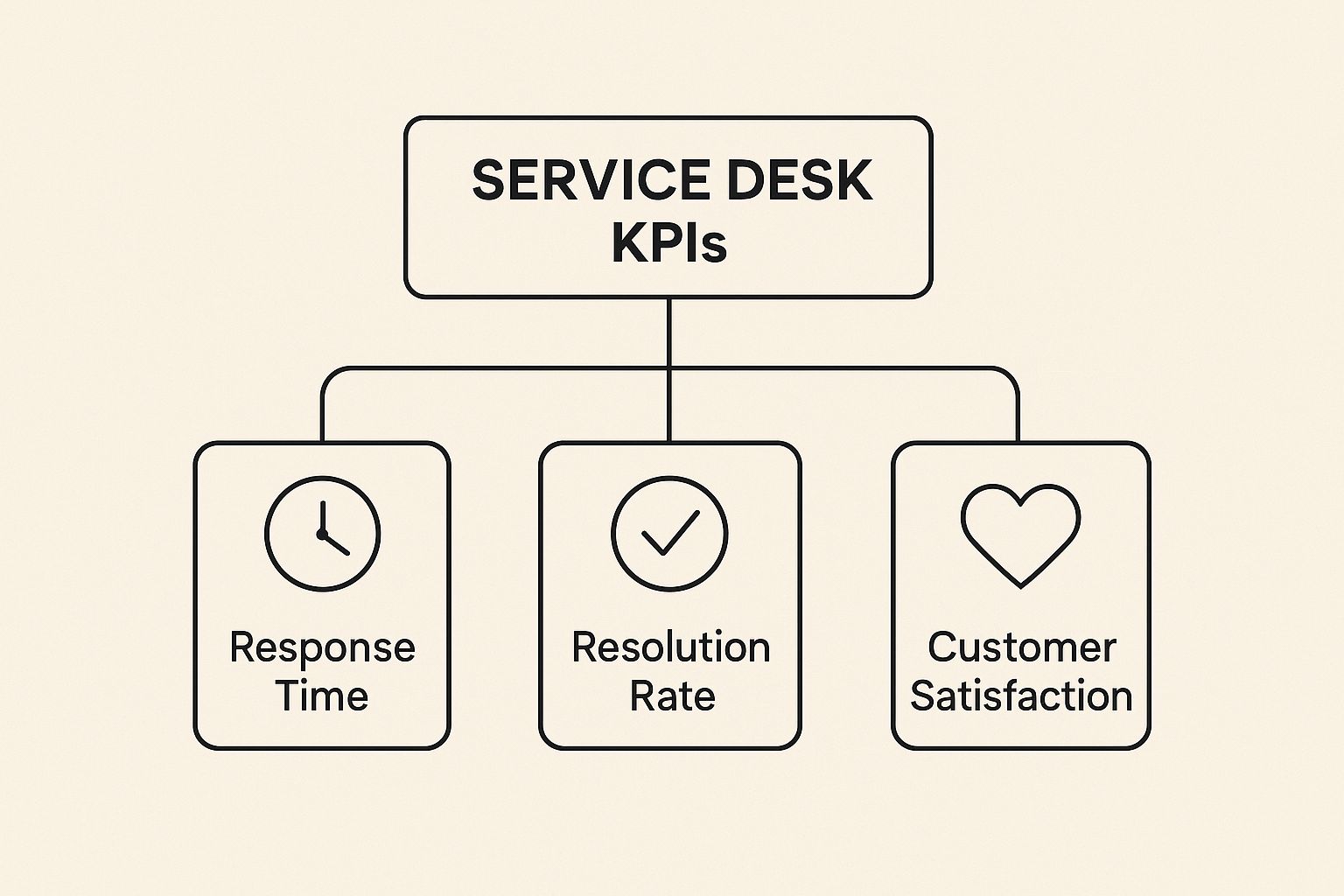
Ultimately, a balanced diet of metrics from each of these categories will give you the most complete and honest picture of your service desk's health and its impact on the business.
Tracking KPIs for Operational Efficiency

If your service desk were a car's engine, these operational KPIs would be the gauges on the dashboard—the speedometer, the RPM counter, the fuel level. They cut through the noise of "feeling busy" and give you a hard, data-driven look at your team's speed, responsiveness, and resourcefulness.
Simply put, these metrics answer one critical question: how fast and how well can we solve people's problems? Tracking them is non-negotiable for spotting bottlenecks, balancing team workload, and making sure you have the right people in the right places. Without them, you're driving blind, likely to discover a problem only after it has caused a major breakdown.
Average Resolution Time
Average Resolution Time (ART), which you might also see called Time to Resolution (TTR), is the clock that starts the moment a ticket is created and stops only when it's officially resolved. It captures the entire journey of a support request from start to finish.
This single number speaks volumes about your team's efficiency and the kinds of issues they're up against. A consistently low ART is a great sign; it means your team is knocking out problems without much friction. On the flip side, a climbing ART is a flashing red light on your dashboard.
A rising ART can point to a few different gremlins in the system:
- Knowledge Gaps: Are agents struggling with common requests they should know how to handle?
- Complex Incidents: Maybe the problems themselves are getting tougher to solve.
- Inefficient Workflows: Your internal process might be the culprit, full of unnecessary steps or delays.
By keeping an eye on ART, you can pinpoint exactly where the slowdowns are and decide whether you need more training, better documentation, or a streamlined workflow.
Ticket Backlog
Your Ticket Backlog is the total pile of unresolved tickets sitting in the queue. Think of it as your service desk's to-do list. A small, manageable pile is perfectly normal. But when that pile starts growing day after day, it's a recipe for agent burnout and seriously unhappy users.
A perpetually growing backlog is a huge warning sign. It's often the first indicator of understaffing, clunky processes, or an unexpected surge in requests. To really get ahead of it, you have to track not just the total number of open tickets but also how old they are. A backlog full of ancient tickets is far more alarming than a temporary spike of new ones.
A ballooning ticket backlog isn't just a list of tasks; it's a measure of accumulated technical debt and unresolved user friction. Left unmanaged, it directly impacts productivity and erodes user confidence in IT support.
This is a critical metric for service desks, as it indicates the number of unresolved tickets waiting to be addressed. A high backlog can signify understaffing, inefficient processes, or an unexpected surge in support requests. Proactive management of backlogs involves identifying trends in ticket volume and using predictive analytics to prepare for future demands.
Agent Utilization
So, how much of your team's paid time is actually spent solving problems? That's what Agent Utilization tells you. It measures the percentage of an agent's logged-in time that they spend on active support work, like handling tickets, compared to their total available time.
This KPI is all about understanding your team's capacity and workload balance. If utilization is consistently low, you might be overstaffed or not assigning tasks effectively. But be careful—an extremely high rate, pushing 100%, is a clear signal of impending burnout. You're running the engine in the red.
Striking the Right Balance
The goal isn't to max out utilization; it's to optimize it. Most experts agree that a healthy rate lands somewhere between 70-85%. This shows agents are productive but still have some breathing room.
That buffer is crucial for a few reasons:
- Prevents Burnout: Agents who are constantly at full capacity have no time to decompress, learn, or even think. This leads to low morale and high turnover.
- Improves Service Quality: When agents aren't rushing from one fire to the next, they can dedicate more focus to each ticket, leading to better, more thoughtful resolutions.
- Allows for Proactive Work: That extra time lets your team work on things that prevent future tickets, like writing knowledge base articles or tackling recurring problems.
By tracking these core operational metrics, you can ensure your service desk runs like a well-oiled machine. For those interested in a deeper exploration, our guide on essential help desk metrics offers further insights into optimizing team performance.
Measuring KPIs for Service Quality and User Trust

While operational speed is a big deal, quality is the currency of trust. A lightning-fast response to a ticket means very little if the solution is just a temporary patch or, even worse, flat-out wrong.
This is where quality-focused service desk KPIs really shine. They measure how effective your support is and give you a direct window into the user's actual experience. These metrics shift the conversation from "how fast did we close the ticket?" to "how well did we actually solve the problem?"
Get this right, and you'll transform your service desk from a purely functional team into a genuinely trusted partner within the business. If you ignore quality, you're setting yourself up for a nasty cycle of recurring issues, frustrated users, and a support team that’s constantly fighting fires instead of preventing them.
First Contact Resolution: The Gold Standard
First Contact Resolution (FCR) is arguably the single most important KPI for tracking both quality and efficiency. It measures the percentage of tickets that are completely resolved during the very first interaction—no follow-ups, no escalations, no reopened tickets. Done.
Put yourself in the user's shoes. When their problem is fixed in one go, it’s a massive win. They don't have to deal with the frustration of back-and-forth emails or calls and can get straight back to their work.
For the service desk, a high FCR rate is just as critical. It means agents are spending less time on old, recurring problems and have more capacity to tackle new issues, which dramatically boosts the whole team's productivity. A good benchmark to aim for is an FCR rate of around 70%, which is a solid industry average.
Customer Satisfaction: Capturing the User's Voice
Customer Satisfaction (CSAT) is the most direct way to find out how users feel about your service. It’s usually a simple survey sent after an interaction, asking them to rate their experience.
But the real value of CSAT isn't just the final score; it's the why behind it. A generic "Rate us from 1-5" survey gives you a number, but it doesn't give you anything you can actually act on.
To get truly useful feedback, try these strategies:
- Keep it Short: A single-question survey has a much higher chance of getting a response.
- Ask for Comments: Always add an optional, open-ended question like, "How could we have improved?" This is where the gold is buried.
- Time it Right: Send the survey immediately after a ticket is resolved. The experience is still fresh, and the feedback will be more accurate.
A high CSAT score is a powerful indicator of trust and reliability. It proves your service desk isn't just closing tickets but is actively creating positive experiences, which does wonders for the relationship between IT and the rest of the business.
Keeping an eye on these scores on a dedicated customer service metrics dashboard is a great way to spot trends and fix issues before they grow into bigger problems.
Ticket Reopen Rate: The Silent Productivity Killer
The Ticket Reopen Rate tracks the percentage of tickets that users reopen after an agent has marked them as resolved. A few are to be expected, but a high or climbing rate is a major red flag.
A high Ticket Reopen Rate is a silent drain on your team's productivity. Every single reopened ticket represents a failure to resolve an issue correctly the first time. It forces your team to revisit old problems, pulling them away from new requests that are piling up.
Even more importantly, it's a sign that your agents might be treating symptoms instead of curing the underlying disease.
For example, an agent might resolve a "printer not working" ticket by restarting the print spooler. The user can print again, so the agent closes the ticket. But if the spooler crashes again the next day, the user reopens the ticket. The real issue—a faulty driver—was never actually fixed. This KPI helps you uncover these patterns of ineffective, short-term fixes and pushes your team toward finding permanent solutions.
Sure, metrics like operational speed and service quality are great for internal report cards. But to really get the attention of business leaders, you have to speak their language: money.
It’s about translating your team's technical wins into tangible financial outcomes. This is where you connect the dots between closing tickets and protecting revenue, proving your service desk is a strategic asset, not just a line item on a budget.
These next two KPIs shift the entire conversation. They move the focus from what your team does to why it’s absolutely critical for the entire organization. When you can put a dollar sign next to your impact, you’re in a much better position to justify budgets, argue for new tools, and earn a seat at the strategic table.
Cost Per Ticket
One of the most straightforward financial KPIs is Cost Per Ticket. It’s exactly what it sounds like: the total expense of resolving a single support ticket. This number gives you a clear baseline for how financially efficient your support operation is.
But its real value is in building a business case for improvements. A high Cost Per Ticket isn't just a number; it’s a story. It might be telling you about clunky processes, a need for better agent training, or the financial drag from outdated software.
To get an accurate figure, you need to tally up all the associated operational costs:
- Labor Costs: Salaries and benefits for every person on the service desk team.
- Technology Costs: Licensing fees for your help desk software, monitoring tools, and any other systems you rely on.
- Overhead Costs: A fair portion of things like office space, utilities, and administrative support.
Once you start tracking this, you can show exactly how an investment pays for itself. Let’s say your Cost Per Ticket is $25. If you roll out a new knowledge base that deflects 200 tickets a month, you can walk into a meeting and report a $5,000 monthly saving. That’s a powerful argument.
Business Impact of Incidents
While Cost Per Ticket looks inward at your efficiency, Business Impact of Incidents looks outward at your value to the company. This is a heavy-hitter KPI that quantifies the real-world financial fallout from IT problems, like lost productivity and operational gridlock caused by system downtime.
Think about it. When a critical sales application goes down, the problem isn't just the time your agents spend fixing it. It's the lost sales, the stalled proposals, and the dent in customer trust. By tying ticket data to these business outcomes, you can demonstrate how the service desk actively shields the company from financial harm.
Attaching a dollar value to downtime transforms the service desk's role. A quick resolution is no longer just good service; it's a direct contribution to the company's financial health, preventing significant losses.
For example, you can calculate the cost of lost productivity by multiplying the number of affected users by their average hourly cost and the duration of the outage. Presenting this data shows that your team’s rapid response didn't just close a ticket—it saved the company thousands in potential losses. This kind of thinking is also essential for meeting your commitments, which you can read more about in our guide to effective service level agreement monitoring.
Quantifying business impact elevates the entire conversation. Suddenly, you're not just talking about ticket queues and resolution times. You're talking about risk mitigation, productivity, and revenue protection, making your service desk an undeniable partner in the company's success.
How to Build and Share KPI Dashboards
Raw data from your service desk is a lot like a pile of uncooked ingredients—full of potential, but not yet a meal. To turn that raw data into something you can actually use, you need to create a visual story. This is where KPI dashboards come in, transforming rows of numbers into clear, compelling narratives that tell you what's working and what's not.
A great dashboard doesn't just show you numbers; it helps you understand performance in a single glance. The trick is picking the right way to visualize each metric. A poorly chosen chart can muddy the waters, but the right one makes trends and red flags jump right off the screen.
Principles of Effective Data Visualization
Before you start dragging and dropping charts, it’s worth thinking about what makes a dashboard truly effective. The whole point is to make the information as easy to digest as possible, so your team can spend less time figuring out the chart and more time acting on the insights.
Keep these core ideas in mind:
- Tell a Clear Story: Your dashboard needs a purpose. Is it tracking progress toward a quarterly goal? Highlighting a recurring problem? Every single element should support that central narrative.
- Choose the Right Chart: Different charts are built for different jobs. Don't just pick a chart because it looks cool; pick it because it's the best tool for representing that specific piece of data.
- Keep It Simple: Clutter is the enemy of clarity. Too much information, a rainbow of clashing colors, or overly complex graphs will just confuse people. Stick to a clean layout with plenty of breathing room.
If you want to get dashboards up and running quickly, there are fantastic options for building analytics and data visualization tools that don't require a data science degree. And for a deeper dive into arranging your visuals, check out our guide on dashboard design best practices.
Matching KPIs to Chart Types
How you display your service desk key performance indicators has a massive impact on how they're understood. Some visuals are just naturally better at telling certain kinds of stories with your data.
Here’s a quick guide to pairing common KPIs with the right chart type:
- Line Charts for Trends: When you need to see how a metric is changing over time, a line chart is your go-to. It’s perfect for tracking things like Ticket Volume or Average Resolution Time over several weeks or months.
- Bar Charts for Comparisons: Need to see who's doing what or which channel is busiest? Bar charts are ideal for comparing performance across different agents, teams, or ticket categories, like Tickets per Agent or CSAT scores.
- Pie Charts for Composition (But Use Them Sparingly!): Pie charts are good for one thing: showing parts of a whole, like the breakdown of tickets by priority. But be warned, they get confusing fast with more than a few slices. Use them only when you have a handful of categories.
- Single Number Displays for Key Totals: For those big, important numbers you need to see instantly—like your First Contact Resolution (FCR) rate or the current Ticket Backlog—nothing beats a large, bold number display. It’s impossible to miss.
Thankfully, modern tools like Jira Service Management have built-in reporting that makes creating these visuals pretty straightforward.
This dashboard from Atlassian is a great example of how different charts can work together. It gives a manager a quick, multi-faceted view of their team's performance by combining various visual elements effectively.
Tailoring Dashboards for Your Audience
Not everyone needs to see the same data. In fact, a one-size-fits-all dashboard is a great way to make sure no one looks at it. The best dashboards are built specifically for the people who will be using them.
A dashboard for an executive should be a simple, high-level summary that answers, "Are we on track?" A dashboard for a team manager needs to be a granular, diagnostic tool that answers, "Who needs help and where are the bottlenecks?"
Think about creating different dashboards for different stakeholders:
- Executive Dashboard: Keep this one high-level. Focus on the big-picture, business-impact KPIs like Cost Per Ticket and overall CSAT trends. Simple is better here, with just a few key metrics and clear color-coding (green for good, red for bad).
- Manager Dashboard: This is where you get into the weeds. A manager needs to see operational metrics like Agent Utilization, Ticket Backlog, and Ticket Reopen Rate. This dashboard is a daily-use tool for managing resources and coaching the team.
- Team Dashboard: Often displayed on a large screen in the office, this dashboard is all about motivation and shared goals. Focus on real-time metrics like incoming tickets, team FCR rates, and even showcase positive CSAT comments to keep spirits high.
Common Questions About Service Desk KPIs

As you start putting service desk KPIs into practice, you'll find that a few practical questions pop up almost every time. Getting clear, straightforward answers to these is the key to building a performance-focused culture that actually lasts.
Let's cut through the noise and tackle the most common questions head-on. My goal here is to clear up any lingering confusion and give you the strategic clarity you need to make your KPIs work for you.
How Many KPIs Should a Service Desk Actually Track?
It’s easy to fall into the trap of measuring everything you possibly can. But this usually just leads to "analysis paralysis"—you're drowning in data but have no real idea what to do with it. The secret is to start with a focused, balanced set of metrics that speak directly to your most important goals.
A great starting point is to track 5-7 core KPIs. This number is small enough to be manageable but gives you a complete enough picture of your service desk's health.
Think of your dashboard as telling a story. To get the full story, you need metrics from a few different angles:
- Efficiency KPIs: These tell you how fast you're operating. Think Average Resolution Time.
- Quality KPIs: These show how effective your support is. First Contact Resolution (FCR) and Customer Satisfaction (CSAT) are perfect examples.
- Business Value KPIs: This connects your work to the bottom line. Cost Per Ticket is a classic one.
Here's a solid rule of thumb: Every single KPI on your dashboard must have a clear purpose. If you look at a metric and it doesn't make you ask a specific question or consider taking action, it's just noise. Get rid of it.
Of course, as your service desk matures and your processes get tighter, you can start adding more granular metrics. But starting small keeps your team from getting overwhelmed and ensures everyone is on the same page about what success looks like.
What Is the Difference Between a Metric and a KPI?
This is a really common point of confusion, but the distinction is actually pretty simple and incredibly powerful.
Think of it this way: all KPIs are metrics, but not all metrics are KPIs.
A metric is just a number you can track. For example, the "total number of tickets closed today" is a metric. It's a piece of data, sure, but by itself, it doesn't tell you much about your strategic performance.
A Key Performance Indicator (KPI), on the other hand, is a very specific metric that you’ve tied directly to a business goal. It measures how you're performing against something that is truly critical to the organization. The "First Contact Resolution Rate" is a classic KPI because it directly measures your progress toward improving both operational efficiency and user trust—two major strategic goals.
Here’s a simple table to make it crystal clear:
| Type | Definition | Example |
|---|---|---|
| Metric | A simple measurement of activity. | Total number of tickets created this month. |
| KPI | A measurement of performance against a strategic goal. | Percentage of tickets resolved within the SLA. |
In short, metrics give you raw data. KPIs give you direction. When you focus on the right KPIs, you make sure your team's efforts are always aligned with what really matters to the business.
How Do We Set Realistic KPI Benchmarks?
Setting the right targets is a bit of an art and a science. Aim too high, and you’ll demoralize your team. Aim too low, and you won’t drive any real improvement. The trick is to blend internal analysis with a bit of external awareness.
First and foremost, your most important benchmark is your own past performance.
- Establish a Baseline: Before you set any new goals, track your chosen metrics for at least 30-90 days. This gives you a data-backed, honest look at where you're starting from.
- Research Industry Standards: It's smart to look up average performance for your industry, but treat these as a guide, not a gospel. User expectations at a nimble tech startup are worlds away from those at a large university help desk.
- Set Incremental Goals: Go for steady, achievable improvements. A goal to improve FCR by 5% in the next quarter is way more sustainable—and motivating—than trying to make an unrealistic leap overnight.
Ultimately, your benchmarks should feel challenging but attainable. You want to push your team to grow without setting them up to fail.
When team members go on vacation or take sick leave, it can throw your carefully tracked KPIs off track. With resolution Reichert Network Solutions GmbH, you can use the Out of Office Assistant for Jira Cloud to automatically reassign issues and approvals, ensuring workflows continue uninterrupted and your performance metrics stay consistent.
