

It’s Sunday night, and the familiar dread sets in. You have to compile the weekly project status report, a document you suspect will be skimmed in 30 seconds before being archived forever. We’ve all been there, crafting detailed updates that disappear into the ether. But what if your status report wasn’t a chore, but a secret weapon? What if it was a compelling story that aligned stakeholders, preempted risks, and made you look like a strategic genius?
The truth is, a great report isn’t just about the data; it’s about the delivery. The format you choose is a powerful tool for communication. From specialized operational updates, like detailed driver vehicle inspection reports that ensure vehicle compliance, to high-level executive summaries, clarity is king. This article is your tactical playbook. We are going to dissect 7 powerful project status report example formats, each designed for a specific purpose, audience, and project type.
Forget tedious data entry. With modern tools automating the grunt work by connecting platforms like Jira and monday.com, you can finally focus on what matters: the strategic analysis. We’ll break down each example, showing you exactly how to transform your updates from ignored memos into indispensable strategic assets. Let’s get started.
1. RAG Status Dashboard Report
Nothing says “I have this project under control” quite like a beautifully simple traffic light system. The RAG (Red, Amber, Green) Status Dashboard is the undisputed champion of at-a-glance project health updates. It’s a visual, universally understood method that lets you communicate complex project realities in milliseconds. Think of it as the project manager’s secret weapon for keeping executives informed without drowning them in a 50-page document.
The magic of this project status report example lies in its simplicity. Key project areas like Budget, Schedule, Scope, and Resources are each assigned a color. Green means “All good, nothing to see here!” Amber signals “Hmm, potential issue, keep an eye on this,” and Red screams “Houston, we have a problem!”
Strategic Breakdown
This format shines in fast-paced environments like Agile software development or large-scale construction projects where stakeholders need quick, high-level updates. It forces you to distill complex problems into a simple status, which is a powerful exercise in itself.
The bar chart below illustrates a typical portfolio-level RAG distribution, showing the overall health of multiple projects at once.
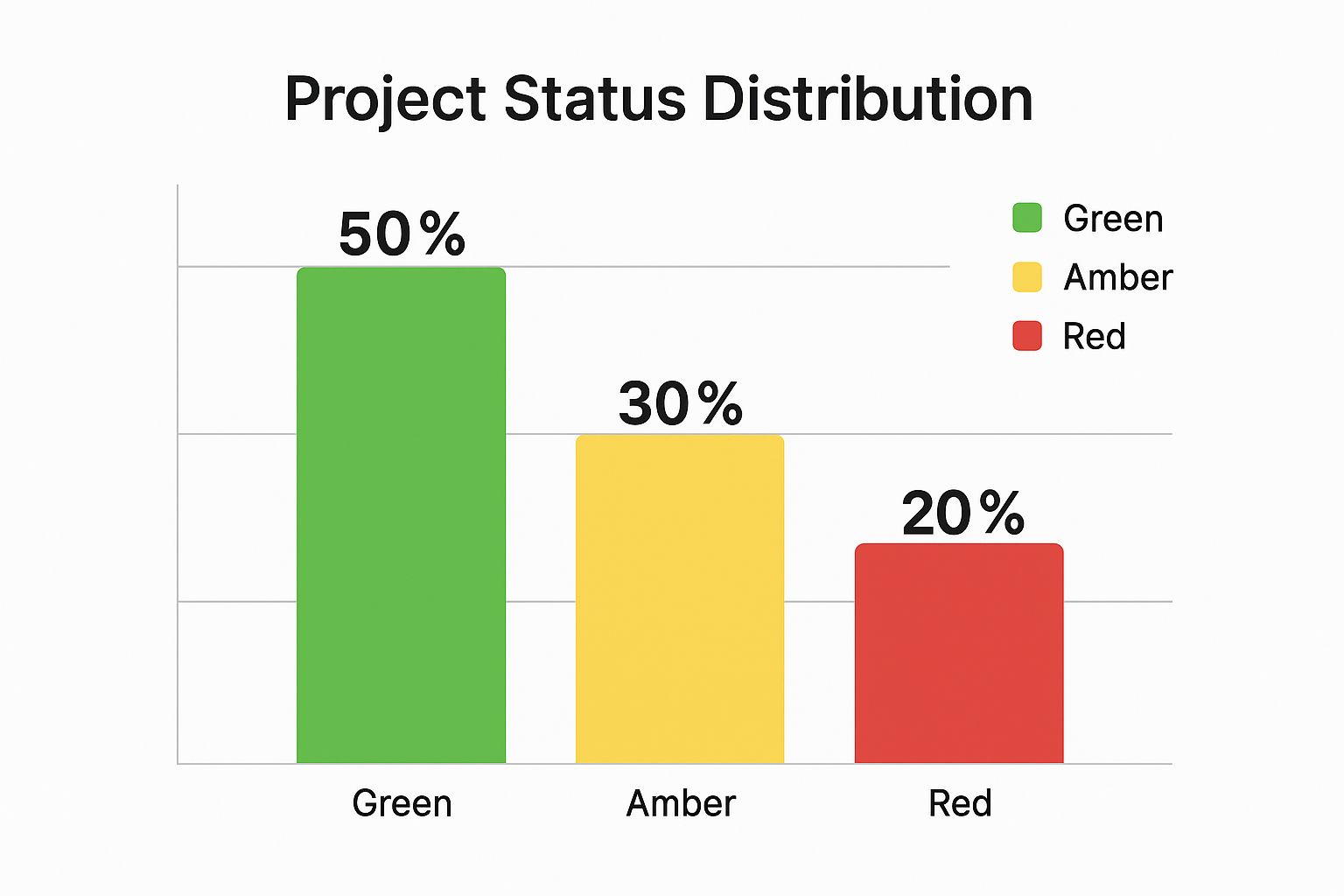
This chart immediately tells a story: while half the projects are on track, a significant 20% require urgent attention, making it easy to prioritize management focus.
Actionable Takeaways
To master the RAG report, follow these key tactics:
- Define Your Colors: Don’t just “wing it.” Create a clear, objective rubric for what constitutes Red, Amber, and Green for each category. For example, a “Green” budget might be <2% variance, “Amber” 2-7% variance, and “Red” >7% variance.
- Explain the ‘Why’: A red or amber status without context is just a pretty color. Always include a brief, one-sentence explanation. For example: “Schedule: Amber – Key developer on sick leave, projected 3-day delay.”
- Show the Trend: Is that Amber status getting better or worse? Add a small arrow icon (↑, ↓, →) to indicate the trend. This adds a crucial layer of foresight.
To further enhance the visual clarity and strategic utility of your reports, especially for RAG status, exploring resources on optimizing your business dashboards can be highly beneficial.
2. Earned Value Management (EVM) Report
If the RAG report is the quick snapshot, the Earned Value Management (EVM) Report is the full-blown diagnostic MRI. It’s for when you need to go beyond “Are we on track?” and answer the critical questions: “How efficiently are we working?” and “Based on our performance so far, where will we actually end up?” This isn’t just reporting; it’s hardcore project forecasting based on real-world performance data.
This powerful project status report example integrates scope, schedule, and cost into a single, unified framework. It moves past simply comparing planned vs. actual costs. Instead, it measures the value of the work completed (Earned Value) against what was planned and what was spent. This gives you incredibly precise metrics like the Schedule Performance Index (SPI) and Cost Performance Index (CPI) to quantify your project’s health.
Strategic Breakdown
This format is the gold standard for high-stakes, long-term projects where budget and schedule precision are non-negotiable. Think NASA space missions, Department of Defense contracts, or massive infrastructure builds. It’s overkill for a two-week marketing campaign but indispensable for a multi-year enterprise software rollout. It provides an objective, data-driven defense against overly optimistic projections.
By tracking EVM metrics, a project manager can see if a project that is currently on-budget is actually behind schedule, meaning it’s headed for a cost overrun later. This predictive power allows for proactive intervention rather than reactive panic.
Actionable Takeaways
To effectively deploy an EVM report, you need discipline and a solid game plan:
- Build on a Solid Foundation: EVM is impossible without a detailed Work Breakdown Structure (WBS). You must break the project into measurable work packages, each with its own budget (this is the Planned Value, or PV).
- Focus on the Indices: Don’t get lost in the raw numbers. The key metrics are the indices. A Cost Performance Index (CPI) or Schedule Performance Index (SPI) below 1.0 is a clear warning sign that you are either over budget or behind schedule, respectively.
- Train Your Team: EVM requires a shift in mindset. Team members need to understand the concepts to provide accurate data on work completion. A brief training session on the “why” behind EVM can dramatically improve data quality.
- Use the Right Tools: Calculating EVM manually is a recipe for disaster. Leverage project management software with built-in EVM capabilities to automate calculations and focus your energy on analyzing the trends, not crunching the numbers.
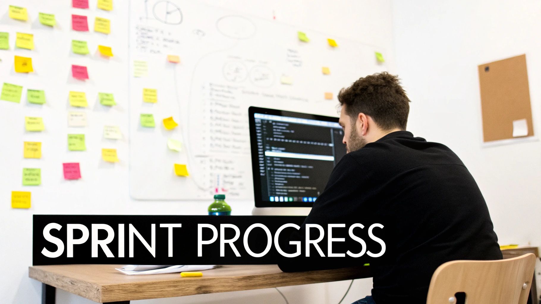
3. Agile Sprint Report
If the RAG report is the executive’s quick glance, the Agile Sprint Report is the development team’s heartbeat monitor. This isn’t just a report; it’s a living document that captures the rhythm and momentum of a sprint. Forget Gantt charts that are outdated the second you publish them. This report focuses on what’s actually getting done, measured in completed user stories, team velocity, and what’s left in the tank.
This project status report example is the engine room of modern software development, used by powerhouses like Spotify and Atlassian to track progress in short, iterative cycles. It visualizes the team’s journey through a sprint, making roadblocks and successes transparent to everyone involved. The focus is on outcomes (shipped features), not just output (lines of code written).
Strategic Breakdown
This report format is tailor-made for Agile methodologies like Scrum, where work is time-boxed into sprints (typically 1-4 weeks). It provides an empirical, data-driven look at performance through burndown charts, which track the completion of work against time. The goal is to create a predictable delivery cadence, making it perfect for feature development at companies like Salesforce or Netflix’s platform teams.
The chart above, a classic burndown chart, is the star of the show. It tells you immediately if the team is on track to complete its commitment. If the “Actual” line trends above the “Ideal” line, it’s a clear signal that the team is falling behind and needs to discuss impediments.
Actionable Takeaways
To make your Agile Sprint Report a true driver of performance, implement these tactics:
- Automate Everything: Manually pulling data is a sprint-killer. Use tools like Jira or Asana to automatically generate burndown charts and velocity metrics. This frees the team to focus on development, not administration.
- Focus on ‘Done’: The only metric that truly matters is “Done-Done.” A story is either 100% complete or 0% complete. Avoid the trap of counting “almost-done” tasks, as this creates a false sense of progress.
- Include Retrospective Gold: The sprint report is incomplete without insights from the sprint retrospective. Add a small section on what the team will “start doing,” “stop doing,” and “continue doing” to foster continuous improvement.
For teams looking to refine their process from the very beginning, a deep dive into effective sprint planning can significantly improve the quality of the data and insights fed into these reports.
4. Milestone-Based Progress Report
Forget tracking every tiny task. For complex, long-term projects, the real story is told through major achievements. The Milestone-Based Progress Report focuses on the big picture, organizing updates around key project gates and critical deliverables. This format is perfect for communicating progress on projects where the journey is as important as the destination, like a pharmaceutical drug trial or a multi-phase construction build.
This project status report example cuts through the daily noise to answer the most important question for stakeholders: “Are we hitting our major targets?” It shifts the focus from busywork to meaningful advancement, making it a favorite in industries guided by strict phase-gate processes, like those pioneered by NASA and Stage-Gate International. Progress isn’t just a percentage bar; it’s a series of conquered milestones.

Strategic Breakdown
This report format excels in regulated or highly structured environments like product launch campaigns or merger and acquisition integrations. It provides a clear, forward-looking roadmap that highlights dependencies between major project phases. Stakeholders can immediately see not just what’s been done, but what’s next and what could prevent the project from moving to the next stage.
The visual timeline or Gantt-style chart is its powerhouse. It frames the entire project as a narrative of sequential victories, which is incredibly effective for maintaining long-term stakeholder buy-in and managing expectations. It answers “Are we on track?” with a clear visual story of past successes and future goals.
Actionable Takeaways
To make your milestone reports truly impactful, try these strategies:
- Define ‘Done’ Clearly: Each milestone needs objective, measurable completion criteria. “Phase 1 Complete” is useless. “Phase 1 Complete: User-testing concluded and feedback report signed off by Product Head” is actionable.
- Show What’s At Risk: Don’t just list completed milestones. Actively highlight dependencies and risks to upcoming milestones. For example: “Milestone 4: Beta Launch – AT RISK due to dependency on delayed API development in Milestone 3.”
- Track Both Business and Technical Goals: A project isn’t successful just because the code is finished. Include business milestones like “Legal review complete” or “Marketing campaign assets approved” to provide a holistic view of progress.
For those managing projects with intricate dependencies, mastering the art of tracking progress with milestones is an essential skill for ensuring clarity and alignment across all teams.
5. Risk-Focused Status Report
For projects where failure is not an option, the Risk-Focused Status Report is the guardian angel of project management. This format moves beyond simple progress updates to put risk identification, assessment, and mitigation front and center. It’s for the project manager who knows what could go wrong and wants everyone else to be prepared for it, transforming paranoia into a strategic advantage. This isn’t just about tracking tasks; it’s about safeguarding the project’s very existence.
The core of this project status report example is its proactive stance. Instead of just reporting on what has happened, it dedicates significant space to what might happen. Key sections include a Risk Register, a Probability/Impact Matrix, and detailed Mitigation Plans. This shifts the conversation from “Are we on schedule?” to “What are the biggest threats to our schedule, and what are we doing about them right now?”
Strategic Breakdown
This report format is indispensable in high-stakes, high-volatility sectors. Think of nuclear power plant construction, major cybersecurity implementations, or complex financial regulatory projects. In these fields, an unmanaged risk doesn’t just cause a delay; it can lead to catastrophic failure, massive financial penalties, or significant safety hazards.
This approach forces a culture of constant vigilance. It ensures that the team isn’t just executing tasks but is also actively scanning the horizon for potential icebergs. It makes risk management a continuous, collaborative activity rather than a one-time exercise at the project’s start.
Actionable Takeaways
To effectively implement a Risk-Focused Status Report, adopt these tactics:
- Standardize Your Scales: Create clear, quantitative scales for risk probability and impact. For example, Probability could be a 1-5 scale (1 = Very Low, 5 = Very High), and Impact could be tied to specific dollar amounts or schedule delays. This removes subjectivity and ensures everyone speaks the same language.
- Link Risks to Objectives: Don’t just list risks in a vacuum. Explicitly connect each identified risk to the specific project objective it threatens (e.g., “Risk #7: Supply chain disruption for Component X threatens the ‘Go-Live by Q3’ objective”). This highlights the direct consequences of inaction.
- Include Threats and Opportunities: Savvy risk management isn’t just about avoiding bad things. Use your report to identify positive risks, or opportunities, and outline plans to capitalize on them. For instance, “Opportunity: A key competitor’s product launch was delayed, creating a window to capture early market share.”
For teams looking to build a robust foundation for this type of reporting, exploring various risk management framework examples can provide invaluable structure and guidance.
6. Resource Utilization Report
When your project’s most valuable asset is its people, a Resource Utilization Report isn’t just a nice-to-have, it’s the command center. This report format pivots away from broad strokes like budget and scope to focus intensely on one critical variable: your team’s time and capacity. It’s the ultimate tool for answering the dreaded question, “Who is working on what, and are they about to spontaneously combust from overwork?”
This powerful project status report example is all about balancing the scales. It tracks metrics like planned vs. actual hours, team member availability, and overallocation hotspots. For consulting firms, creative agencies, or any organization juggling multiple projects with a shared talent pool, this report prevents burnout, exposes hidden bottlenecks, and ensures you’re getting the most value from every team member without stretching them too thin.
Strategic Breakdown
This format is the lifeblood of professional services and software development agencies where profitability is directly tied to billable hours and efficient staff deployment. It moves the conversation from “Is the project on time?” to “Do we have the right people with enough capacity to keep it on time?” It highlights resource conflicts before they derail a sprint or a client engagement.
Imagine a creative agency with two high-priority projects needing the same lead designer. A utilization report immediately flags this conflict, allowing managers to re-prioritize tasks, bring in a freelancer, or manage client expectations proactively. It transforms resource planning from a reactive guessing game into a data-driven strategy.
Actionable Takeaways
To make your Resource Utilization Report a true strategic asset, implement these tactics:
- Go Beyond Project Work: A common mistake is only tracking project-related hours. Account for everything: administrative tasks, team meetings, training, and even paid time off. This gives you a true picture of an individual’s total capacity.
- Forecast, Don’t Just Report: Don’t just show who is overutilized this week. Use the data to project capacity for the next 4-6 weeks. This foresight allows you to identify future resource shortages and hire or reallocate staff before it becomes a crisis.
- Visualize the Workload: Use color-coded heat maps or stacked bar charts. Assign green to healthy utilization (e.g., 80-90%), yellow for at-capacity (90-100%), and red for overallocation (>100%). This visual cue makes it easy to spot problems in seconds.
For teams looking to refine their capacity planning, particularly in complex IT environments, digging deeper into the fundamentals of IT resource management can provide invaluable, structured approaches.
7. Financial Performance Report
When the most important question is “Are we making or losing money?”, the Financial Performance Report steps into the spotlight. This report format unapologetically puts dollars and cents front and center, making it the go-to choice for stakeholders whose primary concern is the bottom line. It’s less about the daily scrums and more about the cold, hard cash flow, budget variance, and return on investment.
This project status report example is a deep dive into the financial soul of a project. It moves beyond a simple budget line item on a RAG report and provides a detailed narrative of financial health. Key components typically include Budget vs. Actuals, Earned Value Analysis (EVA), Cost to Complete (CTC), and Return on Investment (ROI) projections. It’s the kind of report that makes CFOs and investment committees feel seen and understood.
Strategic Breakdown
This format is indispensable for projects where financial oversight is paramount. Think large-scale government infrastructure investments, enterprise ERP implementations with massive capital outlay, or real estate development projects. In these scenarios, a 5% budget overrun isn’t just a minor hiccup; it can mean millions of dollars and require board-level approval. This report provides the rigorous detail needed for such high-stakes financial governance. It ensures every dollar is tracked, justified, and aligned with tangible project deliverables.
Actionable Takeaways
To create a financial report that builds confidence, not confusion, focus on these tactics:
- Look Both Ways: Don’t just report on money already spent. A powerful financial report includes both committed costs (invoices received, contracts signed) and forecasted costs (anticipated future expenses). This gives a complete picture of your financial obligations.
- Connect Cash to a Cause: Numbers in a vacuum are meaningless. Always link financial performance directly to project milestones and deliverables. For example: “Phase 2 completed 10% under budget due to early procurement of materials.”
- Analyze Scenarios: For high-uncertainty projects, provide scenario analysis. Show best-case, worst-case, and most-likely financial outcomes. This demonstrates foresight and prepares stakeholders for potential volatility.
For projects where fiscal discipline is a key success factor, understanding detailed financial reporting is crucial. It often goes hand-in-hand with implementing broader IT cost reduction strategies to maximize project value.
Project Status Report Comparison of 7 Types
| Report Type | Implementation Complexity | Resource Requirements | Expected Outcomes | Ideal Use Cases | Key Advantages |
|---|---|---|---|---|---|
| RAG Status Dashboard Report | Low to moderate | Basic project data and visualization tools | Quick visual overview of project health | Large organizations with multiple concurrent projects | Fast interpretation, standardized, highlights urgent issues |
| Earned Value Management (EVM) Report | High | Detailed WBS, specialized tools, training | Quantitative performance analysis and forecasting | Large, complex projects, federal contracts over $20M | Objective metrics, early warnings, reliable forecasts |
| Agile Sprint Report | Moderate | Agile tools (Jira, Azure DevOps), team engagement | Sprint progress and velocity tracking | Agile software development teams | Aligned with Agile, real-time visibility, promotes transparency |
| Milestone-Based Progress Report | Moderate | Milestone definitions, schedule management | Progress toward key project gates | Gate-based approvals, phased projects (pharma, construction) | Focus on major achievements, clear stakeholder communication |
| Risk-Focused Status Report | Moderate to high | Risk management expertise, detailed risk data | Proactive risk identification and mitigation | High-stakes projects with safety, financial, or regulatory risks | Improved preparation, better decision-making, stakeholder confidence |
| Resource Utilization Report | Moderate | Time tracking, resource management software | Optimized resource allocation | Resource-constrained, multi-project organizations | Early constraint identification, supports planning and scheduling |
| Financial Performance Report | Moderate to high | Detailed cost tracking, financial systems | Budget control, cost forecasts, ROI tracking | Publicly funded and investor-backed projects | Strong financial focus, supports business case validation and accountability |
From Report to Relationship: Making Your Updates Matter
So, we’ve journeyed through the wild world of project reporting, from the elegant simplicity of a RAG dashboard to the number-crunching intensity of an Earned Value Management report. We’ve dissected Agile sprints, tracked milestones, and stared into the abyss of risk registers. But after all this analysis, what’s the one big secret? It’s that a project status report example is never just about the template; it’s about the conversation it starts.
You’re not just a scribe documenting the past. You are a strategist, a storyteller, and a diplomat. Your report is your tool to build trust, align teams, and steer the project ship away from icebergs. If you view it as a mere chore, a box-ticking exercise, it will be received as one. But if you see it as a strategic communication asset, it becomes your most powerful lever for success.
Three Master Principles to Rule Them All
Across all seven distinct examples we explored, from financial performance to resource utilization, three core principles emerged. Mastering these will elevate your reporting from a simple data dump to a strategic masterpiece.
-
Know Your Audience: The hyper-detailed EVM report that makes your finance team sing will put your executive stakeholders to sleep. The high-level Milestone Report your CEO loves won’t give your dev team the specifics they need. Before you write a single word, ask: “Who is this for, and what one thing do they need to know?” Tailor the format, language, and data to answer that question, and you’ve already won half the battle.
-
Tell a Story with Data: A snapshot in time is interesting, but a trend is compelling. Don’t just report that a task is 50% complete. Show its velocity over the last three weeks. Don’t just list a new risk. Explain how its probability has shifted and what that means for the critical path. We saw this in the Agile Sprint Report with burndown charts and in the Risk-Focused Report with heat maps. Your job is to connect the dots and create a narrative: “Here’s where we are, here’s how we got here, and here’s the story the data tells us about where we’re going.”
-
Focus on the Future: A report that only looks backward is a history lesson, not a management tool. The most effective reports are forward-looking. They use past performance to forecast future outcomes, proactively identify upcoming roadblocks, and clearly define the next steps. Every single example, from the RAG status to the Resource Utilization forecast, contained an element of this. Make your report less about “what we did” and more about “what we will do” to ensure success.
The fatal flaw of any report, no matter how beautifully crafted, is becoming a data silo. The real magic happens when your report is a living, breathing artifact that pulls real-time information automatically. This is where modern integration tools are no longer a luxury but a necessity. Manually chasing down data from Jira, financial software, and resource planners turns you into a “data janitor,” wasting precious hours on copy-paste tasks that are tedious and prone to error.
To truly transform your reporting, you must automate the data collection so you can focus on the strategic storytelling. The goal is to evolve from a compiler of information into a curator of insights.
Your challenge, should you choose to accept it, is this: Pick just one tactical takeaway from this article. Maybe it’s adding a trend line to a key metric, creating a mini-report for a specific stakeholder, or color-coding risks. Implement it in your very next status update. See what changes. See who engages. Turn your next report from a monologue into a dialogue, and watch how it transforms your project’s trajectory.
Stop wasting time being a data janitor and become the strategic storyteller your team needs. With monday.com for Jira by resolution Reichert Network Solutions GmbH, you can seamlessly integrate your development work in Jira with your project dashboards in monday.com, automating your reporting process. Build a powerful, real-time project status report example without the manual copy-and-paste by connecting your most critical tools today.
