
Ever feel like your product backlog is a bottomless pit of brilliant ideas, urgent requests, and that one feature your CEO sketched on a napkin? You’re not alone. Deciding what to build next is one of the toughest, and most critical, parts of product management. Get it right, and you’re a hero launching value-packed releases that delight users. Get it wrong, and you’re stuck maintaining features that collect digital dust.
This is where a solid feature prioritization framework transforms chaos into clarity. It’s less about finding a magic wand and more about adopting a systematic approach to make tough calls with data-backed confidence. Forget endless debates and gut feelings; a good framework provides a shared language for your team to evaluate what truly matters.
In this guide, we’ll slice through the noise and dive into seven battle-tested frameworks that top product teams use to build things people actually want. We’ll break down exactly how to use each one, from the simple Value vs. Effort matrix to the more detailed RICE scoring model. Get ready to turn that sprawling feature wishlist into a powerful, strategic roadmap. Let’s start building smarter.
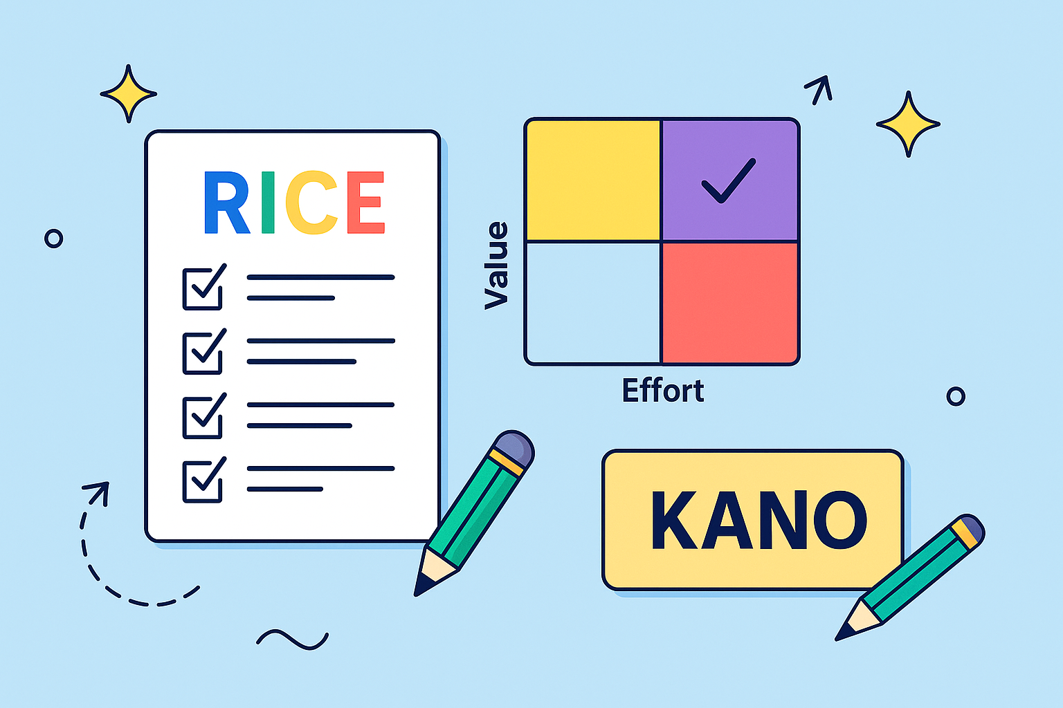
1. RICE Framework (Reach, Impact, Confidence, Effort)
Tired of prioritizing features based on who yells the loudest in the meeting room? The RICE framework is your secret weapon for bringing calm, quantitative analysis to the chaos of roadmap planning. Developed and popularized by the product wizards at Intercom, this feature prioritization framework is designed to help teams evaluate competing ideas in a consistent, disciplined way. It forces you to think critically about not just the potential payoff, but also the real-world costs and your own certainty.

The magic is in its formula: (Reach × Impact × Confidence) ÷ Effort. Each component forces you to answer a crucial question, turning vague ideas into concrete scores that you can compare apples-to-apples. This method removes much of the emotional bias and gut-feel decision-making, grounding your roadmap in data.
How It Works
Scoring with RICE is a straightforward process. You evaluate each potential feature against four distinct factors:
- Reach: How many users will this feature affect within a specific time period (e.g., per month)? This is a hard number, not a guess. Example: 500 customers will encounter this new dashboard widget per month.
- Impact: How much will this feature positively affect those users on an individual level? This is often scored on a scale: 3 for massive impact, 2 for high, 1 for medium, 0.5 for low, and 0.25 for minimal. Example: The widget saves each user significant time, so we’ll score it a 3.
- Confidence: How confident are you in your estimates for Reach and Impact? This is a percentage score that tempers your enthusiasm with a dose of reality. 100% is high confidence, 80% is medium, and 50% is low. Example: We have solid data for Reach but our Impact is an educated guess, so let’s go with 80% confidence.
- Effort: How much total time will this require from your entire team (product, design, engineering)? This is measured in “person-months” or a similar unit. Example: This requires 2 person-months of work.
Once scored, the highest RICE score wins. For a deeper dive into its mechanics, explore these helpful product backlog prioritization techniques. This simple calculation provides a powerful, objective starting point for any prioritization discussion.
2. Kano Model
Ever wonder why some features make users shrug, while others spark pure, unadulterated joy? The Kano Model is the feature prioritization framework that decodes this mystery, shifting the focus from “what” to build to “how” features impact customer satisfaction. Developed in the 1980s by Professor Noriaki Kano, this model helps teams move beyond a simple feature checklist and understand the emotional response their work will generate. It’s less about a formula and more about a mindset, helping you see your product through your customers’ eyes.

The Kano Model argues that not all features are created equal. Some are expected table stakes, while others can create a powerful competitive advantage by surprising and delighting users. By categorizing features based on their potential to satisfy (or dissatisfy) customers, you can build a more strategic and impactful roadmap. This approach is perfect for teams trying to balance foundational improvements with innovative, market-leading ideas.
How It Works
The core of the Kano Model is classifying potential features into five distinct categories by surveying users. This helps you understand where to invest your resources for maximum impact:
- Must-haves (Basic Features): These are the features customers absolutely expect. If they are missing, users will be deeply dissatisfied, but if they are present, they won’t be particularly impressed; they are simply the cost of entry. Example: The brakes on a new car.
- Performance Features (Satisfiers): With these features, more is better. The better you execute them, the more satisfied your customers become. This is where you often compete directly with others. Example: Better gas mileage in a car.
- Delighters (Excitement Features): These are the unexpected, delightful features that users don’t even know they want until they see them. They create a “wow” factor and can build powerful brand loyalty. Example: The first time a car offered seat warmers.
- Indifferent Features: Users don’t care about these features one way or another. Their presence or absence has no real effect on customer satisfaction.
- Reverse Features: The presence of these features actively causes dissatisfaction. More of this is actually worse. Example: An overly complex and confusing dashboard in a car.
By using targeted surveys to categorize your backlog items, you can ensure you’re protecting your baseline with Must-haves while strategically investing in Performance features and game-changing Delighters.
3. MoSCoW Method (Must have, Should have, Could have, Won’t have)
If complex formulas make your head spin, the MoSCoW method is the refreshingly straightforward alternative you’ve been waiting for. This feature prioritization framework doesn’t require a calculator, just a clear understanding of what’s truly essential for your product’s success. Popularized by Dai Clegg at Oracle, it’s a simple yet powerful way to categorize requirements and manage stakeholder expectations by bucketing features into four distinct groups.
The beauty of MoSCoW lies in its collaborative nature. It forces stakeholders to have honest conversations about what is a non-negotiable “Must have” versus a nice-to-have “Could have.” This approach is less about creating a ranked list and more about establishing clear boundaries for a specific release or time period, ensuring the team delivers a viable product without getting bogged down by scope creep.
How It Works
Implementing MoSCoW involves categorizing every potential feature, user story, or initiative into one of four buckets. The key is to get all stakeholders to agree on the definitions and the placement of each item:
- Must have: These are the non-negotiable, critical features. Without them, the product is not viable, legal, or safe. If you can’t launch without it, it’s a Must have. Example: For an e-commerce site, a “checkout” button is a Must have.
- Should have: These features are important but not vital for the initial launch. The product will still work without them, but they might be painful omissions. They are often top priorities for subsequent releases. Example: A “saved payment methods” feature is a Should have.
- Could have: These are the desirable but less important items. They have a small impact if left out and can be considered “nice-to-haves” that improve the user experience but aren’t core to functionality. Example: Adding “product color theme variations” could be a Could have.
- Won’t have (this time): This is the most crucial category for managing scope. These are features that have been explicitly acknowledged and agreed upon as out of scope for the current delivery timeframe. They might be reconsidered in the future. Example: A “customer loyalty program” is a Won’t have for the initial launch.
This simple categorization system, famously used by organizations like British Telecom and the UK government, provides a clear, shared understanding of priorities. It ensures the team focuses its efforts on delivering maximum value by first securing the “Must haves.”
4. Value vs. Effort Matrix (Impact/Effort Matrix)
If complex formulas make your head spin, the Value vs. Effort Matrix is the beautifully simple, visual feature prioritization framework you’ve been waiting for. Instead of plugging numbers into an equation, this method forces you to plot potential features on a simple 2×2 grid. It’s a favorite in Lean Startup circles and design thinking workshops for its power to generate immediate clarity and drive group consensus without getting lost in the weeds.
The matrix is brilliant in its simplicity. One axis represents the Value (or Impact) a feature will deliver to users and the business, while the other represents the Effort (or complexity) required to build it. By visually mapping out your backlog, you can instantly see where the low-hanging fruit is, what your big bets are, and which ideas are simply a waste of time. This approach transforms prioritization from a spreadsheet exercise into a dynamic, collaborative discussion.
How It Works
Using the Value vs. Effort Matrix is a team sport. You gather your stakeholders and collaboratively place each feature idea into one of four distinct quadrants. Each quadrant dictates a clear course of action:
- Quick Wins (High Value, Low Effort): These are the no-brainers. Prioritize these first to build momentum, deliver immediate value to users, and make the team feel like rockstars.
- Major Projects (High Value, High Effort): These are your big, strategic initiatives. They have the potential for massive returns but require significant investment. They need to be broken down and planned carefully.
- Fill-ins (Low Value, Low Effort): These are minor tasks or tweaks that can be worked on during lulls or if there’s spare capacity. They won’t change the game, but they are easy to knock out.
- Thankless Tasks (Low Value, High Effort): Also known as “time sinks” or “money pits.” Avoid these at all costs. They will drain resources for minimal return.
For a quick reference, this summary box highlights the key quadrants you’ll be working with.
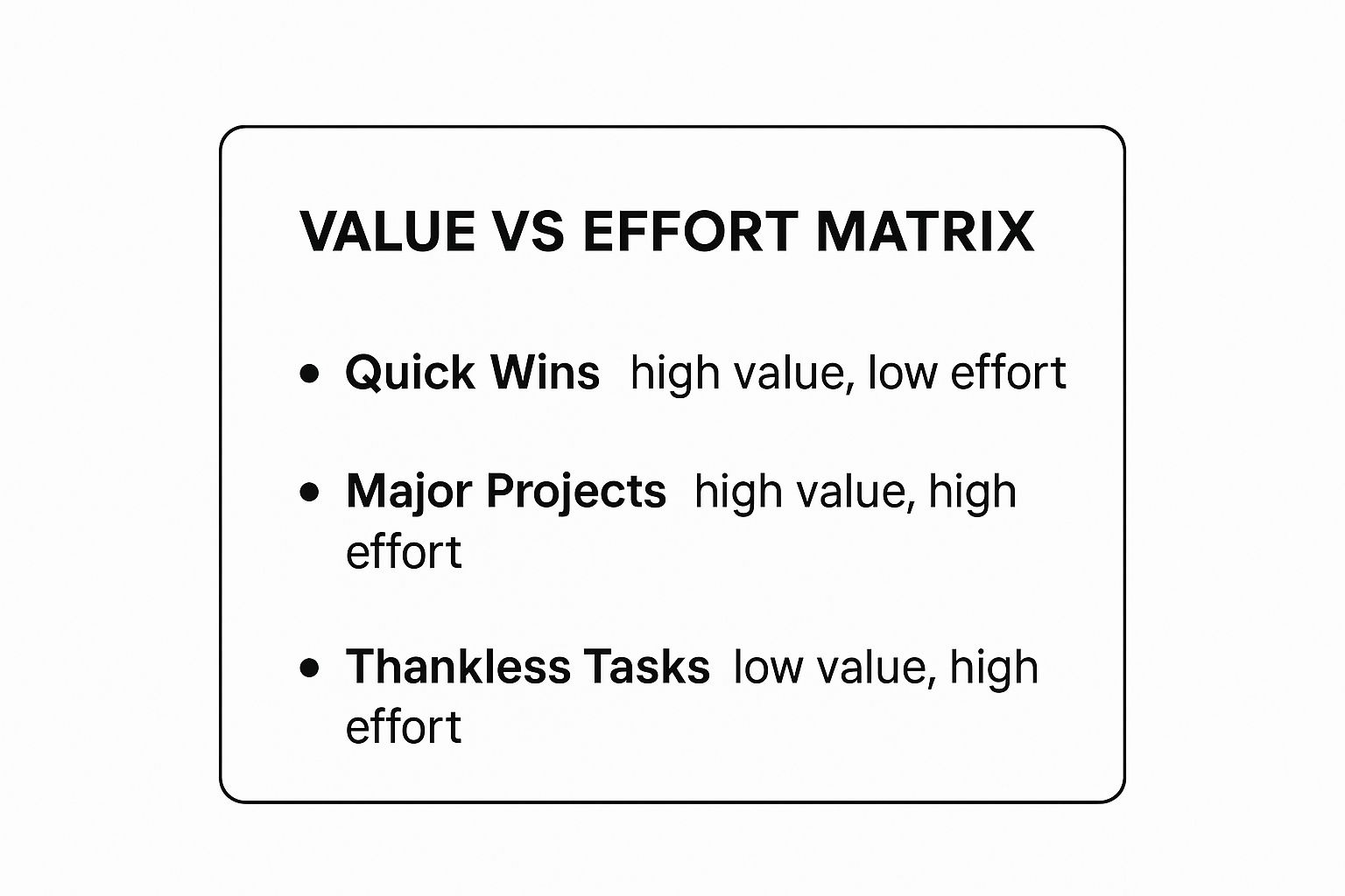
This visual breakdown makes it incredibly clear where to focus your energy first: start with the Quick Wins. This method’s visual nature is also great for improving your overall quality assurance process by helping teams identify high-impact, low-risk changes.
5. ICE Scoring (Impact, Confidence, Ease)
If you’re looking for a quick, agile, and refreshingly simple way to prioritize, the ICE Scoring model is your new best friend. Popularized in growth hacking circles by Sean Ellis, this feature prioritization framework strips away complexity to focus on three core questions. It’s designed for speed, helping teams make fast, reasonably confident decisions without getting bogged down in extensive calculations or data analysis.
The beauty of ICE is its elegant simplicity. You multiply three factors to get a final score: Impact × Confidence × Ease. This method is perfect for teams that need to move quickly, like early-stage startups or marketing teams running A/B tests. It provides just enough structure to guide decisions thoughtfully without creating unnecessary bureaucratic overhead.
How It Works
Getting started with ICE is incredibly straightforward. Your team rates each potential feature, idea, or experiment on a simple 1-10 scale across three criteria:
- Impact: How much will this feature positively affect the key metric you’re trying to improve? A score of 1 is a minor tweak, while a 10 represents a game-changing improvement for your users or business goals. Example: Adding a one-click checkout option could massively boost conversions, so we’ll score its impact as a 9.
- Confidence: How sure are you about your Impact and Ease scores? This is your gut-check meter. A 1 means it’s a wild guess, while a 10 means you have strong supporting data or have built something similar before. Example: We have analytics data suggesting checkout friction is a big problem, so let’s rate our confidence at an 8.
- Ease: How easy will this be to implement for the engineering and design teams? This is the inverse of effort. A 1 is a massive, multi-month project, while a 10 is something a single developer could knock out in a day. Example: The back-end logic is complex, so we’ll score the Ease as a 4.
To get the final ICE score, you multiply the three numbers (e.g., 9 × 8 × 4 = 288). The ideas with the highest scores bubble up to the top of your backlog. This method is a great way to track and quantify your team’s ongoing progress, which is a key part of using continuous improvement metrics. By forcing you to consider both potential upside and implementation reality, ICE ensures you prioritize a balanced mix of quick wins and strategic bets.
6. Weighted Scoring Model
Is your business strategy more nuanced than a simple one-size-fits-all formula? The Weighted Scoring Model is the bespoke suit of prioritization, a highly customizable feature prioritization framework that lets you define what truly matters to your unique goals. Instead of being locked into predefined metrics, you get to create your own criteria and decide exactly how important each one is, ensuring your roadmap is a direct reflection of your business strategy.
This method transforms prioritization from a rigid calculation into a strategic conversation. It’s perfect for when success isn’t just about user impact or effort but involves a complex mix of factors like strategic alignment, market differentiation, or risk reduction. By assigning weights to these custom criteria, you can ensure that the most strategically vital initiatives rise to the top.
How It Works
Implementing a Weighted Scoring Model is a collaborative process of defining, weighting, and scoring. You tailor the entire system to your company’s specific context.
- Define Criteria: First, your team agrees on a set of criteria that define a successful feature. These could include anything from “Increases User Retention” and “Aligns with Q3 OKRs” to “Reduces Technical Debt.” Aim for 5-7 key factors to keep it manageable.
- Assign Weights: Next, you distribute 100 percentage points across your chosen criteria based on their relative importance. If market differentiation is your top priority, it might get a weight of 40%, while a less critical factor like “Ease of Implementation” might only get 10%.
- Score Features: Each feature idea is then scored against every criterion, typically on a simple scale like 1-5 or 1-10. For example, a feature might score a 5 for “Increases User Retention” but only a 2 for “Reduces Technical Debt.”
- Calculate the Total: Finally, for each feature, you multiply its score for each criterion by that criterion’s weight. Summing these results gives you a final weighted score. The feature with the highest total score is your top priority.
This model is a favorite among enterprise software companies and large corporations because it directly links development work to high-level strategic goals. You can explore various ways to estimate and score features by reading about these powerful agile estimation techniques. This approach ensures every decision is defensible and aligned with what the business values most.
7. Story Mapping with Priority Lanes
If your roadmap feels like a disconnected list of features, Story Mapping is the narrative-driven approach you need to see the bigger picture. Instead of a flat backlog, this technique, championed by Jeff Patton, creates a visual, two-dimensional map of the user’s entire journey. This feature prioritization framework helps teams understand how individual features fit together to create a cohesive and valuable user experience from start to finish.
Story Mapping lays out user activities chronologically along the horizontal axis, with the detailed user stories that enable those activities arranged vertically underneath. The magic happens when you introduce horizontal “priority lanes,” transforming a simple map into a powerful, prioritized release plan. This method ensures that even the smallest task is viewed within the context of the user’s end-to-end journey, preventing teams from building features in a silo.
How It Works
Building a Story Map is a collaborative exercise that brings the entire user journey to life. You visualize the flow and then slice it into prioritized releases.
- Map the Backbone: Identify the high-level user activities or steps that form the main narrative of the user’s experience. This is the “backbone” of your map, arranged chronologically from left to right. Example: For an e-commerce site, this could be Search for Product -> View Product Details -> Add to Cart -> Checkout.
- Flesh out the Body: Underneath each backbone activity, brainstorm and place the specific user stories or tasks that enable it. These are the detailed steps the user takes. Example: Under “Search for Product,” you might have stories for “filter by price” and “sort by rating.”
- Draw Priority Lanes: Create horizontal swimlanes that slice across the entire map. These represent your release priorities. Common lanes are Must-have (MVP), Nice-to-have, and maybe a Could-have (Blue-sky) lane for future ideas.
- Prioritize and Slice: Move the user stories up or down into the appropriate priority lane. The top lane now represents your first shippable product slice or Minimum Viable Product (MVP), containing all the essential stories from across the entire user journey.
This visual approach is brilliant for gaining stakeholder alignment and is a key component in effective resource and capacity planning as it clearly defines what needs to be built first. It turns abstract feature lists into a tangible, user-centric plan of action.
Feature Prioritization Methods Comparison
| Framework / Method | Implementation Complexity | Resource Requirements | Expected Outcomes | Ideal Use Cases | Key Advantages |
|---|---|---|---|---|---|
| RICE Framework (Reach, Impact, Confidence, Effort) | Moderate | Requires accurate data and estimates | Objective numerical prioritization of features | Teams seeking data-driven, quantitative prioritization | Removes bias, scalable, clear ranking formula |
| Kano Model | High | Extensive customer research | Categorization of features by customer satisfaction | Product teams focused on customer satisfaction & differentiation | Customer-centric, highlights innovation potential |
| MoSCoW Method | Low | Minimal, mainly stakeholder input | Categorizes features by priority (Must, Should, Could, Won’t) | Teams needing simple prioritization and scope management | Simple, stakeholder-friendly, manages scope |
| Value vs. Effort Matrix | Low | Minimal, requires effort and value estimates | Visual prioritization identifying quick wins | Rapid decision-making with visual insights | Simple, visual, promotes quick wins |
| ICE Scoring (Impact, Confidence, Ease) | Low | Minimal data, fast scoring | Fast, simplified prioritization for experiments | Growth teams and startups with rapid iteration cycles | Quick, experiment-friendly, easy to learn |
| Weighted Scoring Model | High | Significant, involves criteria definition and weighting | Customized, strategy-aligned feature ranking | Large organizations needing strategic prioritization | Highly customizable, aligns with business goals |
| Story Mapping with Priority Lanes | Moderate to High | Collaborative workshops, time investment | Visual backlog prioritizing user journey and needs | User-centric teams building complex user experiences | Maintains context, collaborative, agile-friendly |
Choosing Your Framework: There’s No Silver Bullet
We’ve just sprinted through a gauntlet of the most popular and powerful feature prioritization frameworks, from the simple math of RICE and ICE to the customer-centric philosophy of the Kano Model. We’ve mapped user journeys with Story Mapping, drawn lines in the sand with MoSCoW, and balanced the scales with Value vs. Effort matrices. So, after all that, which one is the undisputed champion, the one true framework to rule them all?
Plot twist: there isn’t one.
The search for a single, perfect feature prioritization framework is a fool’s errand. The best framework isn’t the most complex or the most mathematically pure; it’s the one your team understands, trusts, and actually uses consistently. A simple Value vs. Effort matrix scribbled on a whiteboard that guides every weekly planning session is infinitely more valuable than a perfectly calibrated Weighted Scoring model that sits abandoned in a spreadsheet.
From Theory to Action: Making Your Choice
The real magic happens when you stop searching for a silver bullet and start experimenting. Don’t let paralysis by analysis kill your momentum. Instead, treat the frameworks themselves like features you’re testing.
- Starting a new project? Use Story Mapping to get the big picture and identify your MVP.
- Feeling overwhelmed with small tasks? A quick ICE Scoring session can help you find the quick wins and clear the noise.
- Debating a major epic? The RICE framework forces a more rigorous, data-informed discussion about potential ROI.
- Need to align diverse stakeholders? A Weighted Scoring model can help translate different departmental goals into a single, unified priority score.
The ultimate goal isn’t to rigidly adhere to a specific dogma. It’s to build a shared language and a repeatable process that moves your team from a chaotic, reactive state to a focused, proactive one. The power of a good feature prioritization framework is that it transforms subjective arguments (“I think we should do this!”) into objective, strategic conversations (“This feature has the highest impact for the lowest effort, and the data backs it up.”).
Create Your Own Cocktail
Don’t be afraid to mix and match. The most mature product teams often evolve their own hybrid models. You might use MoSCoW to define release-level priorities but then use a Value vs. Effort matrix to sequence the “Must-Haves.” Or you could incorporate Kano categories directly into your Weighted Scoring criteria to ensure you’re always balancing delighters with performance needs.
Ultimately, these frameworks are just tools. Like any tool, they’re only as effective as the craftsperson wielding them. The true value lies in the conversations they spark, the assumptions they challenge, and the clarity they bring to the impossibly complex question of “What should we build next?” So, pick a framework, start the conversation with your team, and begin building with purpose.
Tired of priority debates happening in isolated Jira tickets while your high-level plans live in monday.com? Bridge the gap and supercharge your prioritization process with monday.com for Jira by resolution Reichert Network Solutions GmbH. Embed live Jira issues directly into your monday.com boards to create a single source of truth, ensuring your strategic framework and your daily development work are always in perfect sync. Learn more at resolution Reichert Network Solutions GmbH.
