
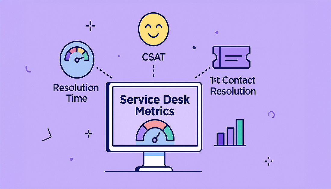
Service desk performance metrics are the numbers you track to see how effective and efficient your IT support team really is. Think of core indicators like First Contact Resolution (FCR), Customer Satisfaction (CSAT), and Average Resolution Time. These tell you about speed, quality, and how happy your users are. Tracking these isn’t just about IT—it’s about making smart, data-driven decisions that push the entire business forward.
Why Service Desk Performance Metrics Matter
Imagine your service desk is the engine that keeps your company’s day-to-day operations running. When an employee hits a technical snag, they depend on that engine to get them back on track, fast. But how do you know if that engine is performing at its peak, just sputtering along, or burning way too much fuel?
That’s exactly where service desk performance metrics come in. They are your dashboard, giving you a real-time, objective look at your support team’s health. Without them, you’re essentially driving blind, making decisions based on gut feelings instead of hard evidence. Metrics turn vague goals like “making support better” into concrete, measurable targets.
Your Dashboard for Operational Health
Just like a car’s dashboard shows you everything from speed to fuel levels, service desk metrics paint a complete picture of your team’s performance. Each number tells a different part of the story.
- Ticket Resolution Time is your speedometer—it tells you how fast you’re solving problems.
- Cost Per Ticket acts as your fuel efficiency gauge, showing how cost-effectively the team operates.
- Customer Satisfaction (CSAT) scores are like a direct check on the engine’s health, revealing how people actually feel about the service they receive.
This infographic shows how these fundamental metrics form the foundation of any solid performance strategy.
What this really highlights is the need for balance. You have to measure response speed, resolution effectiveness, and the end-user experience all at once. If you let one area slip, it can easily undermine the others, leading to a poor service environment all around.
Tracking performance isn’t about micromanaging agents; it’s about understanding processes. Strong metrics reveal bottlenecks, highlight training opportunities, and justify resource allocation, ultimately linking IT support directly to business success.
To help you get a handle on the core concepts before we dive deeper, the table below organizes essential metrics into clear categories. Think of this as a framework for building a balanced and comprehensive tracking strategy.
Key Service Desk Metric Categories at a Glance
This table categorizes essential service desk metrics to provide a clear overview of what each type of KPI measures, helping you build a balanced performance tracking strategy.
| Metric Category | What It Measures | Example Metrics |
|---|---|---|
| Operational Efficiency | The speed and productivity of your support team. | Average Resolution Time, Ticket Backlog, First Response Time |
| Customer Experience | How users perceive the quality and ease of support. | Customer Satisfaction (CSAT), Customer Effort Score (CES), Net Promoter Score (NPS) |
| Business Impact | The financial and strategic value of the service desk. | Cost Per Ticket, First Contact Resolution (FCR), Agent Utilization |
Using this structure ensures you’re not just focusing on one aspect, like speed, but are getting a holistic view of how your service desk truly performs and contributes to the business.
The Core Metrics for Service Desk Success

While you could track dozens of different numbers, a handful of metrics truly form the bedrock of a high-performing service desk. These are the indicators that give you the clearest, most direct insight into your team’s performance.
Think of them as the main gauges on your car’s dashboard. They don’t tell you everything, but they immediately signal whether things are running smoothly or if you need to pull over and look under the hood. Mastering these gives you a solid foundation for evaluating efficiency, user happiness, and operational strain.
Let’s break down each one.
First Contact Resolution (FCR)
This one’s the gold standard. First Contact Resolution (FCR) measures the percentage of support tickets you solve in the very first interaction. No back-and-forth emails, no follow-up calls, no forcing the user to explain their problem all over again.
A high FCR is a massive win for everyone. The user gets their problem solved with minimal effort, which feels great. For the business, it’s a huge efficiency booster. Agents can move on to the next issue instead of getting bogged down revisiting old ones.
A strong FCR rate, typically aiming for 70-80%, is one of the best predictors of customer satisfaction. When you fix something on the first try, it shows you’re competent and you respect the user’s time.
Getting this number up usually means giving your agents what they need: better knowledge bases, the right permissions to actually fix things, and solid training. It’s a direct reflection of how prepared your team really is.
Customer Satisfaction (CSAT)
While FCR measures what you did, Customer Satisfaction (CSAT) measures how the user felt about it. It’s a direct pulse check on their experience, usually captured by asking a simple question like, “How satisfied were you with our support?” on a 1-5 scale.
This feedback is priceless. A high CSAT score, generally 80% or higher, means your team isn’t just closing tickets—it’s creating positive interactions. If your resolution times are fast but CSAT is low, it might be a red flag for issues with an agent’s tone, poor communication, or a clunky process.
To get good CSAT data, you need to:
- Time it right: Send the survey right after the ticket is closed. The experience is still fresh in their mind.
- Keep it simple: A single, clear question with an optional comment box gets way more responses than a long survey.
- Read the comments: The real gold is in the written feedback. That’s where you find out the “why” behind the score.
CSAT adds the essential human context that other numbers can’t provide.
Average Resolution Time
Average Resolution Time, often called Time to Resolution (TTR), tracks the total time from the moment a ticket is opened until it’s officially closed for good. It’s a key indicator of your team’s overall efficiency and the complexity of the issues coming your way.
But you have to look at this metric with some context. A low average is usually good, but not if it’s because agents are rushing and sacrificing quality. Closing a ticket without truly solving the problem just leads to reopened tickets and frustrated users.
For a clearer picture, you need to break this metric down:
- By Priority: High-priority incidents should have a much faster resolution time than low-priority requests.
- By Category: Tracking resolution time for password resets versus server outages will help you spot specific bottlenecks in your process.
Analyzing this data helps you set realistic Service Level Agreements (SLAs) and manage what users expect from you. If you want to dive deeper into a broader set of metrics, check out this great overview of service desk key performance indicators.
Ticket Volume Trends
Finally, Ticket Volume Trends is all about tracking the number of incoming tickets over time. This isn’t just about counting; it’s a predictive tool that helps you manage your resources before you get overwhelmed.
Do you see a spike in tickets at the end of every month? It could point to a problem with your month-end reporting software. Did a flood of tickets appear right after a new app launched? That’s a sign that you need better user training or that the rollout was buggy.
By watching these trends, you can shift from being purely reactive to proactive. It lets you anticipate your busiest times, staff your team correctly, and even identify underlying problems in your IT environment before they turn into major headaches.
Measuring the Customer Experience

While operational metrics tell a great story about how fast and efficiently your team works, they don’t reveal the whole picture. To really get a feel for your service desk’s impact, you have to look at it through your customers’ eyes. Are they happy? Frustrated? Or just… indifferent?
This is where customer experience metrics come in. They move past simple ticket counts and resolution times to capture perception, emotion, and loyalty. Focusing on the customer journey helps you build a support experience that doesn’t just fix problems but also forges genuine, positive relationships.
Customer Satisfaction (CSAT) For An Immediate Check
Think of the Customer Satisfaction (CSAT) score as an in-the-moment happiness check. It’s usually a single, direct question sent right after a ticket is resolved, asking, “How satisfied were you with our support?” This gives you a quick snapshot of how that specific interaction felt to the user.
A strong CSAT score is a fantastic indicator of immediate quality. But it’s crucial to capture this feedback while the experience is still fresh in their mind. Waiting even a day to send the survey can muddy the waters. For example, a global customer service trend shows that over 50% of customers might jump to a competitor after just one poor support experience—that’s how important real-time feedback is.
Top-tier service desks often aim for CSAT scores of 80% or higher. Getting there takes more than just speed; it demands clear communication, empathy, and truly effective solutions. To see how CSAT fits into the bigger picture, you can dig deeper into our guide on essential customer service KPIs.
Net Promoter Score (NPS) For Long-Term Loyalty
If CSAT is all about a single interaction, then Net Promoter Score (NPS) measures the big picture of customer loyalty. It gets there by asking a powerful, forward-looking question: “On a scale of 0-10, how likely are you to recommend our company to a friend or colleague?”
This simple question neatly sorts your users into three distinct groups:
- Promoters (9-10): These are your loyal fans. They’re happy with your service and will likely sing your praises to others.
- Passives (7-8): They’re satisfied enough, but not enthusiastic. This group is vulnerable to being lured away by competitors.
- Detractors (0-6): These are unhappy customers. Worse, they can actively damage your brand’s reputation through negative word-of-mouth.
Your NPS is calculated by subtracting the percentage of Detractors from the percentage of Promoters. Any positive score is a good start, but a score above 50 is widely considered excellent. Unlike CSAT, which is transactional, NPS reflects the overall health of the relationship a user has with your entire brand.
Customer Effort Score (CES) For Measuring Ease
Perhaps one of the most revealing metrics for any service desk is the Customer Effort Score (CES). It asks a brilliantly simple question: “How much effort did you personally have to put in to handle your request?”
Think about it. A user might be “satisfied” with a friendly agent (giving a high CSAT), but they’ll walk away frustrated if they had to jump through five hoops just to get there. A low CES score is a powerful predictor of customer loyalty—often even more so than CSAT.
A user might report being satisfied with an agent’s friendly demeanor, but if they had to explain their issue to three different people before reaching that agent, their effort was high. This signals a hidden process problem that CSAT alone would miss.
A high-effort experience—like being transferred multiple times or having to repeat information—is a massive source of frustration. Tracking CES helps you pinpoint and stamp out these friction points in your support process. At the end of the day, making support feel effortless is one of the surest ways to build a fiercely loyal user base.
Right, so you’ve looked at how your customers feel. Now it’s time to turn the mirror on your own team.
Figuring out your team’s operational efficiency is like popping the hood on your car to check the engine. These are the metrics that tell you how productively your team is actually working, where your processes are sputtering, and how you can build a support environment that doesn’t burn people out.
By looking at things like how long it takes to solve a ticket, how many tickets are piling up, and how busy your agents are, you can shift from just putting out fires to truly fine-tuning your entire support machine. These numbers give you the hard data you need to spot internal friction before it ever spills over and affects the customer.
Keeping an Eye on Average Resolution Time
Average Resolution Time (ART)—you might also hear it called Mean Time to Resolution (MTTR)—is the complete stopwatch time for a support ticket. It starts the second a ticket is logged and stops only when it’s officially closed. Think of it as a direct signal of your team’s overall speed.
A high ART isn’t just a bad number; it’s a symptom. It could point to a bottleneck in your workflow, a tricky new bug that’s stumping everyone, or simply not having enough people on deck. For example, if your resolution time suddenly jumps after a software release, you’ve probably got a widespread issue on your hands.
This KPI is critical because long waits kill customer satisfaction. In fact, industry data shows over 50% of customers will consider switching to a competitor after just one bad support experience. A good benchmark to aim for is an ART of under 24 hours. Tracking this lets you spot trouble early, move people where they’re needed most, and stay on top of your service level agreements (SLAs). For more on this, check out these insights on help desk metrics from Zendesk.
Taming the Ticket Backlog
Your ticket backlog is essentially technical debt for your support team. It’s the pile of all unresolved tickets sitting in the queue. A small backlog is perfectly normal, but if it’s constantly growing, that’s a five-alarm fire. It’s a clear sign that new tickets are coming in faster than your team can handle them.
A massive backlog is a morale killer. Agents feel like they’re on a treadmill they can’t get off, which leads straight to burnout and a drop in quality as they start rushing just to clear the queue. Watching your backlog helps you ask the right questions:
- Are we staffed correctly for our current ticket volume?
- Are specific types of tickets getting stuck and going stale?
- Do we need better automation or self-service options to handle the simple, repetitive stuff?
Actively managing this queue ensures older issues don’t get forgotten and prevents your team from drowning in work.
A healthy service desk keeps its backlog stable or, ideally, shrinking. If the number of incoming tickets is always higher than the number of solved tickets, your process is unsustainable. It’s time for a change.
The Balancing Act of Agent Utilization
Agent utilization is the percentage of time an agent spends doing actual support work versus their total time on the clock. So, if an agent spends six hours of an eight-hour shift working on tickets, their utilization is 75%. It’s a straightforward way to gauge productivity and see if you have the right number of people.
But be careful here. Pushing for 100% utilization is a classic mistake and a recipe for disaster. It leaves zero time for professional development, updating documentation, taking a mental break, or dealing with that one really weird issue that pops up. Aiming for maximum utilization is the fastest way to burn out your best people and watch service quality plummet.
The goal is to find a healthy balance. A sustainable rate is usually somewhere between 60% and 80%. This sweet spot means agents are being productive without being overworked. It gives them the breathing room they need to deliver thoughtful, high-quality support. Monitoring utilization helps you staff your team intelligently and create a work environment that’s both efficient and human.
Turning Metrics Into Actionable Insights

Collecting service desk performance metrics is a bit like gathering ingredients for a meal. On their own, they’re just raw materials. The real magic happens when you chop, mix, and cook them into something that actually provides nourishment—in this case, meaningful business intelligence that drives real improvement.
This is where many organizations get stuck. Transforming raw numbers into actionable insights takes more than a fancy tool; it demands a smart approach to how you visualize and analyze the data. Your goal is to make the numbers tell a clear story to anyone who looks at them.
Designing Dashboards for Different Roles
Let’s be honest: not everyone on the team needs to see the same information. Flooding an executive with granular ticket data is just as useless as giving a front-line agent a high-level financial summary. The key is to build tiered dashboards, each tailored to the specific needs of its audience.
This way, every stakeholder gets the right information, in the right format, to make decisions that matter for their role. A well-designed system delivers clarity, not more complexity.
The most effective dashboards answer specific questions. An executive asks, “Is IT supporting business goals cost-effectively?” A manager asks, “Are we meeting our SLAs?” An agent asks, “How am I performing against my targets today?”
Think of it as a three-tiered structure:
- The Executive View: This is the high-level dashboard focused purely on business impact. It should feature metrics like Cost Per Ticket, overall CSAT trends, and SLA compliance rates. The goal here is a quick, at-a-glance health check of the entire operation.
- The Manager View: An operational dashboard for service desk leads. This view goes a level deeper, showing things like Average Resolution Time by category, the current Ticket Backlog, and Agent Utilization. It’s all about helping managers balance workloads and spot process bottlenecks before they become major problems.
- The Agent Scorecard: A personal performance view for individual agents. It displays metrics they can directly influence, like their personal FCR rate, average CSAT score, and the number of tickets they’ve resolved. This empowers agents by giving them direct ownership of their performance.
Reporting Framework for Different Stakeholders
To make this practical, it’s crucial to establish a reporting framework that aligns the right metrics with the right people at the right frequency. This ensures everyone from the C-suite to the front lines is on the same page without getting overwhelmed by irrelevant data.
| Stakeholder | Key Metrics of Interest | Reporting Frequency | Purpose |
|---|---|---|---|
| Executives (C-Suite) | Cost Per Ticket, CSAT, Business Alignment, SLA Compliance | Monthly/Quarterly | Strategic oversight and budget validation |
| Service Desk Manager | Team Performance, Ticket Backlog, Agent Utilization, FCR | Weekly/Bi-Weekly | Operational management and process improvement |
| Team Leads | Daily Ticket Volume, SLA Risks, Agent Availability | Daily | Tactical resource allocation and daily management |
| Service Desk Agents | Personal FCR, Individual CSAT, Resolved Tickets | Daily/Real-Time | Self-assessment and performance improvement |
This structured approach ensures that reporting is not just a routine task but a strategic tool that provides clear, relevant insights tailored to each role’s responsibilities.
Connecting the Dots to Find Root Causes
The most powerful insights emerge when you start correlating different metrics to uncover the “why” behind the numbers. A single KPI in isolation can be misleading. But when you look at them together, they can reveal the root cause of surprisingly complex problems.
For example, you might notice your First Contact Resolution (FCR) rate has tanked this month. That’s worrying, but it doesn’t tell you what to do. But what if you overlay that data with your Ticket Volume Trends? Suddenly, you see a massive spike in tickets all related to a new software deployment.
Now you have a clear hypothesis: the new software is causing problems that your front-line agents aren’t equipped to solve, forcing escalations and torpedoing your FCR. This insight lets you take targeted action, like creating specialized training or updating the knowledge base for that specific application. This is what it means to use data to get better over time. For a deeper dive into this concept, you can explore more about metrics for continuous improvement.
By building a framework that turns raw data into clear narratives, you can shift from constantly putting out fires to making proactive, strategic decisions. This structure gives every team member, from the front lines to the C-suite, the precise information they need to do their best work.
Frequently Asked Questions
When you start digging into service desk metrics, a lot of questions pop up. It’s one thing to know the definitions, but another to apply them confidently. Let’s tackle some of the most common questions we hear.
How Do I Choose the Right Metrics?
There’s no magic list of metrics that works for everyone. The best approach is to start with your business goals and work backward. Ask yourself: what does “success” actually look like for our team right now?
Are you trying to make users happier and more loyal? Or is the main focus on trimming operational costs and making the team more efficient?
- For user loyalty: You’ll want to lean into experience metrics. Think Customer Satisfaction (CSAT) and Customer Effort Score (CES). These tell you how customers feel about your support.
- For efficiency: Your best bet is to prioritize operational metrics like Average Resolution Time and First Contact Resolution (FCR). These measure how lean and effective your process is.
The real trick is to pick a balanced mix. You need to know what’s happening internally (efficiency) and how it’s perceived externally (customer experience). Don’t track a metric just because you can; track it because it helps you make a smarter decision.
What’s the Difference Between a KPI and a Metric?
This is a classic point of confusion, but it’s simpler than it sounds. Think of it this way: all KPIs are metrics, but not all metrics are important enough to be KPIs.
A metric is any number you can track. It measures activity. For example, the total number of tickets your team closed this week is a metric.
A Key Performance Indicator (KPI) is a very specific metric that’s tied directly to a critical business goal. It measures progress. For instance, hitting an 80% FCR rate to boost customer satisfaction is a KPI.
Your total ticket volume is a useful metric for understanding workload. But your FCR rate is a KPI because it directly signals how effective your support process is and its impact on the business. One measures activity, the other measures strategic success.
How Often Should We Review Our Metrics?
There’s no single right answer here—it completely depends on who is looking and what they’re looking for. A one-size-fits-all review schedule just doesn’t work.
- Daily or Real-Time: Agents on the front lines need to see their personal stats, like tickets resolved and individual CSAT scores. This gives them immediate feedback to self-correct throughout the day.
- Weekly: Team leads and managers should be looking at operational metrics like Ticket Backlog and SLA Compliance. This helps them manage workloads, spot problems before they escalate, and keep the week on track.
- Monthly or Quarterly: This is for the high-level view. Executives need a summary of strategic KPIs—things like Cost Per Ticket and overall CSAT trends—to see the bigger picture, assess business impact, and make decisions about budgets.
When you review metrics regularly, they stop being a boring historical report and become a live feedback loop that drives constant improvement.
It’s time to break down the walls between your sales, support, and development teams. With resolution Reichert Network Solutions GmbH, you can integrate HubSpot and Jira for seamless, real-time data sync. Give your teams the full customer story they need, right inside the tools they use every day. See how you can accelerate your workflows and learn more at https://www.resolution.de/hubspot-for-jira.
