

Ever feel like your team is running in circles, stuck in a maze with no map? That’s what it’s like to operate a business without clear processes. Process mapping is the GPS your operations desperately need, drawing a clear visual path from chaos to coordination.
It’s about more than just drawing a few diagrams. It’s a powerful strategy for understanding how work actually gets done versus how you think it gets done.
Your Guide to Gaining Workflow Clarity

By putting your workflows on paper (or a screen), you suddenly see all the hidden steps, surprise inefficiencies, and frustrating bottlenecks that are tripping your team up. This newfound clarity is the absolute first step toward making any meaningful operational improvements.
The Foundation of Modern Efficiency
While it feels like a very “now” business practice, the idea of visually mapping work is actually over a century old. Its roots trace back to industrial efficiency pioneers Frank and Lillian Gilbreth, who first introduced flow process charts way back in 1921.
They laid the groundwork for visualizing and improving how work gets done, and their methods were so effective they became standard practice in engineering by the 1940s.
A process map is more than a picture; it’s a shared understanding. When everyone can see the same workflow, collaboration improves, mistakes decrease, and innovation becomes possible. It transforms abstract ideas into a tangible plan for success.
Why Every Team Needs This Skill
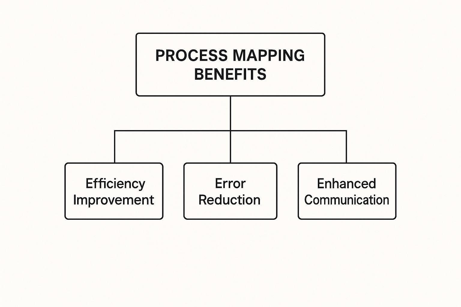
Honestly, getting a handle on these techniques is a game-changer for any team that wants to build a more efficient, predictable operation. The clarity you get from a good process map pays off in so many ways:
- Improved Onboarding: New hires can see exactly where they fit into the bigger picture, getting up to speed in record time.
- Reduced Errors: When the steps are laid out visually, there’s way less room for confusion and mistakes.
- Enhanced Collaboration: Teams finally see how their work connects to other departments, which helps tear down those frustrating silos.
- Data-Driven Decisions: Your maps create a baseline. Now you can actually measure improvements and track performance against a clear standard.
The principles you’ll learn are incredibly versatile, helping with everything from product development to streamlining grant management. This guide will set you up to pick the right mapping tools for whatever challenges you’re facing.
Choosing the Right Process Mapping Technique
Alright, so you’re sold on the “why” of process mapping. Now for the fun part: the “how.” Picking the right technique is a bit like choosing the right knife in the kitchen—you wouldn’t use a cleaver for delicate garnish. Each method gives you a completely different angle on your workflow, designed to solve very specific problems.
Think of this as your field guide to the heavy hitters of process mapping. We’ll walk through the most common techniques, breaking down what makes each one tick and, more importantly, when you should pull it out of your back pocket.
The Most Common Process Mapping Techniques
While there’s a whole universe of niche diagrams out there, a few core techniques will cover about 90% of what you’ll ever need. Getting to know their individual strengths is the real key. It doesn’t matter if you’re mapping a simple content approval workflow or a sprawling manufacturing pipeline; there’s a right tool for the job.
- Flowcharts: The classic. Flowcharts are the bread and butter of process mapping for a reason. They’re perfect for simple, linear processes because they are incredibly easy to build and even easier to understand. This makes them ideal for training materials, basic documentation, and getting a straightforward sequence of tasks down on paper.
- Business Process Model and Notation (BPMN): If flowcharts are the bread and butter, BPMN is the five-course meal. This is the heavyweight champion you bring in for complex, multi-layered processes. It uses a globally standardized set of symbols, which allows for an incredible amount of detail. It’s the go-to for technical teams, system architects, and anyone who needs to create formal, unambiguous documentation for compliance.
- Value Stream Mapping (VSM): Is your main goal to become ruthlessly efficient? Meet your new best friend, VSM. This technique is laser-focused on one thing: identifying and obliterating waste. It forces you to distinguish between steps that add real value and those that are just fluff, making it an absolute must-have for lean manufacturing and operational excellence initiatives.
- SIPOC Diagrams: When you need a 30,000-foot view before diving into the weeds, SIPOC is unbeatable. The acronym stands for Suppliers, Inputs, Process, Outputs, and Customers. It gives you a brilliantly simple, one-page snapshot of a process and all its key players. It’s the perfect starting point before you commit to a more detailed mapping effort.
As this shows, it’s not just about drawing boxes and arrows. The end game is always about concrete business wins: better efficiency, fewer mistakes, and teams that actually talk to each other.
Selecting Your Technique Based on Goals
Let your end goal be your guide. What problem are you actually trying to solve? Are you trying to patch a leaky process, get a new hire up to speed, or tear down a system and rebuild it for maximum horsepower?
For example, a marketing team just trying to get their blog post approval process under control would be perfectly happy with a simple flowchart. It’s a visual way to show the handoff from writer to editor to legal, making it dead simple for everyone to see who does what, and when.
On the other hand, a software development team plotting out a new feature integration would be lost without the precision of BPMN. It lets them map every single database interaction, every API call, and every potential error state. Nothing is left to chance.
The real magic happens when a process map shows how different teams and activities connect. It reveals those hidden handoffs and dependencies that quietly dictate how well your business actually runs. It turns an abstract workflow into a tangible portrait of your company in action.
Now, imagine a factory manager who keeps seeing production bottlenecks. They would reach for Value Stream Mapping without a second thought. VSM would help them quantify the time spent waiting for parts versus the time spent on actual assembly, shining a spotlight on where the biggest delays are. This relentless focus on hard data is why VSM is so powerful; some analyses have shown it can slash lead times by a staggering 40%.
Your Quick Guide to Process Mapping Techniques
To make it even easier, here’s a quick cheat sheet. Use this table to pick the perfect process mapping technique based on what you’re trying to accomplish and how messy the process is.
| Technique | Best For | Key Focus | When to Use It |
|---|---|---|---|
| Flowchart | Simple, linear workflows | Visualizing a sequence of steps | Training new employees, basic process documentation, clarifying simple handoffs. |
| BPMN | Complex, multi-layered processes | Technical precision and standardization | Designing new software systems, formal compliance audits, detailed technical analysis. |
| Value Stream Map | Improving efficiency and speed | Identifying and eliminating waste | Lean manufacturing, optimizing operations, reducing cycle times. |
| SIPOC Diagram | High-level overviews | Defining scope and stakeholders | The kickoff of a new project, providing context before a deep-dive analysis. |
Choosing the right technique is the first step toward turning a chaotic process into a well-oiled machine. It’s about gaining clarity first, so you can take meaningful action later.
Visualizing Your Path from Chaos to Clarity
One of the biggest wins in process mapping is simply seeing where you actually are so you can figure out how to get where you want to go. This is where one of the most practical techniques comes in: creating ‘As-Is’ and ‘To-Be’ maps.
Think of it as the ultimate “before and after” picture for your workflows. It’s a two-step journey that guides your team from the messy reality of today to a much clearer, more efficient future. It gives you a structured way to not just spot problems, but to actually design the solutions.
The Honest Snapshot: The As-Is Map
First things first, you have to get real. The ‘As-Is’ process map is your brutally honest, no-filter snapshot of a process just as it is right now—all the good, the bad, and the ugly. Forget the official handbook or how things are supposed to work. The whole point is to capture reality.
To get this right, you absolutely have to talk to the people doing the work day in and day out. They’re the ones who know the unwritten rules, the frustrating workarounds, and the real-deal bottlenecks that gum everything up. A good ‘As-Is’ map will shine a light on:
- Hidden Bottlenecks: Where does work get stuck in a queue?
- Redundant Steps: What are we doing twice for no good reason?
- Pain Points: Where do people want to pull their hair out?
This map becomes your baseline, your single source of truth. It’s the diagnostic tool that shows you exactly what needs fixing.
Your Blueprint for the Future: The To-Be Map
Once you’ve got a clear picture of the current mess, it’s time to dream a little. The ‘To-Be’ process map is your blueprint for a smarter, sleeker workflow. This isn’t about small-potatoes-tweaks; it’s a chance to fundamentally rethink how work gets done.
The ‘To-Be’ map is a collaborative vision. It’s where your team gets together and asks, “If we could start from scratch, how would this flow?” The answer is your roadmap for getting better.
This new map should outline a process that’s faster, simpler, and delivers better results. It’s your game plan for wiping out all the waste and roadblocks you found in the ‘As-Is’ stage.
There’s a reason powerful methodologies like Lean and Six Sigma rely so heavily on this. ‘As-Is’ maps give a detailed account of current workflows, while ‘To-Be’ maps visualize the optimized future state, helping teams systematically crush inefficiencies.
Putting these two maps side-by-side creates a powerful story for change. It gets everyone on the same page about the problems and excited about the future. From there, you can use all sorts of process improvement techniques to bridge that gap and turn your blueprint into a real-world win.
How Value Stream Mapping Drives Real Results
Let’s zoom in on one of the most powerful process mapping techniques out there: Value Stream Mapping (VSM). Don’t think of this as just another diagram to hang on the wall. VSM is more like going on a treasure hunt for waste in your business, where the “treasure” is a faster, leaner, and more profitable operation.
The whole point is to ruthlessly identify—and then eliminate—any activity that doesn’t add real, tangible value for your customer. By doing this, you can turn sluggish, bloated workflows into value-delivering machines that directly boost your bottom line.
Spotting Value in Your Daily Grind
To really get VSM, you have to start thinking like your customer. What are they actually paying for? It helps to use a simple, relatable example, like making a morning coffee at your favorite cafe.
- Value-Added Activities: These are the steps the customer is happy to pay for. Grinding fresh beans, tamping the espresso perfectly, steaming the milk, and handing over that delicious final product. These actions directly create the coffee they want.
- Non-Value-Added Activities: This is everything else. The barista walking to the back to get more milk? Waiting for a machine to heat up? Searching for the right size cup? These things might be necessary, but they don’t add any value. The customer isn’t paying for the barista’s travel time.
VSM forces you to look at your own business processes through this same critical lens. You map out every single step and then ask the hard question: is this adding value or creating waste? The answers can be eye-opening.
A Value Stream Map isn’t just a process picture; it’s an economic tool. It attaches time and cost to every step, revealing precisely where delays and unnecessary expenses are hiding in plain sight.
The practical impact of this method is undeniable. Take the global logistics company Encoparts, for example. They used VSM to completely overhaul their international purchasing division. The result? A stunning 33% increase in operational efficiency, proving just how potent this technique can be when applied correctly. You can dig into more examples of the impact of VSM from these insights on business process efficiency.
From Map to Momentum
Once you have your VSM laid out, the path forward becomes incredibly clear. You can start targeting the biggest sources of waste—whether it’s waiting time, unnecessary movement, or redundant tasks—and systematically design them out of your process.
This creates a ripple effect of improvements. Cycle times shrink. Quality improves because there are fewer opportunities for error. Best of all, your team gets to spend more of its energy on the activities that truly matter.
For teams looking to bake this kind of efficiency into their daily work, a well-structured workflow process template can be a fantastic way to turn VSM insights into repeatable, optimized actions. The map shows you where to go, and the template helps you get there, day in and day out.
A map is only useful if you actually follow it. Let’s be honest, the best process maps aren’t just pretty diagrams; they’re living, breathing guides for your team. This is where all that hard work mapping your “To-Be” state pays off, turning those insightful charts into real, actionable workflows inside the Atlassian ecosystem.
Think about it. Tools like Jira and Confluence are built for this exact purpose. Instead of letting a beautifully crafted flowchart collect digital dust in a forgotten folder, you can plant it right onto a Confluence page. Suddenly, it’s not just a diagram—it’s your team’s single source of truth for that process.
From Static Diagrams to Dynamic Workflows
Imagine you’ve just mapped out the perfect content creation pipeline. Instead of just showing it to your team in a meeting and hoping they remember, you can make it completely interactive. Every step on that map—like “Draft Blog Post” or “Review SEO”—can be directly linked to a specific Jira issue type. This one simple move connects your visual guide to the actual work getting done.
Here’s what that looks like in the real world:
- A Visual Bug-Reporting Flow: Picture a swimlane diagram in Confluence showing the journey a bug takes from QA to development. Each step, like “Triage Bug” or “Assign to Developer,” links straight to a Jira ticket. Now the entire process is transparent and easy to track.
- An Interactive Onboarding Checklist: You can map a new hire’s entire journey as a flowchart. Clicking on “Set Up Workstation” could take them to a Jira Service Management request form, while “Complete HR Paperwork” links them to the exact Confluence page they need.
This kind of integration makes your process maps a central, collaborative part of daily work, not just some artifact from a long-forgotten planning session.
Give Your Maps Visual Power with Confluence Apps
To really kick things up a notch, the Atlassian Marketplace is full of apps designed specifically for creating and embedding diagrams. Tools like Gliffy are fantastic for building everything from simple flowcharts to complex BPMN diagrams, all without leaving your Confluence pages.
Here’s a glimpse of the Gliffy interface right inside Confluence. You can see how easy it is to start building out detailed diagrams on the fly.
This is how teams can build and tweak their process maps together, keeping everything in their main documentation hub.
The real magic happens when a map is directly connected to the work itself. When a diagram in Confluence can create a task in Jira with a single click, the process isn’t just documented—it’s automated.
This approach guarantees that everyone is following the most current version of a process, because the map is the starting point for the work. And for teams looking to bridge the gap between different platforms, you can learn more about a HubSpot and Jira integration that follows these same principles of connected, living workflows.
When you turn your visual maps into the launchpad for action, Atlassian helps make process improvement a tangible, daily reality for your team.
Common Mapping Mistakes and How to Avoid Them
Getting into process mapping is a great first step, but it’s shockingly easy to fall into a few common traps that can completely sink the whole effort. Knowing these pitfalls ahead of time is like having a cheat sheet for success, helping you create maps that actually spark real change.
One of the most frequent blunders is mapping in isolation. A process map drawn up by a manager in an office, without any input from the folks actually doing the work, is basically a work of fiction. It won’t ever capture the real-world workarounds and headaches that are the whole reason you’re mapping in the first place.
Another classic mistake is getting hopelessly lost in the details. While being thorough is good, mapping every single click and keystroke just creates a monstrously complex document that no one will ever want to look at. The goal is clarity, not a PhD-level dissertation on a single task.
A process map should be a living document, not a museum piece. The biggest mistake of all is creating a beautiful map, celebrating its completion, and then promptly forgetting it exists. An outdated map is worse than no map at all.
Your Roadmap to Better Mapping
So, how do you steer clear of these problems? Simple. Treat mapping like a team sport from day one. Get the people who live and breathe the process involved to make sure your map reflects reality, not fantasy.
Here are a few quick tips to keep your initiative on track:
- Define Your Scope: Know where to draw the line. Clearly set the start and end points of the process you’re mapping to avoid the dreaded “scope creep” that can balloon a project into something unmanageable.
- Embrace Simplicity: Start with a high-level, birds-eye view. Only dive into more detail where it’s absolutely necessary to solve a specific, known problem.
- Schedule Reviews: Don’t just set it and forget it. Put a recurring event on the calendar to review and update your maps, especially after you’ve tweaked a workflow.
Ultimately, these process mapping techniques are all about improving how people work together. This is especially true when you start mapping out how your teams interact with your customers. To dive deeper into that, check out our guide on effective customer experience mapping, which builds on these very same principles.
Frequently Asked Questions About Process Mapping
Diving into process mapping can feel like you’re learning a new language, so it’s only natural for a few questions to pop up. Let’s tackle some of the most common ones we hear from teams just getting their feet wet.
How Does This Actually Improve Customer Satisfaction?
This is a great question, and the answer gets to the heart of why we map processes in the first place. Process mapping is a fantastic tool for boosting customer happiness because it forces you to see your business through their eyes. By mapping out the entire customer journey, you can finally spot—and fix—all those hidden friction points that cause frustration, like slow response times or clunky service delivery.
When your internal processes are smooth, the customer experience becomes seamless. You’re not just making diagrams; you’re engineering a better reality for your customers. Faster service, fewer errors, and consistent quality are the direct results of well-mapped workflows. That’s what builds loyalty and keeps people coming back.
What Are the Real Cost Savings?
Let’s talk money. The financial benefits of solid process mapping techniques can be huge. When you visually lay out a workflow, you can immediately identify and slash costly, non-value-adding activities. Think of all the time wasted on redundant tasks, back-and-forth emails, or unnecessary approvals—that’s cash bleeding out of your operations.
Process mapping helps you pinpoint exactly where these inefficiencies are, allowing for targeted improvements like automation or just simplifying a convoluted step. In fact, some studies show process mapping projects can deliver productivity gains between 15-30% for knowledge workers. That efficiency translates directly into lower operational costs and a much healthier bottom line.
A process map isn’t just a diagram; it’s a financial x-ray of your operations. It reveals where money is being wasted on inefficiency, giving you a clear path to trim costs without sacrificing quality.
Can We Map Processes That Change Often?
Absolutely. In fact, dynamic, fast-moving environments are where process mapping really shines. Take a process that’s constantly in flux, like incident response. Having a visual map provides a crucial, agreed-upon baseline for everyone to follow, ensuring a consistent approach even when things get chaotic. You can see more on applying these ideas in our guide on incident management best practices.
The key here is to treat your maps as living documents, not as artifacts to be carved in stone. With regularly scheduled reviews, you can keep them relevant and genuinely useful, ensuring your team can adapt quickly without ever losing coordination.
Ready to stop mapping and start doing? With resolution Reichert Network Solutions GmbH, you can connect your monday.com boards directly into Jira issues, turning your ideal workflows into reality. Unify your project planning, task tracking, and team communication in real time. Bridge the gap between platforms and accelerate your team’s decision-making by embedding monday.com boards directly into Jira.
Learn more and start your journey to a fully integrated workflow here: monday.com for Jira
