

Welcome to mission control for project managers. You’re juggling tasks, deadlines, and a dozen different stakeholders, all while trying to keep the train on the tracks. A well-designed project dashboard isn’t just a pretty chart; it’s your command center, your early warning system, and your single source of truth.
But building one from scratch can feel like reinventing the wheel when you’re already behind schedule. Forget the guesswork. We’ve curated seven killer project dashboard examples that cut through the noise and deliver immediate clarity. This isn’t just a gallery of screenshots; it’s a strategic teardown of what works and why.
For each example from platforms like Smartsheet, ClickUp, and Databox, we’ll break down the secret sauce:
- The Layout: Why certain charts are placed where they are.
- The Metrics: The exact KPIs they track to monitor project health.
- The Takeaway: Actionable insights you can steal and apply to your own setup today.
We provide direct links and deep-dive analysis for every dashboard. Get ready to move beyond basic task lists and build a dashboard that actually drives decisions, aligns your team, and makes you look like a project management genius. Let’s dive in.
1. resolution Reichert Network Solutions GmbH
Imagine trying to conduct an orchestra where the string section and the brass section use completely different sheet music. That’s the chaos many teams face when juggling Jira for development and monday.com for project management. Enter resolution Reichert Network Solutions GmbH, which offers not just a tool, but a powerful bridge between these two titans. Their monday.com for Jira integration creates a unified command center, delivering some of the most cohesive project dashboard examples by syncing two distinct platforms into one harmonious workflow.
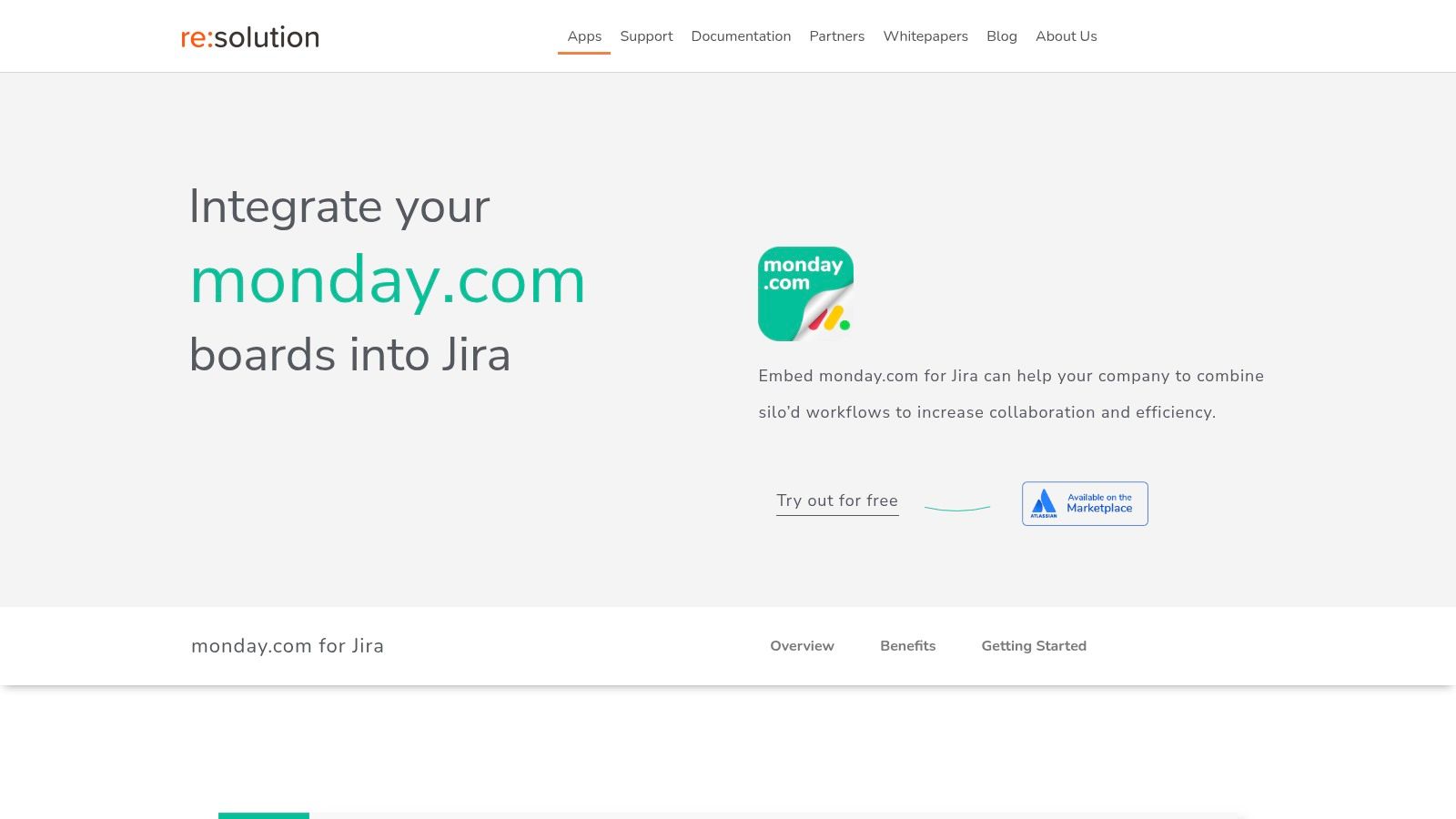
This isn’t just about mirroring data; it’s about embedding interactive monday.com boards directly into Jira issues. This allows a developer to see the full scope of a marketing campaign tied to a specific feature, or a project manager to track bug fixes from their monday.com board without ever having to switch tabs. The result is a dynamic, live dashboard that demolishes information silos and gives every team member unparalleled context.
Strategic Analysis: The Unified Dashboard Advantage
The core strength of resolution’s integration is its ability to create a “single source of truth” dashboard that reflects real-time operations across departments. This approach directly tackles the operational drag caused by data fragmentation.
- Two-Way Synchronization: Updates are not a one-way street. A status change in Jira is instantly reflected in monday.com and vice versa. This bi-directional flow ensures that dashboards are always current, eliminating the need for manual updates and reducing the risk of decisions based on outdated information.
- Cost Optimization: One of the most brilliant strategic moves is the read-only access feature. Stakeholders who only need to view progress don’t require a paid monday.com license. This dramatically cuts down on software overhead, making enterprise-level visibility financially viable for more teams.
- Granular Control: The platform provides customizable permissions and configurable column views. This means you can create a high-level executive dashboard showing only key milestones while simultaneously providing a detailed, task-oriented view for the development team, all from the same integrated data source.
Actionable Takeaways & Replicable Strategies
How can you leverage this for your own projects? Start by identifying your biggest cross-team communication bottleneck. Is it the marketing team waiting on development updates? Or is it operations struggling to track support ticket resolutions?
- Embed for Context: Use the embed feature to place relevant monday.com project boards inside your most critical Jira epics. This gives developers immediate access to the “why” behind their work, fostering a more engaged and informed team.
- Automate Reporting: Leverage the synced data to build automated progress reports and dashboards within monday.com. This frees up project managers from the tedious task of chasing down updates, allowing them to focus on strategy. For deeper insights, you can learn more about optimizing project progress reporting.
- Implement a Phased Rollout: Start with a single cross-functional team as a pilot. Use their experience to create best-practice templates for dashboards and workflows before expanding the integration across the organization.
The integration is available for a free trial on the Atlassian Marketplace, making it easy to test its capabilities. While it requires subscriptions to both Jira and monday.com, the value it delivers in productivity, transparency, and cost savings on licenses presents a compelling and strategic investment for any organization aiming for true operational synergy.
2. Smartsheet
If you’ve ever stared at a blank screen, paralyzed by the sheer thought of building a project dashboard from scratch, Smartsheet is your new best friend. It’s less of a single tool and more of a massive, pre-built Lego set for project managers. Instead of giving you a blank canvas, it offers a vast library of free, industry-specific templates that get you 90% of the way there on day one.
What makes Smartsheet stand out among other project dashboard examples is its focus on accessibility and practicality. It’s designed for the “accidental project manager,” the person who needs to visualize data now without learning a complex new software ecosystem. Its user-friendly interface feels familiar, almost like a spreadsheet on steroids, which significantly lowers the learning curve.
Strategic Breakdown & Key Features
Smartsheet’s core strength lies in its template-driven approach. You can find ready-made dashboards for everything from construction project management and IT ticket tracking to marketing campaign performance.
- Diverse Template Library: Access free dashboards for specific use cases, ensuring you start with relevant KPIs and layouts.
- Real-Time Visualization: Charts and graphs update automatically as the underlying data in your Smartsheet grid changes.
- Microsoft Integration: It plays nicely with tools you already use. You can easily integrate with Excel and PowerPoint, making it simple to pull data and create presentations for stakeholders.
Key Insight: Smartsheet excels by removing the initial friction of dashboard creation. By providing structured, industry-vetted templates, it allows teams to focus on inputting their data and gaining insights, rather than on design and configuration.
Actionable Takeaways & Tips
To get the most out of Smartsheet, dive into the templates. Don’t just pick the first one you see; explore the options for your specific industry. Customize a template by adding your company logo and tweaking the color scheme to match your brand.
While the free version and templates are powerful, remember that advanced features like automated workflows and more complex integrations are part of the paid plans. A great strategy is to start with a free template to prove the concept and demonstrate value before seeking a budget for a subscription. By mastering the art of connecting your data sources, you can create a truly dynamic and responsive dashboard. To dive deeper into how platforms like this fit into a larger ecosystem, you can learn more about the essentials of project management integration.
Website: Smartsheet Project Dashboard Templates
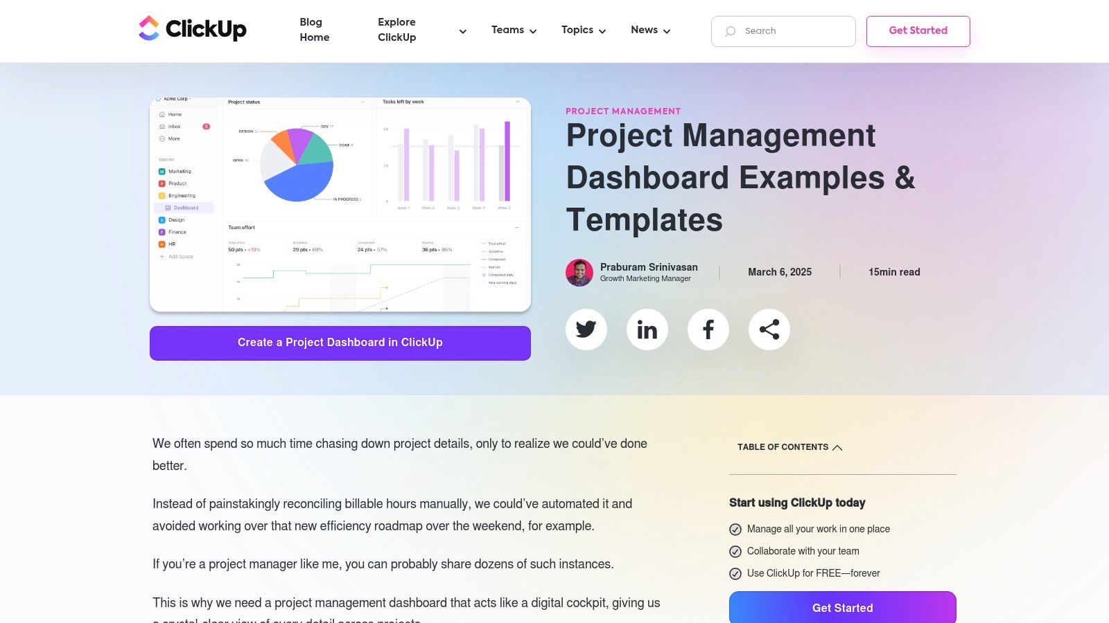
3. ClickUp
If Smartsheet is a pre-built Lego set, ClickUp is the box of assorted bricks with limitless potential. It’s a hyper-customizable powerhouse designed for teams that want to build their project dashboard exactly how they envision it, no compromises. ClickUp ditches the one-size-fits-all approach for a versatile, drag-and-drop widget system that lets you craft a command center tailored to your team’s unique workflow.
What makes ClickUp a standout among project dashboard examples is its all-in-one philosophy. It aims to be the single source of truth for your entire project lifecycle, from initial brainstorming to final reporting. While its extensive feature set can present a steeper learning curve, its intuitive design and regular updates make it an incredibly powerful tool for teams of any size, especially those who feel constrained by more rigid platforms.
Strategic Breakdown & Key Features
ClickUp’s strength lies in its modularity. You aren’t locked into a specific layout; instead, you build your view using “widgets” that pull real-time data from your projects. This allows you to create dashboards for high-level portfolio overviews, granular sprint tracking, or team workload management.
- Drag-and-Drop Widgets: Build your dashboard with custom charts, task lists, workload views, and embeds from other apps.
- Real-Time Collaboration: Dashboards are living documents. See updates from your team instantly and add chat widgets to discuss progress without leaving the view.
- Third-Party Integrations: Connect with dozens of other applications, allowing you to pull in data from Slack, GitHub, and more to create a truly unified hub.
Key Insight: ClickUp’s power is in its adaptability. It empowers teams to create a visual language that matches their specific processes, rather than forcing them to adapt to a pre-defined structure. This makes it ideal for dynamic, cross-functional teams with evolving needs.
Actionable Takeaways & Tips
Start by identifying the one or two most critical questions your dashboard needs to answer. Is it “Who is overworked?” or “Are we on track to hit our deadline?” Build your first dashboard around answering only those questions. Its robust free plan is more than enough to get started and prove its value.
Don’t be afraid to experiment with different widgets and layouts. The beauty of ClickUp is that you can easily clone and modify dashboards for different audiences, like stakeholders or individual teams. By mastering its widgets, you can build a highly effective system for mastering collaborative work management. Remember that some of the most advanced widgets and reporting features are part of the paid plans, so focus on mastering the core functionalities first.
Website: ClickUp Project Dashboard Examples
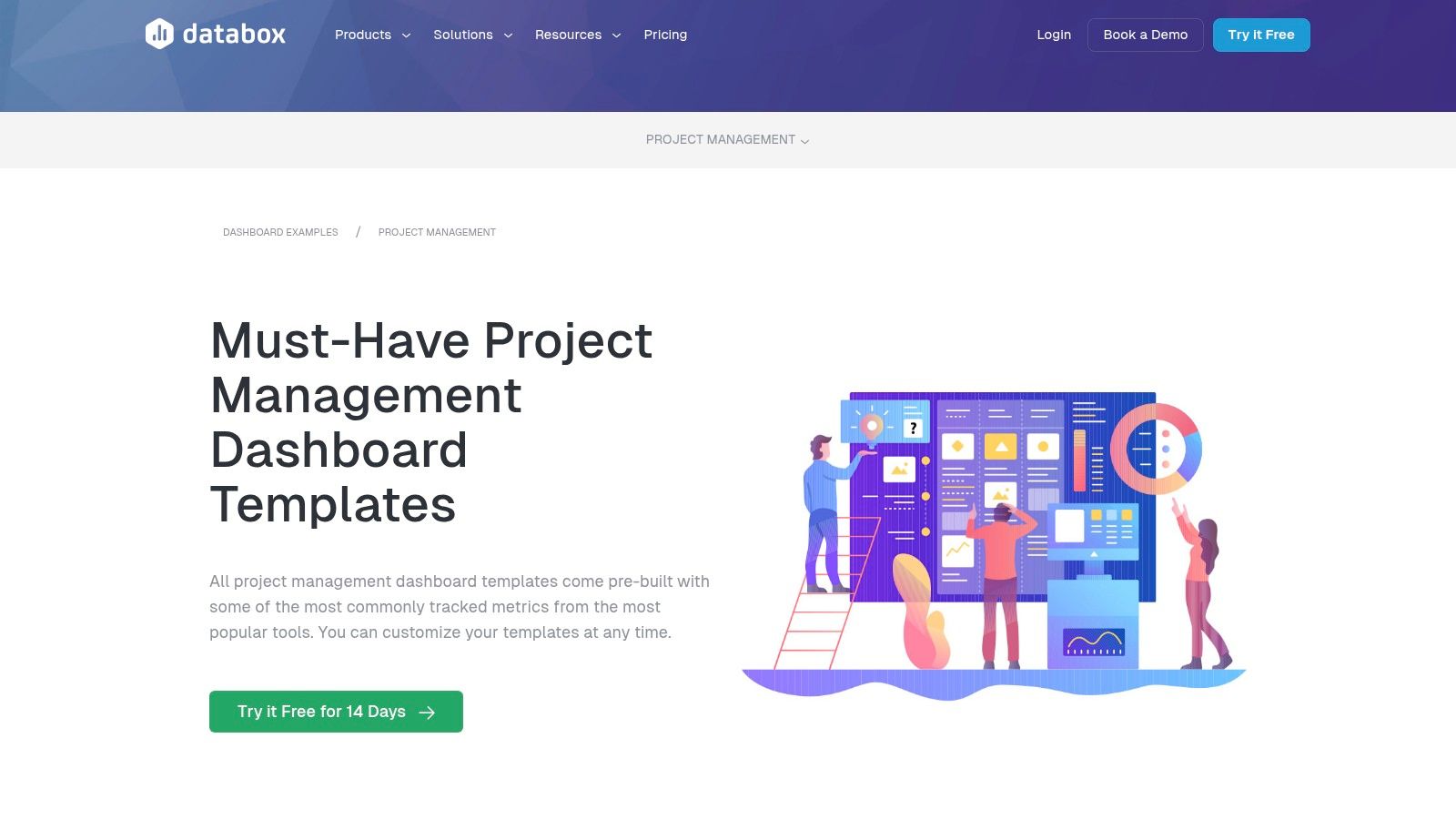
4. Databox
If you believe that data should be beautiful, accessible, and instantly understandable, then Databox is the project dashboard for you. It’s designed for the modern manager who lives and breathes data and needs to see performance metrics from multiple sources in one streamlined view. Instead of locking you into a single ecosystem, Databox acts as a central hub, pulling information from tools like Asana, Jira, and Harvest into a single, visually stunning dashboard.
What makes Databox a leader among project dashboard examples is its powerful integration engine combined with its user-friendly, drag-and-drop customization. It’s built for teams that need to connect the dots between task completion, time spent, and overall project budget without writing a single line of code. Its mobile-first design also ensures you can check on project health from anywhere, whether you’re in a boardroom or grabbing coffee.
Strategic Breakdown & Key Features
Databox’s strength is its ability to aggregate and visualize data from over 70 different platforms, transforming siloed metrics into a cohesive narrative. It empowers managers to build dashboards that answer specific strategic questions about team productivity and project profitability.
- Broad Integration Library: Connect seamlessly with popular project management, finance, and marketing tools to create a comprehensive overview.
- Customizable Visualizations: Go beyond standard charts. Mix and match metrics, set custom goals, and use a variety of visualization types to tell your project’s story.
- Mobile-First Accessibility: Access fully functional, real-time dashboards on your phone or tablet, ensuring you never miss a critical update.
Key Insight: Databox excels by making sophisticated data aggregation simple. It democratizes business intelligence, allowing managers without a data science background to build powerful, multi-source dashboards that drive smarter, faster decisions.
Actionable Takeaways & Tips
Start by connecting just one or two of your most-used data sources, like Asana or Jira. Use one of Databox’s pre-built templates to get a feel for the platform before building a custom dashboard from scratch. Customize the widgets to track the KPIs that matter most to your specific project, such as “Tasks Completed vs. Overdue” or “Budget vs. Actuals.”
While the free plan is a great entry point, it has limitations on the number of data sources and dashboards. To unlock its full potential, you’ll need a paid plan. Use the free version to build a compelling business case, demonstrating how a centralized dashboard can improve project oversight. By mastering these tools, you can champion a culture of data-driven decision-making within your team.
Website: Databox Project Management Dashboards
5. ClicData
For those who dream of a central command center that pulls data from every corner of their digital universe, ClicData is the answer. It’s a powerful, data-centric platform that transforms the complex task of data integration into a streamlined, visual experience. ClicData is built for teams that need to connect the dots between disparate sources, like databases, cloud services, and flat files, to get a true 360-degree view of project health.
What makes ClicData one of the most robust project dashboard examples is its impressive data connectivity and automation capabilities. It moves beyond simple project tracking to become a full-fledged business intelligence tool. Its drag-and-drop designer empowers you to craft highly customized dashboards, while its automated data refresh ensures your metrics are always up-to-date, eliminating manual report pulling forever.
Strategic Breakdown & Key Features
ClicData’s power lies in its ability to unify and automate your data ecosystem. It’s designed for managers who need reliable, real-time insights without having to chase down information from a dozen different platforms.
- Broad Data Connectivity: Integrate with hundreds of data sources, including SQL databases, Google Analytics, social media platforms, and cloud storage services.
- Drag-and-Drop Designer: Build bespoke dashboards from the ground up without writing a single line of code, tailoring every widget to your specific KPIs.
- Automated Data Refresh & Alerts: Schedule data updates to run automatically and set up alerts to notify you when key metrics hit critical thresholds.
Key Insight: ClicData excels by treating data as the central nervous system of project management. Its strength is not just visualization but the entire data pipeline, from connection and cleansing to automated reporting, making it a scalable solution for data-driven organizations.
Actionable Takeaways & Tips
To leverage ClicData effectively, start by mapping out all your project data sources. Identify where your budget, timeline, and resource information lives, and use ClicData’s connectors to bring it all into one place. This initial setup is crucial for creating a single source of truth.
While the platform is incredibly powerful, its extensive features can present a learning curve for non-technical users. Begin by using one of their pre-built project management templates to get a feel for the interface before diving into a fully custom build. As you grow more confident, explore advanced features like data transformations to clean and prepare your data for more accurate insights. To master the art of creating visually effective reports, you can get up to speed on the fundamentals of dashboard design best practices.
Website: ClicData Project Management Dashboards
6. DashThis
If your project lives and breathes based on marketing performance, then DashThis is the reporting powerhouse you need. While it’s built from the ground up for marketing agencies and professionals, its slick, automated approach to data visualization makes it a surprisingly strong contender for any project tied to campaign metrics. It’s designed for teams who need to translate complex data into clean, client-ready reports without spending hours wrestling with spreadsheets.
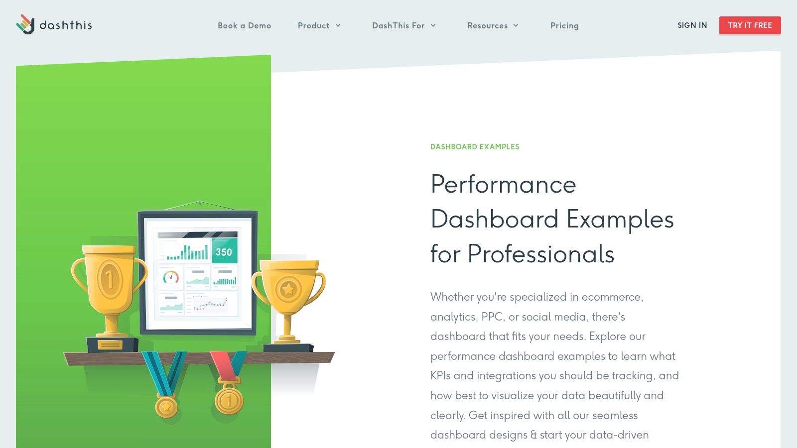
What makes DashThis one of the more unique project dashboard examples is its unwavering focus on automation and simplicity. It excels at connecting to all your marketing data sources (think Google Analytics, Facebook Ads, SEMrush) and pulling everything into one cohesive view. This is perfect for campaign managers who need to track progress against marketing KPIs, blending project milestones with real-time performance data.
Strategic Breakdown & Key Features
DashThis streamlines the process from data connection to final report. Its strength isn’t in task management but in performance reporting, which is a critical component of many modern projects. It automates the tedious work of data gathering so you can focus on analysis.
- Effortless Integration: It connects with over 40 popular marketing tools, consolidating your data streams with just a few clicks.
- Automated Reporting: Schedule daily, weekly, or monthly reports to be sent automatically to stakeholders, keeping everyone informed without manual intervention.
- Customizable Widgets & Templates: Start with pre-built templates for SEO, PPC, or social media and customize them with widgets to show the exact project metrics you need.
Key Insight: DashThis shines by treating marketing reporting as the project. It understands that for many teams, the “project” is the campaign, and success is measured by clicks, conversions, and ROI, not just tasks completed. This focus makes it incredibly effective for its niche.
Actionable Takeaways & Tips
To leverage DashThis for project management, think of your project phases as campaigns. Use custom widgets to track non-marketing metrics by integrating with a tool like Google Sheets, where you can manually update task progress or budget data. This hybrid approach lets you keep everything in one dashboard.
While DashThis is user-friendly, its pricing is tiered based on the number of dashboards you need, starting from a higher price point than some generalist tools. A smart move is to use their 15-day free trial to build a proof-of-concept dashboard for a single, high-impact project. Demonstrate the value of automated, real-time reporting to stakeholders to justify the investment.
Website: DashThis Dashboard Examples
7. Klipfolio
If other dashboard tools are like pre-built Lego sets, Klipfolio is the massive bin of loose, specialized Lego bricks for the data-obsessed project manager. It’s designed for teams who don’t just want to see their data; they want to interrogate it under a bright lamp. Klipfolio empowers you to pull information from virtually anywhere and build a command center that visualizes every pulse of your project in real time.
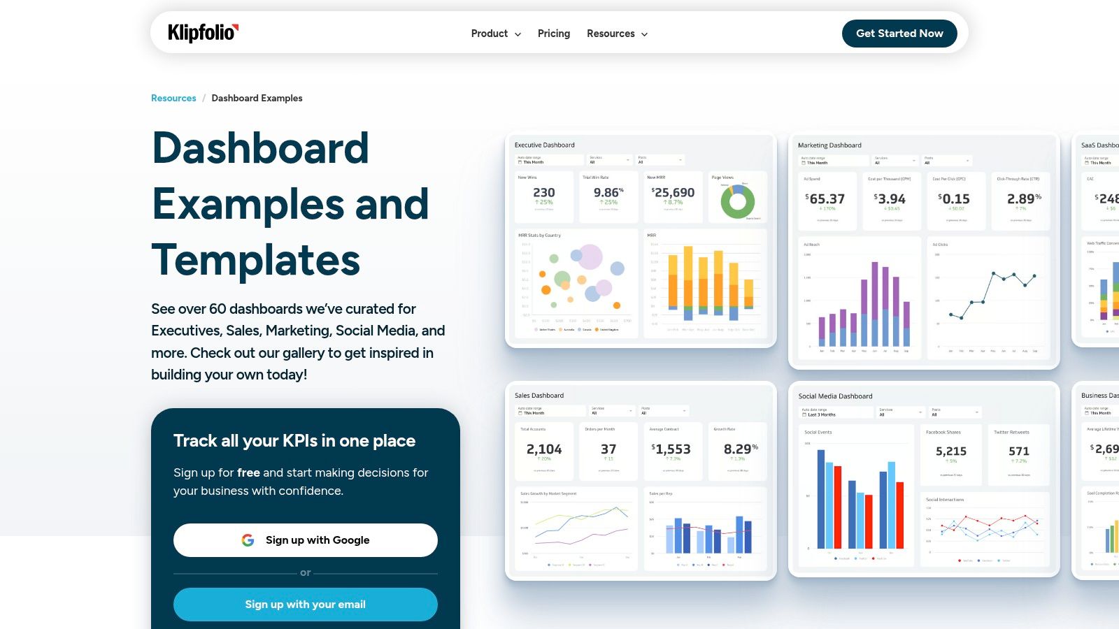
What makes Klipfolio a unique entry among project dashboard examples is its unwavering focus on data connectivity and real-time monitoring. While other platforms simplify, Klipfolio provides power and granularity. It’s the ideal choice for data-driven teams that need to blend metrics from diverse sources-think project management software, financial tools, and customer support systems-into a single, cohesive view. The learning curve can be steeper, but the payoff is a dashboard that is truly bespoke to your operational needs.
Strategic Breakdown & Key Features
Klipfolio’s strength isn’t just in its templates but in its powerful data-modeling engine. It allows you to transform and combine data before it even hits a chart, giving you unparalleled control over your KPIs.
- Extensive Data Integrations: Connect directly to hundreds of data sources, including Google Analytics, Salesforce, and Trello, to create a holistic project overview.
- Customizable Visualizations: Go beyond standard pie charts with a vast library of pre-built visualizations (“Klips”) that you can tailor to your exact specifications.
- Real-Time Data Updates: Dashboards can be set to refresh as frequently as every minute, ensuring your team is always acting on the most current information.
Key Insight: Klipfolio shines by treating data as a first-class citizen. Its platform is architected for flexibility, allowing you to manipulate and blend data from multiple services to create metrics that other tools simply can’t.
Actionable Takeaways & Tips
To leverage Klipfolio effectively, start by mapping out your key data sources. Identify the most critical metrics from each platform before you even start building. Use their pre-built integrations to get started quickly and then explore the custom data source connectors for more advanced use cases.
While the platform is powerful, the pricing model and potential need for a data-savvy team member mean it’s not for everyone. A good strategy is to use their free tier to connect a couple of core services and build a proof-of-concept dashboard. Demonstrate the value of a centralized, real-time data hub to stakeholders before committing to a paid plan, which offers more dashboards and faster data refresh rates.
Website: Klipfolio Dashboard Examples
Project Dashboard Tools Comparison
| Solution | Implementation Complexity | Resource Requirements | Expected Outcomes | Ideal Use Cases | Key Advantages |
|---|---|---|---|---|---|
| resolution Reichert Network Solutions GmbH (monday.com for Jira) | Moderate; requires integration of two platforms | Requires active monday.com and Jira licenses | Real-time two-way sync, reduced license costs | Cross-functional teams needing unified workflows | Seamless sync, stakeholder read-only access, customizable permissions |
| Smartsheet | Low; ready-to-use templates | Minimal; mainly template usage | Accessible project tracking and visualization | Teams needing simple dashboards with Excel/PowerPoint integration | User-friendly, free templates, strong community |
| ClickUp | Moderate to High; highly customizable | Requires learning and possible paid plans | Robust project tracking & workload management | Teams needing versatile, customizable dashboards | Highly customizable, extensive integrations, collaborative |
| Databox | Low to Moderate; mostly setup/connection | Minimal technical setup, mobile access | Real-time analytics and mobile-friendly insights | Professionals wanting easy setup and strong analytics | Easy setup, strong visualization, mobile dashboards |
| ClicData | Moderate; drag-and-drop with data integration | Higher resource use for extensive data sources | Real-time progress tracking, automated alerts | Businesses needing scalable, data-connected dashboards | Highly customizable, broad data connectivity, scalable |
| DashThis | Low; pre-built marketing templates | Minimal; focus on marketing integrations | Simplified reporting and easy visualization | Users wanting quick setup and automated reports | User-friendly, automated reporting, responsive support |
| Klipfolio | Moderate to High; technical customization | Technical expertise recommended | Real-time monitoring, data-driven decisions | Teams prioritizing deep data visualization | Extensive visual library, flexible, strong community support |
Your Blueprint for a Perfect Project Dashboard
And there you have it, a grand tour through the wild and wonderful world of project dashboards. We’ve dissected seven prime project dashboard examples, from the all-in-one command centers of Smartsheet and ClickUp to the data-crunching prowess of Databox and ClicData. The mission was to move beyond pretty pictures and dig into the strategic gold hidden within each layout, metric, and widget.
What’s the secret sauce that ties them all together? It’s not about having the most charts or the flashiest colors. The best dashboards are ruthless editors. They answer specific questions for specific people, transforming a chaotic jumble of project data into a clear, compelling story. They are your project’s heartbeat monitor, your early warning system, and your celebration stage, all rolled into one.
From Inspiration to Implementation
So, how do you take this newfound inspiration and forge your own legendary dashboard? It’s not about blindly copying an example. It’s about stealing the principles behind them.
- Start with the “Who” and “Why”: Before you drag and drop a single widget, ask yourself: Who is this for? An executive needs a 30,000-foot view of budget vs. actual. A campaign manager needs to see lead conversion rates. A dev lead needs a real-time sprint burndown chart. Define the audience, define the purpose.
- Choose Your Weapons Wisely: Your dashboard is only as good as the data feeding it. As we saw with the resolution example, creating a unified view is paramount. Tools that integrate systems like Jira and monday.com are no longer a luxury; they are a necessity for a single source of truth. This eliminates the dreaded swivel-chair-integration where you manually patch data together.
- Embrace Visual Storytelling: A Gantt chart tells a story of timelines and dependencies. A resource heatmap reveals who is overbooked and who has capacity. A pie chart can quickly show task status distribution. Select visuals that communicate the answer to your key questions instantly, without needing a decoder ring.
Building Your Action Plan
Feeling ready to build? Good. Don’t let analysis paralysis set in. Pick one project, one team, and one key objective. Maybe it’s improving on-time delivery or getting a handle on resource allocation.
To further refine your approach, consider how your dashboard will align with your team’s workflow. Understanding different classic project management methods can provide a solid framework, helping you decide whether a Kanban-style board, a traditional waterfall progress tracker, or an Agile sprint overview is the right fit. Your dashboard should support your methodology, not fight against it.
Ultimately, the perfect project dashboard isn’t a static masterpiece. It’s a living, breathing tool that evolves with your project. Start small, gather feedback, and iterate. Take the brilliant ideas from these project dashboard examples, infuse them with your unique project needs, and build the command center that will guide your team to victory.
Ready to eliminate data silos and build a powerful, unified dashboard? See how resolution Reichert Network solutions GmbH can bridge the gap between your development and project management tools. Explore resolution Reichert Network solutions GmbH to seamlessly integrate Jira and monday.com, creating a single source of truth for your next project dashboard.
