Capacity planning is a strong function for technology teams using Jira: managers want to know why important work is delayed, and what can be done to increase productivity. Tracking the impact of absences is not easy with Jira native reporting, and that’s why we have prepared a full toolkit for you, little resource planner!
Tracking absences and their impact on team performance
Doing timesheets in Jira is easy. But knowing what to do when the owner of an initiative is sick wasn’t obvious until now.
In this article we will look into how you can build a capacity planning dashboard in Jira that keeps track of absences and their impact. This is a very important aspect of resource management, and one that is overlooked in the educational materials that I have seen on how to do time and resource management with Jira.
In particular, the article should be useful for teams using Jira Service Management to answer customer requests.
We will use a combination of two apps from the Marketplace: Out of Office Assistant for Jira and Custom Charts for Jira. These two apps work seamlessly together: Out of Office provides specific JQL fields and user values, and Custom Charts can report on them.
Ingredient #1: Capture workload and capacity
App: Out of Office Assistant for Jira

When it comes to tracking team capacity, this app can be used for two purposes:
1. Reallocate workload with automated reassignments
First, Out of Office Assistant can automatically delegate work away from absent team members and allocate it to colleagues who are active. Our customers use it for any type of leaves, from temporary projects to vacations or sick days.
Questions you can answer
- Has the issue been taken on by the coverer?
- Is it progressing fast enough?
- How many issues are currently reassigned, and to whom?
- Is the load distributed fairly, or are any coverers drowning in work?
2. Forecast changes in team capacity with a searchable Out of Office status
When a team member is on holiday, sick, or absent for any other reason, the capacity of the team goes down. Out of Office Assistant allows to forecast the impact of time off on team velocity and specific deliverables.
Questions you can answer
- Who is out of office when?
- Which epics are affected by absences this month?
- How many story points are at risk this sprint?
- Are any customers waiting for an agent that is currently inactive?

Ingredient #2: Build dynamic dashboards
App: Custom Charts for Jira
Custom Charts for Jira lets users build all kinds of charts directly on their Jira dashboard using a single gadget. In a few clicks you can create pie charts, bar charts, funnel charts, tile charts, line graphs, and tables. To better understand how your data is distributed, you can add a second variable and make a 2D stacked bar chart, line graph, or table. Customization options include the ability to change colors and labels, show/hide data points, and reorder segments.
You can also filter your charts down with Simple Search, or add a list of Jira issue details Issue List. Both Issue List and Simple Search are additional gadgets that come free with Custom Charts.
Get help for building your own dashboard
The JQL queries that are used throughout the article are rather simple, but navigating through all the available options to capture the right insights can be challenging. Our team is here to assist, you don’t have to do it alone!
Other Ingredients for a winning resource management function in Jira
There are many other aspects of capacity planning and resource management that we will not touch on. However, if you want to complete the gadgets included in this article and get an even better overview of how you can do capacity planning in Jira, we can recommend the following resources:
- Start with this Capacity Planning Playbook by Atlassian
- Continue with how to do Capacity Planning in Advanced Roadmaps
- Take a deep dive into Tempo Planner’s webinar series
- Read this project manager’s take on Jira pitfalls for resource management
Keep reading about Out Of Office
Monitoring the workload of historic reassignments
It’s not a surprise that delegating issues to what we call “coverers” is the most popular productivity trick in Out of Office Assistant. Having your back covered while you can’t work is such a relief!
Every issue reassigned by Out of Office Assistant can be tracked with this simple JQL:
assignee CHANGED BY "59fb203e1c0767667b2ce0ad"
Where the value 59fb203e1c0767667b2ce0ad is the ID associated with the Out of Office app. This ID is constant for every instance, so write it down.
And every gadget in the workload monitoring section is a variation of that same JQL.
Without any additional parameters, the query returns a list of every issue that has been reassigned by Out of Office to a different assignee (including Unassigned). It might be good enough for initial users, but as soon as you start getting hundreds of results, filtering becomes necessary.
If you’re already there, we have some interesting ideas on how to segment that information further so that you don’t drown in the data.
1- Basic workload dashboard
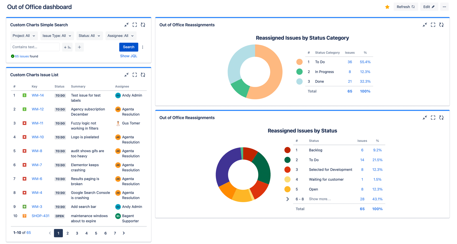
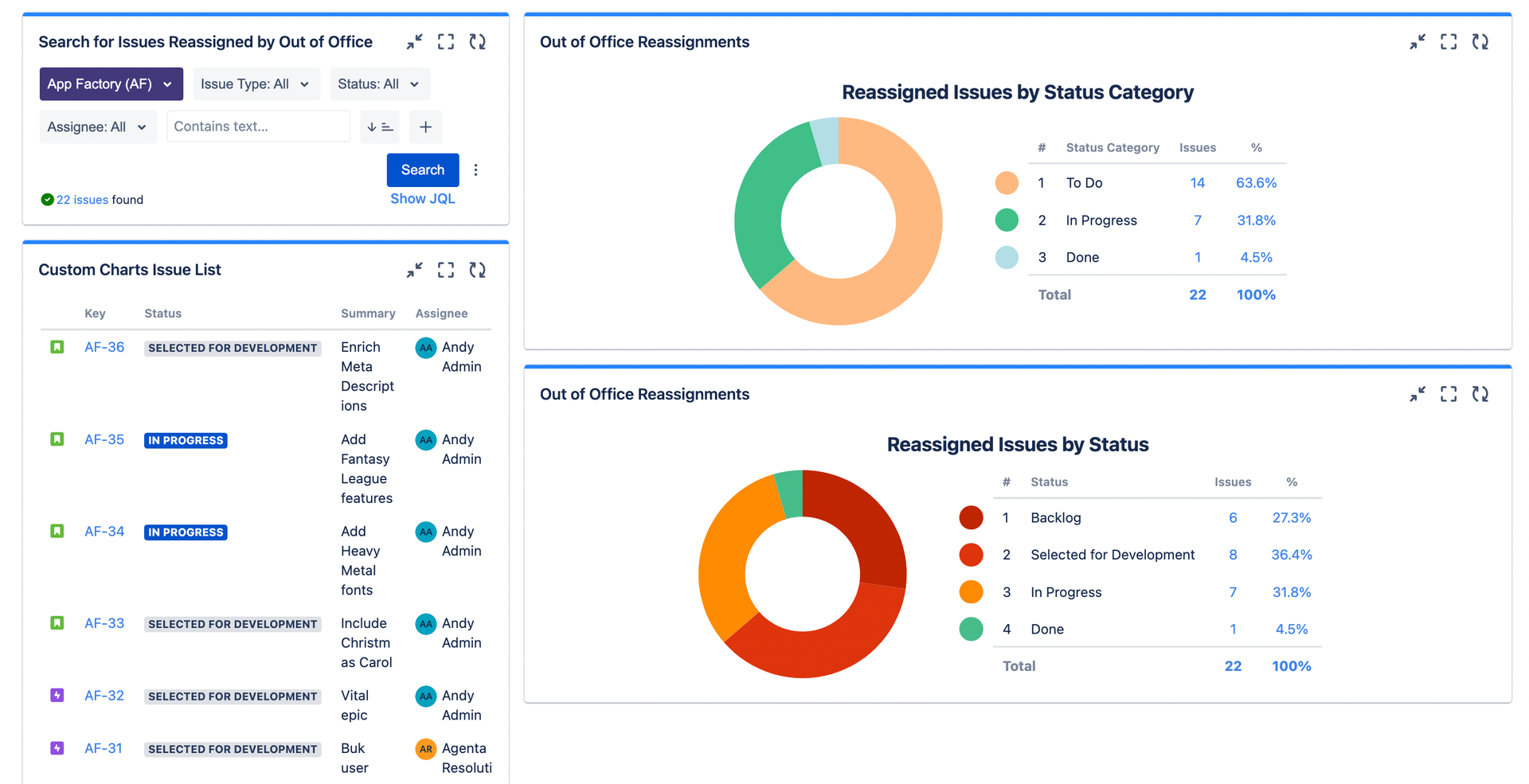
I’ve decided to lead with four gadgets, which is a bit of a cheat. However, all four gadgets are based on the basic query assignee CHANGED BY "59fb203e1c0767667b2ce0ad" and simply show different angles of the same data.
This is a bare minimum that I would recommend to everybody when starting their workload dashboard. The four gadgets are:
- A list of every reassigned issue for details. Play with the columns, and you have every piece of information in front of you.
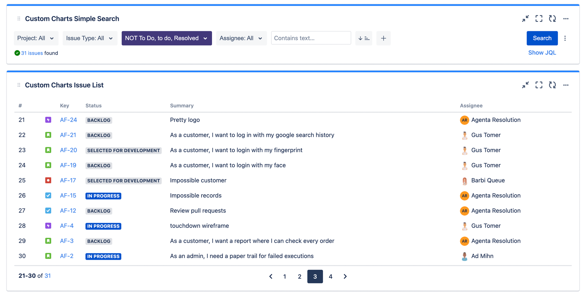
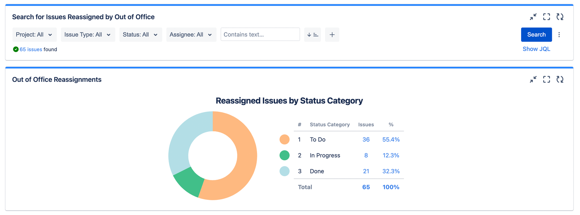
A pie chart with the status category for the big picture. The status category breaks issues into only three buckets: To Do, In Progress, and Done. This gives a quick overview of whether sufficient issues have been completed by coverers, or whether they are still being processed.
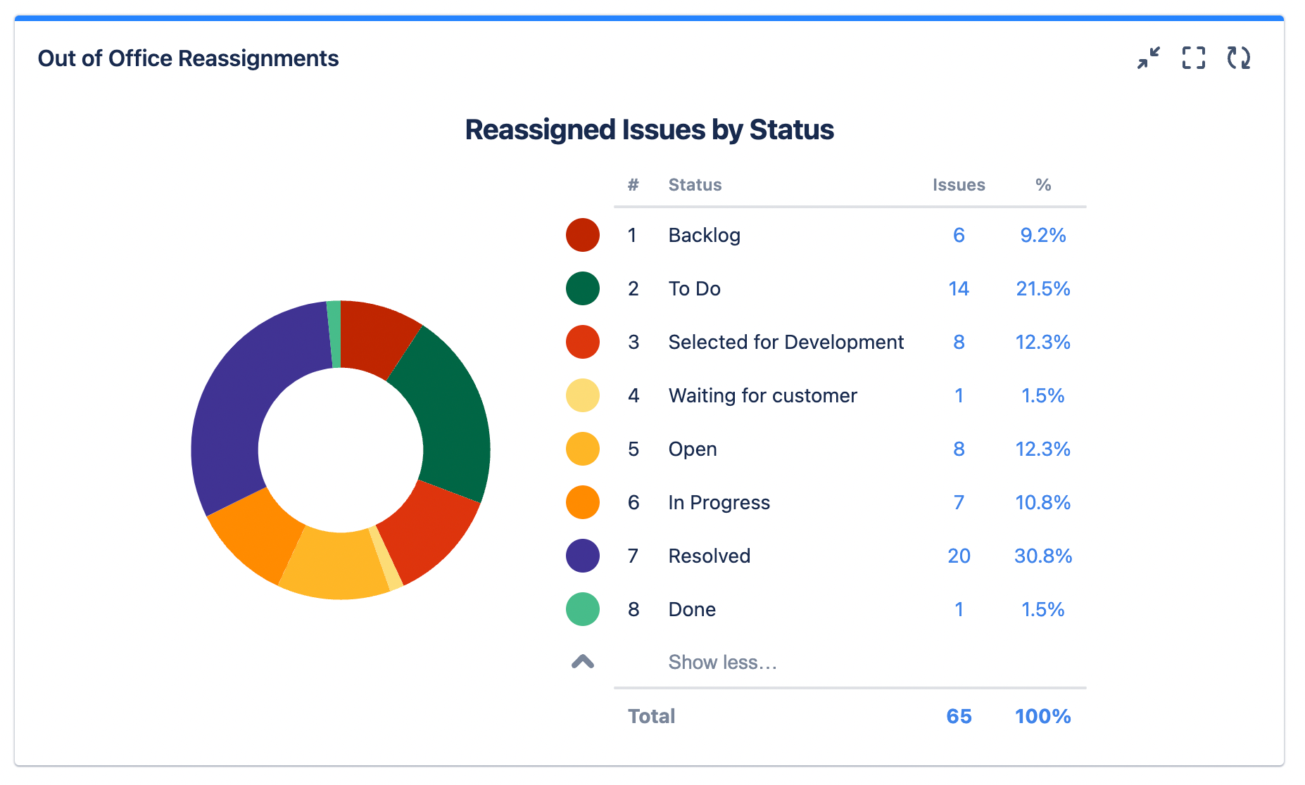
- A pie chart with the specific status for better insights. Same information, but with more details. Sometimes two statuses in the same Status Category can mean very different things.
For example, let’s pick two statuses in the category To Do. It’s fine to have many reassigned issues in the Backlog waiting to be prioritized, but if too many are Selected for Development, it might mean that your team doesn’t have the right velocity. It might also be a signal that your coverers are missing the notifications and don’t know that any issues have been reassigned to them.
- A simple search gadget for filtering. The filters in the search gadget apply to as many gadgets as you link to it (in this case, three). That makes it a very effective way to explore issues by multiple dimensions, and seeing what the linked gadgets show.
For example: as a project lead, I only care about the reassignments within my team. This means that I can filter by the project App Factory and ignore everything else. Or I can drill down even more, looking into specific statuses or assignees.
How to build these charts:
As already mentioned, both charts and the issue list are based on the query assignee CHANGED BY "59fb203e1c0767667b2ce0ad" . The only difference between the two pie charts is how issues are grouped.
Have a look at this video tutorial to learn how to connect a Simple Search gadget to any number of custom chart gadgets.
Bonus: Report Workload Changes with Story Points, not issues.
Until now I have reported the total amount of issues for each group. You can also select different metrics, like the total story points that have been shifted between users. This could be a better unit for measuring effort and shifted workload. Particularly, if there is a lot of context switching, the sheer number of issues may not give you an idea of how complex it is to deliver everything.
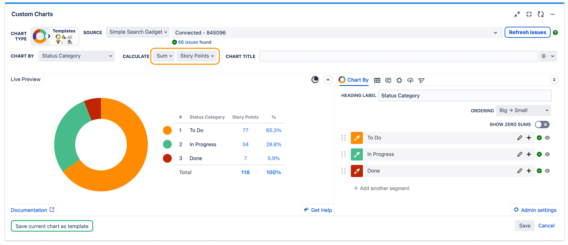
How to build this chart:
Use the assignee CHANGED BY "59fb203e1c0767667b2ce0ad" query (or connect the chart to the search gadget), and select the Sum of Story Points in the CALCULATE section of the gadget configuration.
2. Coverers leaderboard – Who has the least capacity?
Let’s switch gears now. We have been reporting on issues, but workload and capacity planning are all about the people doing the work.
Seeing which users are getting more work reassigned to them should give you a very quick idea of whether your team workload is balanced or not.
In the case below, it’s quite clear that there’s no balance! Poor Bagent is doing most of the heavy lifting, and I’m quite sure that many customers will be waiting for long before he’s able to clean up his queue!
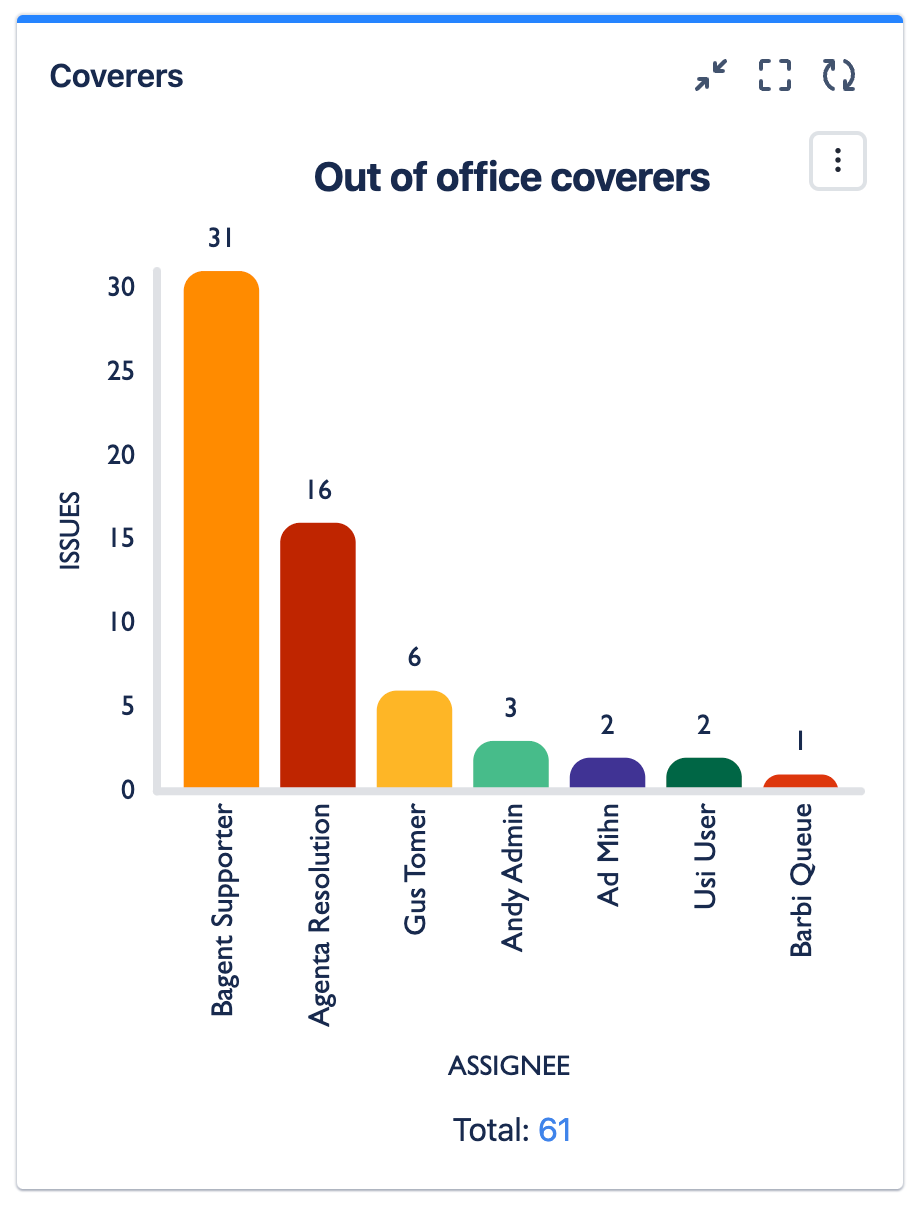
How to build this chart:
Use the basic assignee CHANGED BY "59fb203e1c0767667b2ce0ad", then choose Assignee in the Chart By field.
3. Reassignment paths from creators
When you adopt automatic reassignments, it can happen that a single user becomes the coverer for multiple colleagues in multiple work streams. This is the perfect definition of a bottleneck and a single point of failure. Case in point:
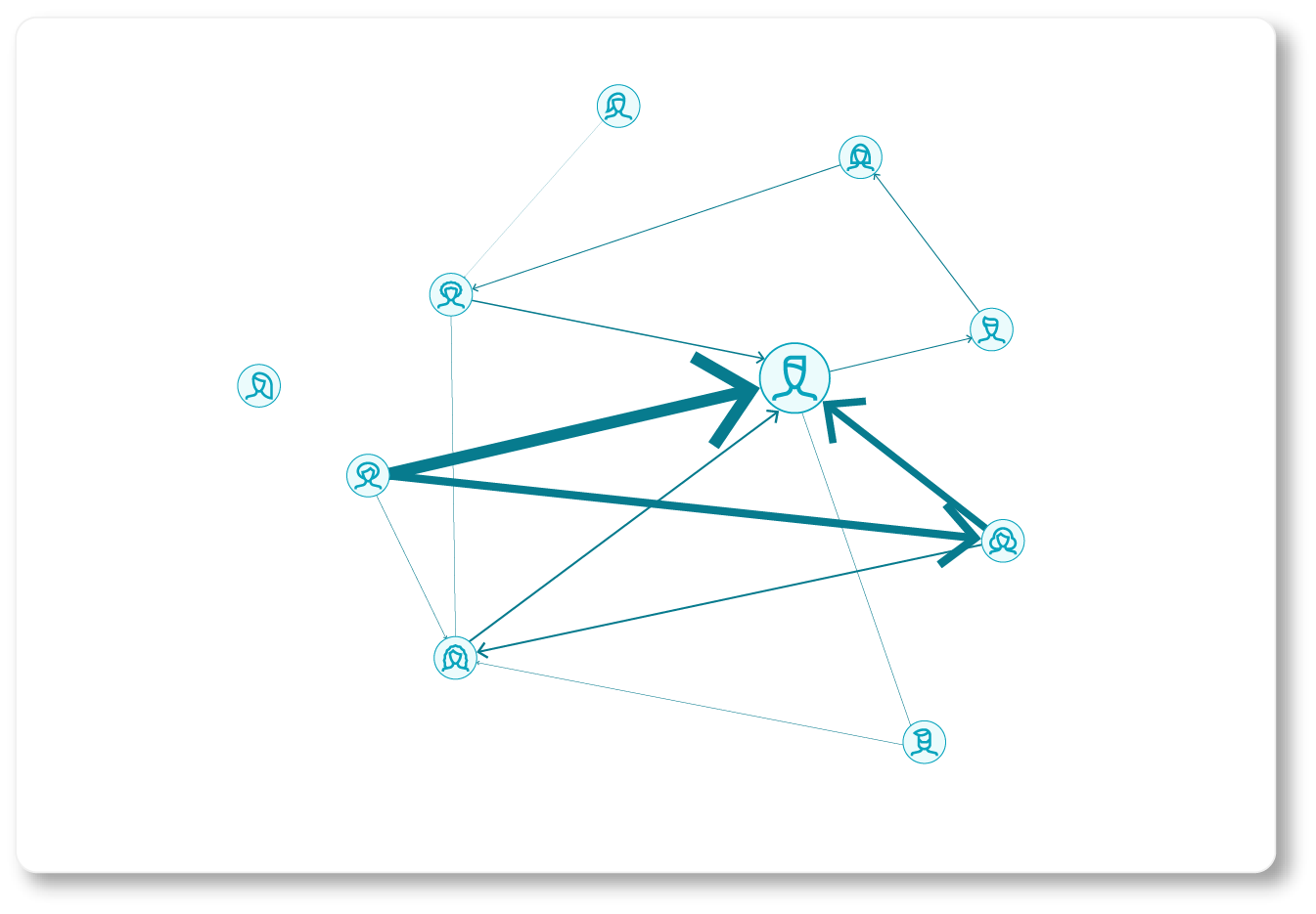
So who’s guilty of dumping all that work on poor Bagent? The answer is not easy.
- It could be the reporter’s fault. If they fail to see that 1) Gus is on holiday and 2) that Gus’ issues will be reassigned to Bagent, then they may be contributing to transforming Bagent into a bottleneck.
- But it could also be the absentees’ fault. Not because they are away, but because there might have been no coordination in defining who should cover for what. And in the end everyone chooses Bagent as the coverer because he’s the best at what he does. This happens a lot in real life.
How can you know whether it’s one of the above, both, or none? Well, this and the next chart should help!
First, we can look at who created the issues reassigned to our bottleneck (in this case, Bagent Supporter). What we can see is that most of the issues are created by a single customer. Since we can’t really blame the customer, we should examine how the reassignment rules were built for this project.

How to build this chart:
In this case, we have to include the instruction to only fetch issues that are reassigned to a specific user:assignee CHANGED BY "59fb203e1c0767667b2ce0ad" to "{userID of coverer}".
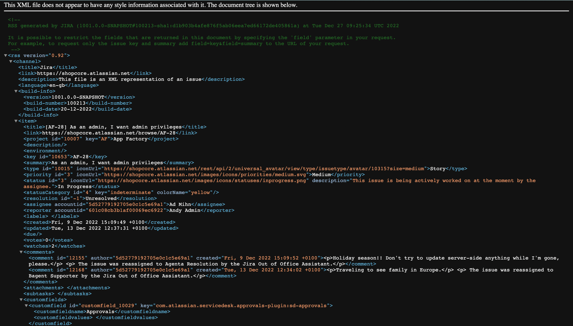
If you’re like me, when you started reading this article you didn’t know how to get a user ID. What worked for me was:
- Finding an issue assigned to (or reported by) the user you want to fetch
- Exporting it in XML
- Opening the XML file and finding the user ID next to the username
4. Reassignment paths from key users
Besides looking at who created the issues, we can also look at how issues are reassigned from a specific assignee.
This is interesting because absent users can create bottlenecks if they decide to reassign all their work to a single coverer. In the example below, we can see that Ad reassigned over 75% of his issues to Agenta.
Had he created rules with multiple coverers every time, the load would have been equally distributed among his entire team.

How to build this chart:
Simply affix “from” to the basic query and follow it with the user ID of the original assignee that you want to examine:assignee CHANGED BY "59fb203e1c0767667b2ce0ad" from "{user ID of original assignee}"
If you don’t know how to find a user ID, follow the steps for the chart #3, right above this one.
5. Reassignment Calendar
This one’s fancy. Until now, the charts only show a total accumulated number of issues. That’s helpful, but it’s quite limited: without knowing when issues are reassigned, it can be hard to judge whether their volume is too high at any given point in time.
One of the charts you can build to better capture trends is a calendar. Now you can judge whether there has been a boom in the usage of the app that coverers may have a hard time keeping up with.
There’s a constraint, though: the Out of Office Assistant doesn’t have a custom field to store the date when the reassignment happened. But depending on your workflow, it might be enough to fetch the creation dates of the issues, as we do in the example.

How to build this chart:
- Use the basic
assignee CHANGED BY "59fb203e1c0767667b2ce0ad - Choose two dimensional tables
- choose Assignee in the Chart By field.
- Choose Creation date in the Group By field
- Configure your desired intervals between daily, weekly, or monthly
6. Reassigned issues – Created vs Resolved
It’s also possible to create a timeline that simply gives the big picture: how many of the reassigned issues have been created vs how many of them have been solved.
If you see a chart like the one below, scream: Houston, we have a problem! Reassigned issues don’t seem to be on anybody’s radar!
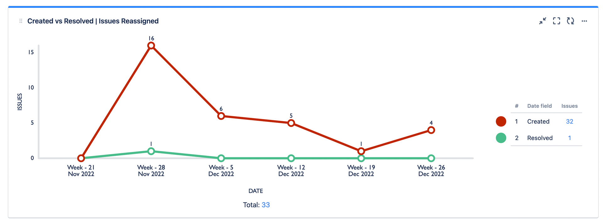
How to build this chart:
Again the same query, after which it’s just a matter of setting the Dates variable in the CHART BY field.
7. SLA time elapsed for issues that have been reassigned
Short attention-span folks, this one’s for you! Simply look at the overall percentage of tickets that have met or breached the time to resolution SLA, and you will know whether reassignments are being dealt with efficiently!

How to build this chart:
Besides the query, just set the CHART BY field to Time to Resolution
In Summary: Covering for others is an art – not a science
When monitoring how workload is reallocated between users, the key idea is to keep a proper balance: no individual capacity should be exceeded if other resources can absorb more work.
Now, this shouldn’t be a recipe for micromanaging assignments. But managers overseeing this data could communicate the bigger picture. The dashboard itself should be enough to point at inefficiencies:
- “We see that Bagent Supporter is getting too much work sent his way”
- “It looks like coverers are not checking their notifications nearly enough.”
Once the problems have been pointed at, it’s easy to tweak the out of office rules for greater efficiency.
Here are some quick wins:
- Substitute single coverers with multiple coverers whenever possible (functional teams are always a great fit for this)
- Make sure that coverers have visibility over their incoming work! Besides notifications, the boards that they use should be customized to show issues from all relevant projects
- Create JQL based rules to divert specific work streams to the most appropriate coverer, instead of having a generic coverer (it’s possible that the same person who can sort deep technical problems is not the right delegate for approving expenses or providing training to new employees).
- Yet another option is to instruct coverers how to triage their incoming work: Some of it will be low prio and can wait, some of it will be better assigned to a different subject matter expert, etc. There’s an art in management and decision making for coverers, who are not necessarily the final owners of every issue they’re assigned to.
Forecast the capacity risks of current and future absences
While reassignments are the most popular feature in Out of Office Assistant, they’re not the only strategy for handling absences. Indeed, it’s perfectly possible to schedule time off without reassigning work. Your team will just have to plan without you.
In this second section we look at how to build a dashboard that helps diagnose the impact of absences and leaves in the company. Once you know how your capacity will change and which pieces of work will likely be delayed, you can adjust your planning and work around those constraints.
The charts in this section query the ooo with conditions like the one below:
assignee.outofoffice.today = 1
…which returns every issue assigned to a user who is Out of office today:
You can also:
- find issues assigned to users who are not out of office
- find issues by the out of office status of the reporter
- query the out of office status in a specific date, or in a time interval in the future
For the specific syntax of the queries and more examples, keep reading in the documentation:
Absence dashboard
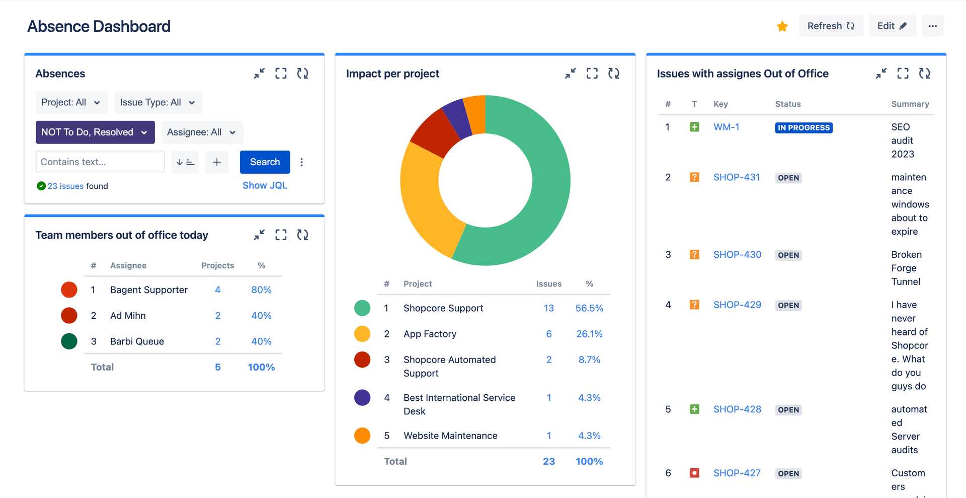
This is what a simple Absence dashboard looks like. The charts that I would always include are:
- The list of team members who are currently out of office.
- The list of issues assigned to those team members, where progress won’t happen today.
- A simple search gadget to segment the data. To start with, I always exclude issues that are done. Depending on what you’re analyzing, you will be excluding or including also issues in To Do.
Let’s go over the details!
8. Issues with assignees out of office
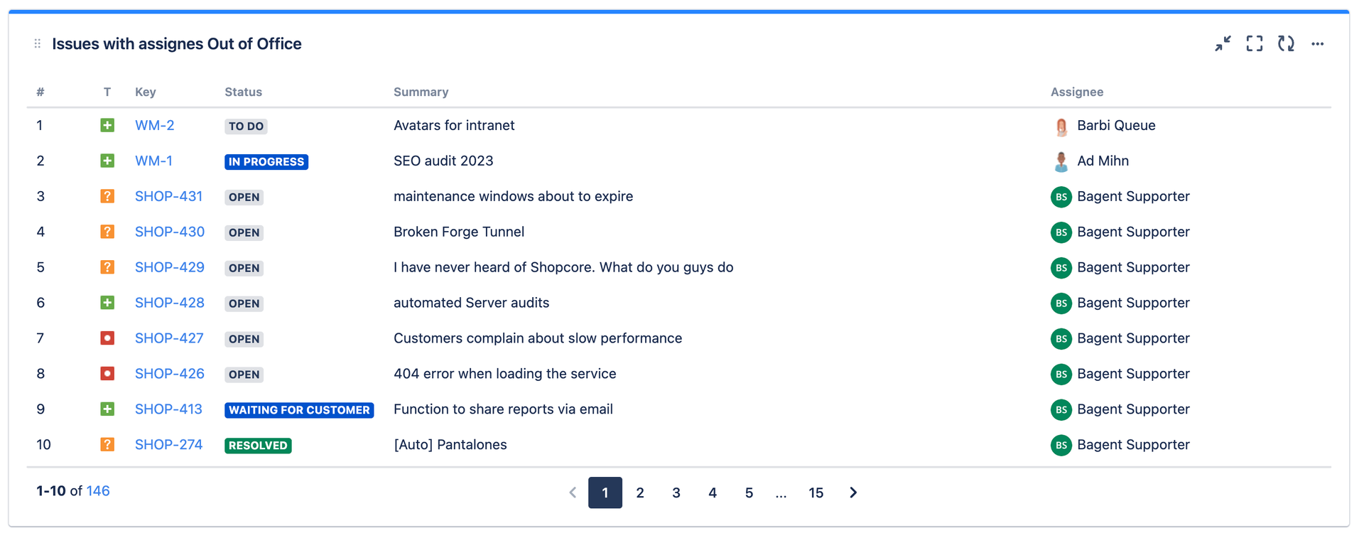
It might look like a basic list, but it’s also quite critical: no progress will happen to any of these issues today. To make results more relevant, you can use queries like assignee.outofoffice.until > endofweek(1), which will give you issues whose assignees will not be coming back before the end of next week. Those are real delays!
How to build this chart:
Simply add a Custom Charts Issue List and use a JQL query like assignee.outofoffice.until > endofweek(1), (or assignee.outofoffice.today= 1 if you want limit it to absences today) as a source.
9. Assignees out of office today

Think as a team lead for a second. Even before creating the meeting appointment to kick off a new initiative, you should check which members of the team are not available today.
You can combine different time formulas for a better overview, since you may want to include a team member in the project if they’re coming back in just a couple of days.
Don’t be afraid to peep outside of the dashboard and have a look at the Out of Office User View for this one!
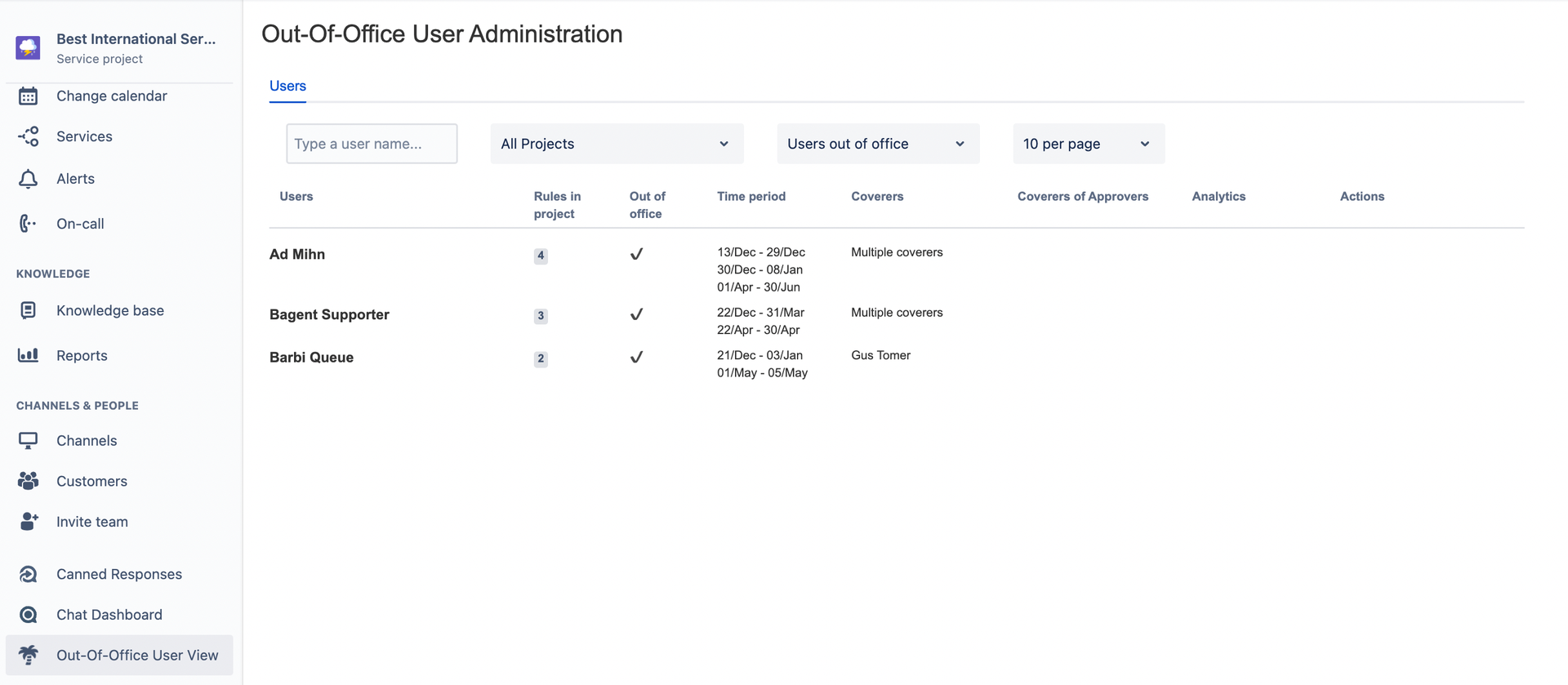
How to build this chart:
Create a custom chart gadget with your own version of the assignee.outofoffice.today = 1 query, then select Assignee in the Chart By field.
10. Story points at risk in the next sprint
Ok, so people are out, but… how much work is actually at risk? How much are we not going to accomplish in this sprint?
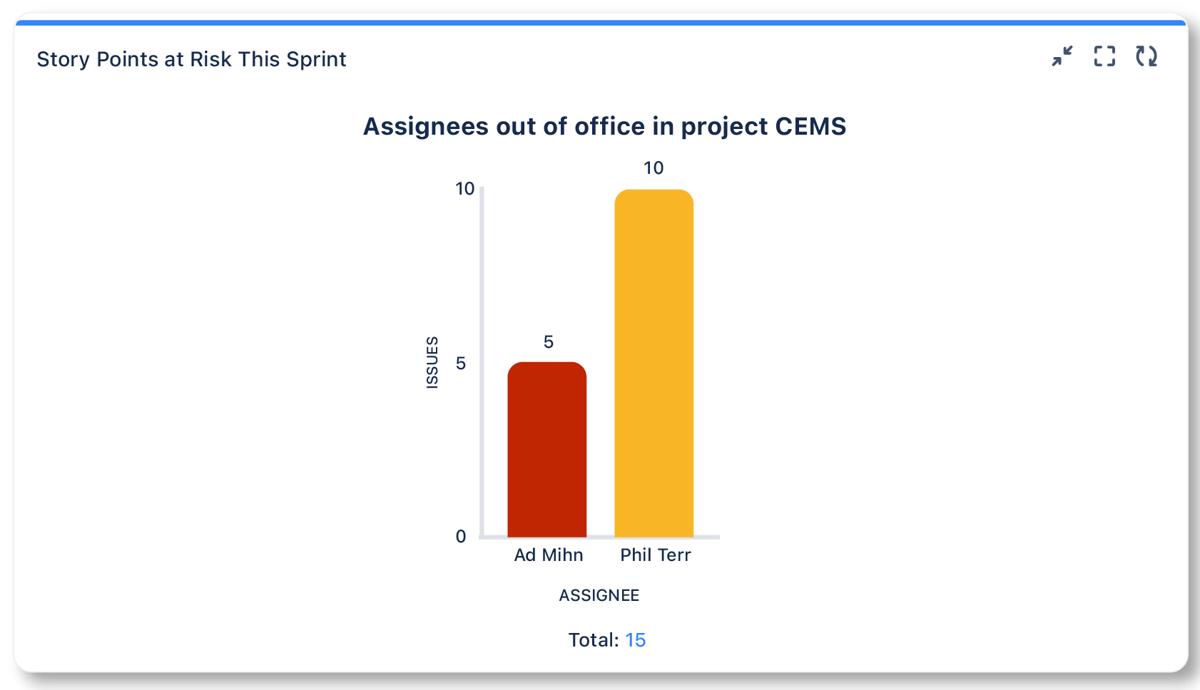
Predicting how much you overcommitted is the second best thing after reaching your goal and nailing the sprint. And honestly, if you have too many team members away, it might be the only realistic thing to do.
This chart can be particularly useful if you’ve just started using sprints and still need to get an idea of what your average velocity is. For more mature teams, looking at the absences upfront before actually committing work to the sprint is usually a better practice.
How to build this chart:
- Make sure every issue assigned to the sprint has story points
- Use the query:
project = "your project" AND sprint in openSprints() AND assignee.outofoffice.today=1 - Select Assignee in the CHART BY field
11. Epics at risk
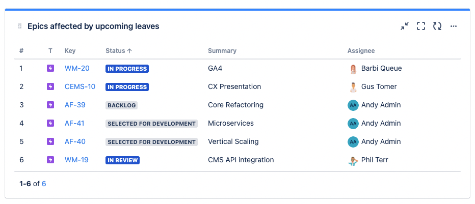
Same idea, but focused on final deliverables and their impact on the business. Looking at how capacity changes in the current sprint is short term. The analysis here is medium term. When will team members be out in the future, and how will their absences affect planned initiatives?
In this case, reshuffling the timing of those initiatives and aligning them to key users should be doable. But this tactical adjustment should definitely not happen every day.
How to build this chart:
- Create a Custom Charts Issue List
- add the query
issuetype=epic AND statuscategory in("In Progress", "To Do") AND assignee.outofoffice.from>=startofday(4d) - adapt the date references and status categories to your needs. It might be interesting to look at entire quarters.
12. Projects with the most impact

For those who enjoy a portfolio level view in Jira. This view can help understand how many of the deliverables are internal vs external, and then find different remedies to it.
When absences are mainly impacting internal projects, for example, it may be easier to just suck it up and accept the delays to put remedy to them.
How to build this chart:
- Select source: Advanced (JQL)
- Type in your desired out of office status query. For example:
assignee.outofoffice.until> endofweek(1) - Select Projects in the CHART BY field
13. Issues waiting for support where the assignee is OoO
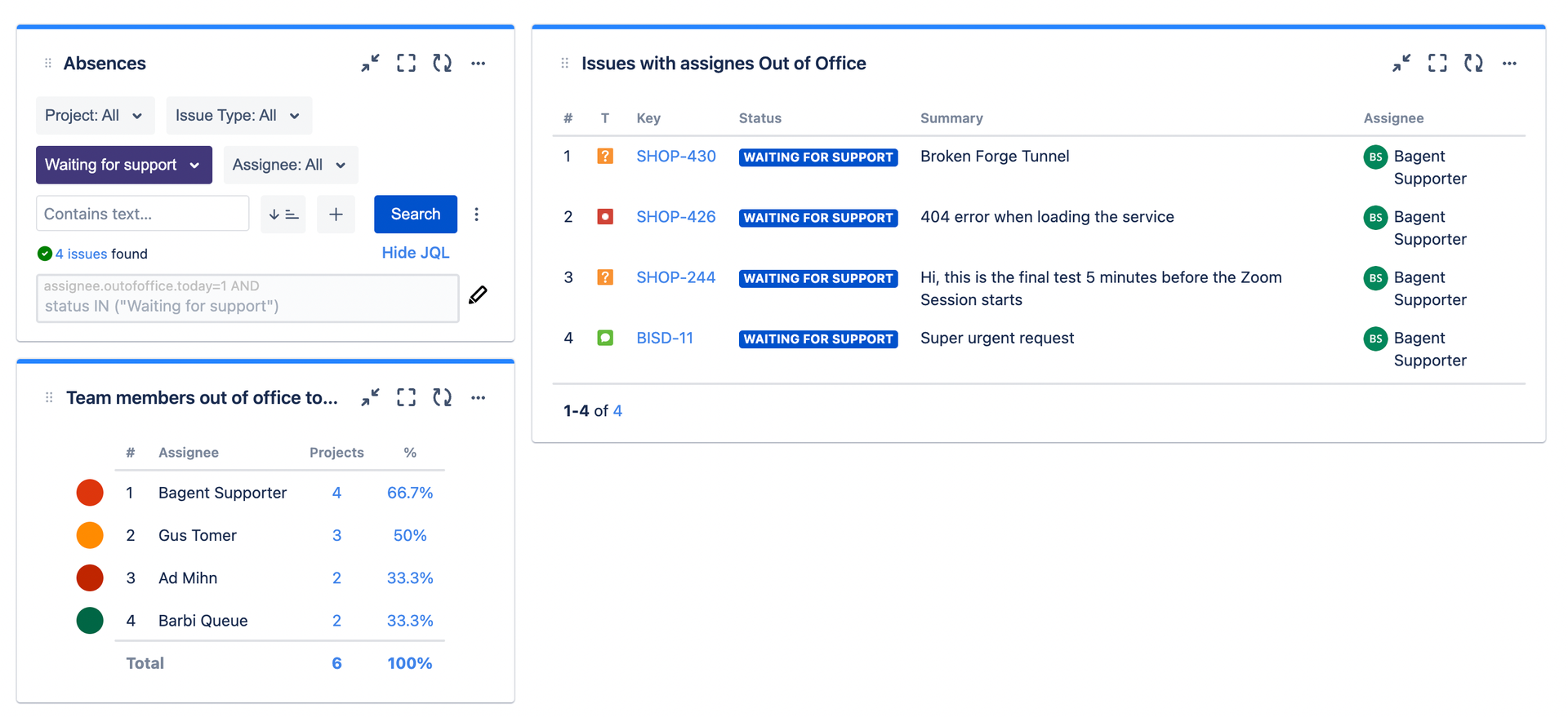
Customers don’t want to wait because your colleagues take time off. Keep a tight eye on tickets that are waiting for an absent support agent, because these should be rather easy to reassign on the go. You may even build a KPI around this and tie it to a clear goal: 0 tickets should be waiting for absent agents.
How to build this chart:
No need to build a different chart for this one if you already have the list of issues at the beginning of this section, and it’s connected to a Simple Search gadget. Simply filter by status and select “waiting for support”.
14. Issues delivered where the reporter is OoO
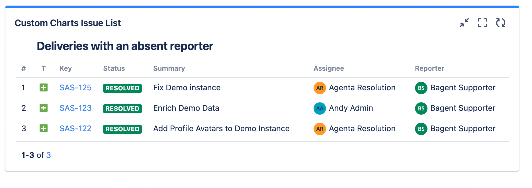
Many large companies have a strong culture of delivering value for internal customers. Strong dependencies are very common in this type of scenarios, and deliveries, like a version release, commonly unblock the next step in the process.
Significant delays can happen when the internal customer is absent on the date of the delivery. This can easily result in late communications to the teams in charge of starting the next phase of the project, for example.
Large companies are often too slow precisely because of such small obstacles. Making sure that no handovers are delayed because of reporter absences can have a very positive impact with very little effort.
How to build this chart:
Here’s the JQL that will do the trick:reporter.outofoffice.today=1 AND StatusCategory="resolved" AND resolutiondate >=-7d
Note that the resolution date is really important: pulling every issue that was ever solved into the filter would make it useless. Of course, you will have to find the exact number of days that work for you.
In Summary: Forecasting Capacity equals Proactive Capacity Planning
There are several ways you can react to the insights in these charts. It all depends on your judgment and on how your teams are using Jira.
- You can zoom in to identify unacceptable delays, and then storm in to appoint a different owner. This approach is cool for support teams and their customers, who are waiting for a solution, but it might be a bit too aggressive where ownership is more contextual and a quick handover is not possible.
- You can also accept that certain delays are going to happen, and readjust your plans to make sure that their impact is diminished. This would best be done during sprint planning meetings, for example.
Regardless of your specific use case, I’m sure that once you include these dashboards in your planning process you will never drop them.
Planning the Capacity of your Teams will never be the same
As you can see, building an absence planning dashboard in Jira is not very difficult, and it can become a powerful piece of how you do capacity planning. If you need any help setting this up, or if you have any questions, please reach out to us and we would be happy to give you a demo.
